seaborn从入门到精通03-绘图功能实现04-回归拟合绘图Estimating regression fits

seaborn从入门到精通03-绘图功能实现04-回归拟合绘图Estimating regression fits

IT从业者张某某
发布于 2023-10-16 17:38:02
发布于 2023-10-16 17:38:02
seaborn从入门到精通03-绘图功能实现04-回归拟合绘图Estimating regression fits
总结
本文主要是seaborn从入门到精通系列第3篇,本文介绍了seaborn的绘图功能实现,本文是回归拟合绘图,同时介绍了较好的参考文档置于博客前面,读者可以重点查看参考链接。本系列的目的是可以完整的完成seaborn从入门到精通。重点参考连接

参考
【宝藏级】全网最全的Seaborn详细教程-数据分析必备手册(2万字总结)
分布绘图-Visualizing distributions data
Many datasets contain multiple quantitative variables, and the goal of an analysis is often to relate those variables to each other. We previously discussed functions that can accomplish this by showing the joint distribution of two variables. It can be very helpful, though, to use statistical models to estimate a simple relationship between two noisy sets of observations. The functions discussed in this chapter will do so through the common framework of linear regression. 许多数据集包含多个定量变量,分析的目标通常是将这些变量相互关联起来。我们之前讨论过可以通过显示两个变量的联合分布来实现这一点的函数。不过,使用统计模型来估计两组有噪声的观测数据之间的简单关系是非常有用的。本章讨论的函数将通过线性回归的通用框架来实现。 The goal of seaborn, however, is to make exploring a dataset through visualization quick and easy, as doing so is just as (if not more) important than exploring a dataset through tables of statistics. seaborn的目标是通过可视化快速轻松地探索数据集,因为这样做与通过统计表探索数据集一样重要(如果不是更重要的话)。
绘制线性回归模型的函数-Functions for drawing linear regression models
The two functions that can be used to visualize a linear fit are regplot() and lmplot(). In the simplest invocation, both functions draw a scatterplot of two variables, x and y, and then fit the regression model y ~ x and plot the resulting regression line and a 95% confidence interval for that regression: 可以用来可视化线性拟合的两个函数是regplot()和lmplot()。 在最简单的调用中,两个函数都绘制了两个变量x和y的散点图,然后拟合回归模型y ~ x,并绘制出最终的回归线和该回归的95%置信区间: These functions draw similar plots, but regplot() is an axes-level function, and lmplot() is a figure-level function. Additionally, regplot() accepts the x and y variables in a variety of formats including simple numpy arrays, pandas.Series objects, or as references to variables in a pandas.DataFrame object passed to data. In contrast, lmplot() has data as a required parameter and the x and y variables must be specified as strings. Finally, only lmplot() has hue as a parameter. 这些函数绘制类似的图形,但regplot()是一个轴级函数,而lmplot()是一个图形级函数。此外,regplot()接受各种格式的x和y变量,包括简单的numpy数组和pandas。系列对象,或者作为pandas中变量的引用。传递给data的DataFrame对象。相反,lmplot()将数据作为必需的参数,x和y变量必须指定为字符串。最后,只有lmplot()有hue参数。
参考
导入库与查看tips和diamonds 数据
import numpy as np
import pandas as pd
import matplotlib.pyplot as plt
import matplotlib as  mpl
import seaborn as sns
sns.set_theme(style="darkgrid")

mpl.rcParams['font.sans-serif']=['SimHei']
mpl.rcParams['axes.unicode_minus']=False

tips = sns.load_dataset("tips",cache=True,data_home=r"./seaborn-data")
tips.head()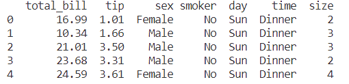
diamonds = sns.load_dataset("diamonds",cache=True,data_home=r"./seaborn-data")
print(diamonds.head())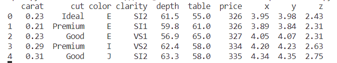
anscombe = sns.load_dataset("anscombe",cache=True,data_home=r"./seaborn-data")
print(anscombe.head())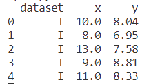
penguins = sns.load_dataset("penguins",cache=True,data_home=r"./seaborn-data")
print(penguins.head())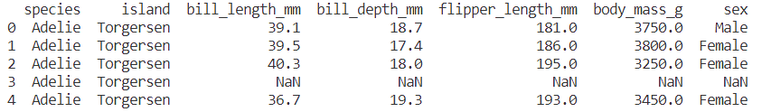
案例1-回归拟合
sns.regplot(x="total_bill", y="tip", data=tips)
sns.lmplot(x="total_bill", y="tip", data=tips)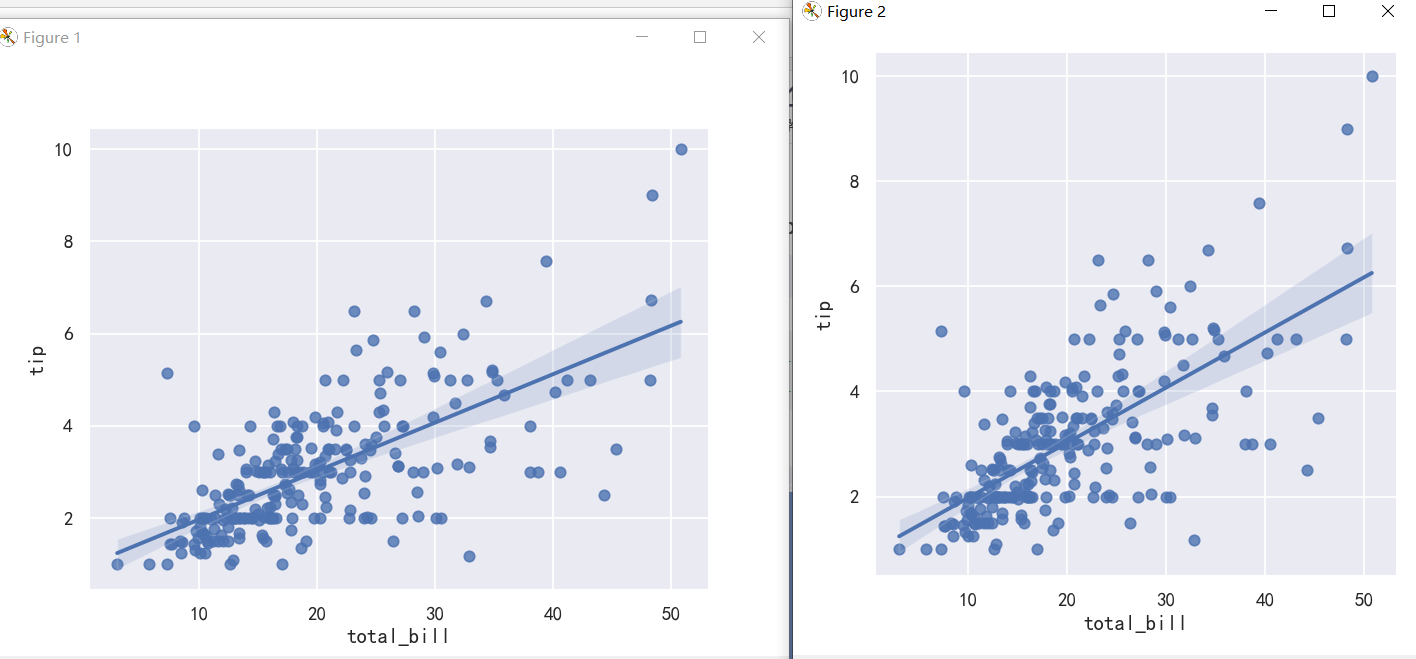
It’s possible to fit a linear regression when one of the variables takes discrete values, however, the simple scatterplot produced by this kind of dataset is often not optimal: 当其中一个变量取离散值时,有可能拟合线性回归,然而,这种数据集产生的简单散点图通常不是最优的:
sns.lmplot(x="size", y="tip", data=tips);
sns.lmplot(x="size", y="tip", data=tips, x_jitter=.05);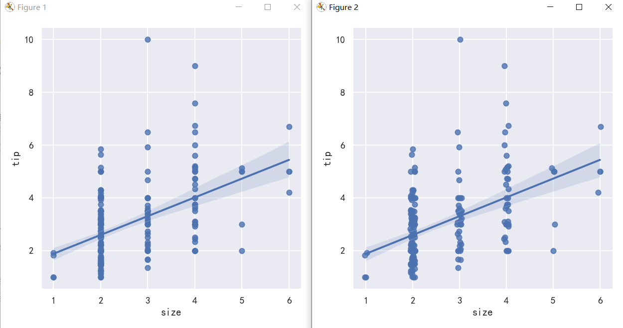
案例2-适合不同模型的拟合-Anscombe的四重奏数据集
scatter_kws参数控制颜色,透明度,点的大小 ci 回归估计的置信区间大小。这将使用回归线周围的半透明带绘制。使用自举法估计置信区间;对于大型数据集,建议通过将该参数设置为None来避免计算。
sns.lmplot(x="x", y="y", data=anscombe.query("dataset == 'I'"),ci=None, scatter_kws={"s": 80})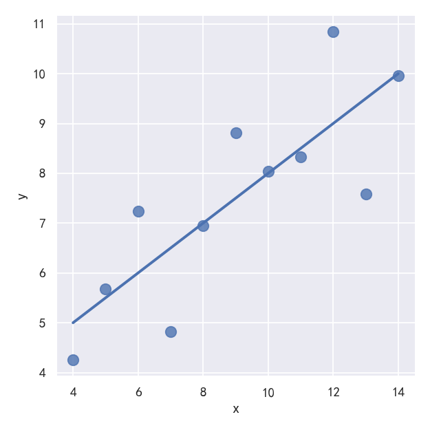
The linear relationship in the second dataset is the same, but the plot clearly shows that this is not a good model: 第二个数据集中的线性关系是相同的,但图表清楚地表明这不是一个好的模型:
sns.lmplot(x="x", y="y", data=anscombe.query("dataset == 'II'"),ci=None, scatter_kws={"s": 80})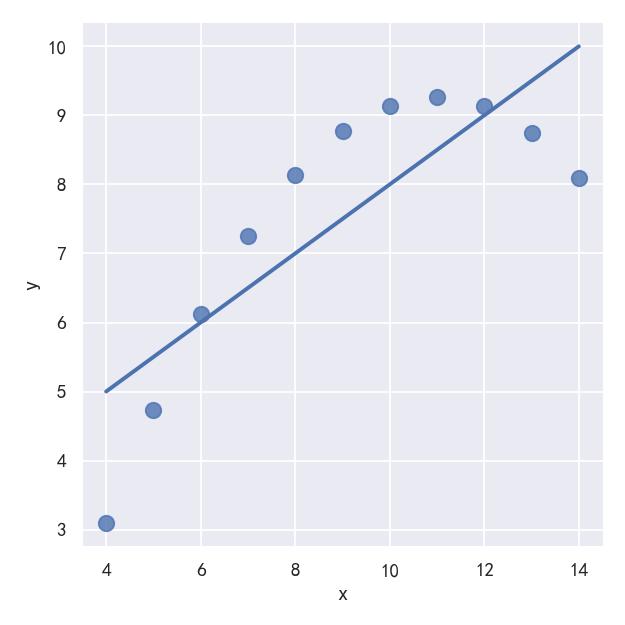
In the presence of these kind of higher-order relationships, lmplot() and regplot() can fit a polynomial regression model to explore simple kinds of nonlinear trends in the dataset: 在这些高阶关系的存在下,lmplot()和regplot()可以拟合一个多项式回归模型来探索数据集中简单的非线性趋势: order参数: If order is greater than 1, use numpy.polyfit to estimate a polynomial regression. 如果order大于1,则使用numpy.Polyfit来估计一个多项式回归。 参考:https://blog.csdn.net/lishiyang0902/article/details/127652317
# sns.lmplot(x="x", y="y", data=anscombe.query("dataset == 'II'"),ci=None, scatter_kws={"s": 80})
sns.lmplot(x="x", y="y", data=anscombe.query("dataset == 'II'"),order=2, ci=None, scatter_kws={"s": 80})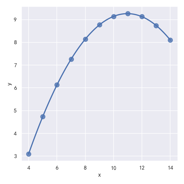
A different problem is posed by “outlier” observations that deviate for some reason other than the main relationship under study: 一个不同的问题是由“异常值”观测造成的,这些观测由于某种原因偏离了所研究的主要关系: In the presence of outliers, it can be useful to fit a robust regression, which uses a different loss function to downweight relatively large residuals: 在存在异常值的情况下,拟合稳健(robust )回归是有用的,它使用不同的损失函数来降低相对较大的残差: robust参数: If True, use statsmodels to estimate a robust regression. This will de-weight outliers. Note that this is substantially more computationally intensive than standard linear regression, so you may wish to decrease the number of bootstrap resamples (n_boot) or set ci to None. 如果为真,则使用统计模型来估计稳健回归。这将降低异常值的权重。注意,这比标准线性回归的计算量要大得多,因此您可能希望减少引导重采样(n_boot)的数量或将ci设置为None。
sns.lmplot(x="x", y="y", data=anscombe.query("dataset == 'III'"),ci=None, scatter_kws={"s": 80})
sns.lmplot(x="x", y="y", data=anscombe.query("dataset == 'III'"),robust=True, ci=None, scatter_kws={"s": 80})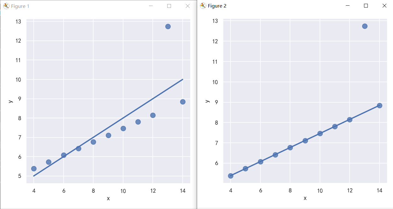
案例3-y值为离散值的线性拟合-参数logistic
tips["big_tip"] = (tips.tip / tips.total_bill) > .15
print(tips.head())
When the y variable is binary, simple linear regression also “works” but provides implausible predictions: 当y变量是二进制时,简单线性回归也“有效”,但提供了令人难以置信的预测 The solution in this case is to fit a logistic regression, such that the regression line shows the estimated probability of y = 1 for a given value of x: 这种情况下的解决方案是拟合一个逻辑回归,这样回归线显示了给定x值y = 1的估计概率:
sns.lmplot(x="total_bill", y="big_tip", data=tips, y_jitter=.03)
sns.lmplot(x="total_bill", y="big_tip", data=tips,logistic=True, y_jitter=.03)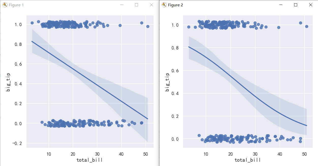
案例4-The residplot() function
参考:http://seaborn.pydata.org/generated/seaborn.residplot.html#seaborn.residplot
The residplot() function can be a useful tool for checking whether the simple regression model is appropriate for a dataset. It fits and removes a simple linear regression and then plots the residual values for each observation. Ideally, these values should be randomly scattered around y = 0: residplot()函数是检查简单回归模型是否适合数据集的有用工具。它拟合并移除一个简单的线性回归,然后绘制每个观测值的残差值。理想情况下,这些值应该随机分布在y = 0附近: If there is structure in the residuals, it suggests that simple linear regression is not appropriate: 如果残差中存在结构,则表明简单线性回归不合适:
fig,axes = plt.subplots(1,2)
fig.set_figheight(8)
fig.set_figwidth(16)
sns.residplot(x="x", y="y", data=anscombe.query("dataset == 'I'"),scatter_kws={"s": 80},ax=axes[0])
sns.residplot(x="x", y="y", data=anscombe.query("dataset == 'II'"),scatter_kws={"s": 80},ax=axes[1])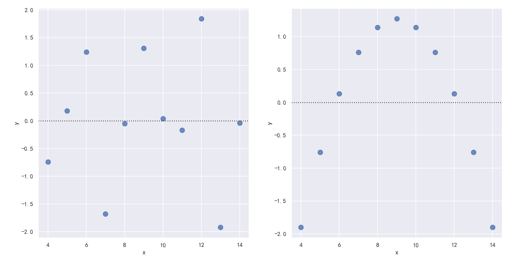
案例5-多变量的拟合回归
The plots above show many ways to explore the relationship between a pair of variables. Often, however, a more interesting question is “how does the relationship between these two variables change as a function of a third variable?” This is where the main differences between regplot() and lmplot() appear. While regplot() always shows a single relationship, lmplot() combines regplot() with FacetGrid to show multiple fits using hue mapping or faceting. 上面的图表显示了探索一对变量之间关系的许多方法。然而,一个更有趣的问题通常是“这两个变量之间的关系如何作为第三个变量的函数而变化?”这就是regplot()和lmplot()之间的主要区别所在。regplot()总是显示单个关系,而lmplot()将regplot()与FacetGrid结合起来,使用色调映射或面形显示多个拟合。 The best way to separate out a relationship is to plot both levels on the same axes and to use color to distinguish them: 区分关系的最佳方法是在同一轴上绘制两个层次,并使用颜色来区分它们: Unlike relplot(), it’s not possible to map a distinct variable to the style properties of the scatter plot, but you can redundantly code the hue variable with marker shape: lmplot不像relplot(),lmplot不可能将一个不同的变量映射到散点图的样式属性,但是你可以用标记形状冗余地编码色调变量:
参数markers=["o", "x"], palette="Set1"To add another variable, you can draw multiple “facets” with each level of the variable appearing in the rows or columns of the grid: 要添加另一个变量,您可以绘制多个“facet”,每个级别的变量出现在网格的行或列中:col参数
sns.lmplot(x="total_bill", y="tip", hue="smoker", data=tips)
sns.lmplot(x="total_bill", y="tip", hue="smoker",markers=["o", "x"], palette="Set1",col="time", row="sex", data=tips, height=3)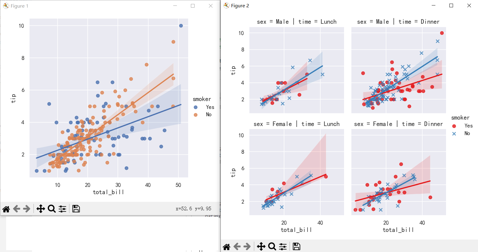
案例6-在其他上下文中绘制回归图Plotting a regression in other contexts
sns.jointplot(x="total_bill", y="tip", data=tips, kind="reg")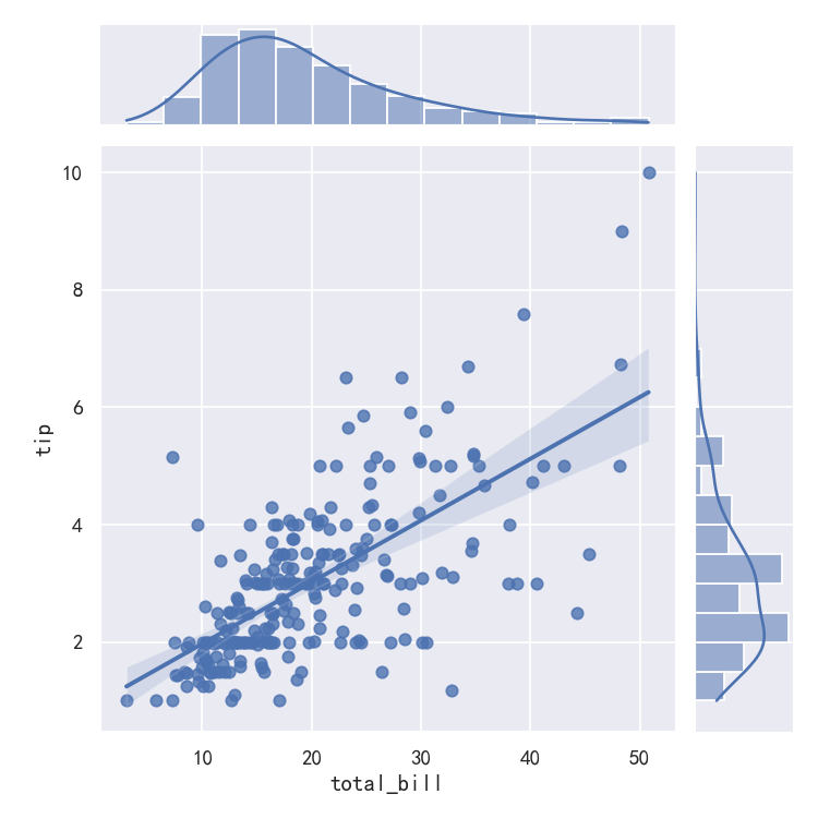
sns.pairplot(tips, x_vars=["total_bill", "size"], y_vars=["tip"],hue="smoker", height=5, aspect=.8, kind="reg")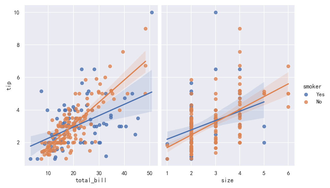
本文参与 腾讯云自媒体同步曝光计划,分享自作者个人站点/博客。
原始发表:2023-10-11,如有侵权请联系 cloudcommunity@tencent.com 删除
评论
登录后参与评论
推荐阅读
目录
腾讯云开发者

Copyright © 2013 - 2026 Tencent Cloud. All Rights Reserved. 腾讯云 版权所有
深圳市腾讯计算机系统有限公司 ICP备案/许可证号:粤B2-20090059 ![]() 粤公网安备44030502008569号
粤公网安备44030502008569号
腾讯云计算(北京)有限责任公司 京ICP证150476号 | 京ICP备11018762号