移动开发(六):.NET MAUI中布局笔记介绍
原创
移动开发(六):.NET MAUI中布局笔记介绍
原创
小明互联网技术分享社区
发布于 2024-09-18 10:57:53
发布于 2024-09-18 10:57:53

一、StackLayout 布局
StackLayout 主要用于水平或者垂直方向一组元素的排列布局。 其中 Orientation 属性用来指定元素排列的方向,默认为 Vertical
(垂直)。 StackLayout 通常用于在页面上排列 UI 的子布局。
代码示例:
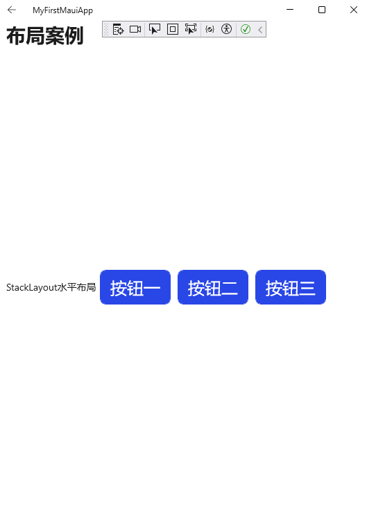
   <StackLayout Margin="10,15,10,15" Orientation="Horizontal">
<Label Text="StackLayout水平布局" VerticalOptions="Center" HorizontalOptions="Center" />
       <Button x:Name="Btn1" Text="按钮一" HeightRequest="50"  HorizontalOptions="Center" Margin="5"  Style="{StaticResource ButtonStyle}" BorderWidth="1" TextColor="White"  BackgroundColor="#2946E6" BorderColor="#2946E6"  />
       <Button x:Name="Btn2" Text="按钮二" HeightRequest="50"  HorizontalOptions="Center" Margin="5"  Style="{StaticResource ButtonStyle}" BorderWidth="1" TextColor="White"  BackgroundColor="#2946E6" BorderColor="#2946E6" />
       <Button x:Name="Btn3" Text="按钮三" HeightRequest="50"  HorizontalOptions="Center" Margin="5"  Style="{StaticResource ButtonStyle}" BorderWidth="1" TextColor="White"  BackgroundColor="#2946E6" BorderColor="#2946E6" />
   </StackLayout>
运行效果:
注意
● 未显式设置某元素的大小,则该元素将展开以填充可用宽度,如果 Orientation 属性设置为 Horizontal,则填充可用高度。
● 一般作包含其他子布局的父布局,不应使用 StackLayout 通过 StackLayout 对象的组合来重现 Grid 布局。 建议使用使用 Grid 更好地实现所需的布局。
二、HorizontalStackLayout 水平排列布局
其功能相当于StackLayout + Orientation 属性为值为Horizontal 。官方说使用该布局性能优于StackLayout。如果遇到水平排列布局建议使用HorizontalStackLayout。
  <HorizontalStackLayout>
      <Button x:Name="Btn1" Text="按钮一" HeightRequest="50"  HorizontalOptions="Center" Margin="5"  Style="{StaticResource ButtonStyle}" BorderWidth="1" TextColor="White"  BackgroundColor="#2946E6" BorderColor="#2946E6"  />
      <Button x:Name="Btn2" Text="按钮二" HeightRequest="50"  HorizontalOptions="Center" Margin="5"  Style="{StaticResource ButtonStyle}" BorderWidth="1" TextColor="White"  BackgroundColor="#2946E6" BorderColor="#2946E6" />
      <Button x:Name="Btn3" Text="按钮三" HeightRequest="50"  HorizontalOptions="Center" Margin="5"  Style="{StaticResource ButtonStyle}" BorderWidth="1" TextColor="White"  BackgroundColor="#2946E6" BorderColor="#2946E6" />
  </HorizontalStackLayout>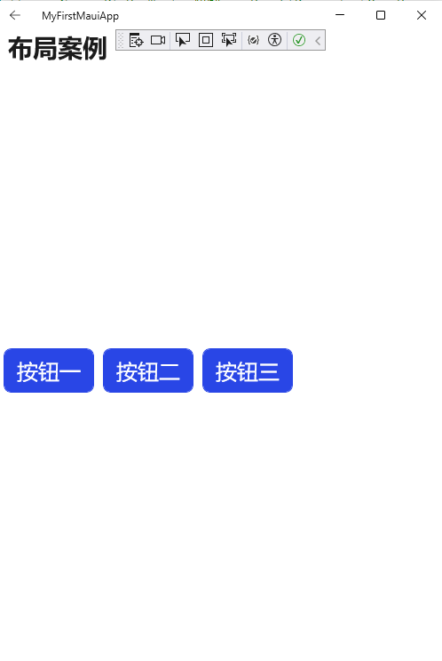
三、VerticalStackLayout 垂直排列布局
其功能相当于StackLayout + Orientation 属性为值为Horizontal 。官方说使用该布局性能优于StackLayout。如果遇到水平排列布局建议使用HorizontalStackLayout。
<VerticalStackLayout>
        <Button x:Name="Btn1" Text="按钮一" HeightRequest="50"  HorizontalOptions="Center" Margin="5"  Style="{StaticResource ButtonStyle}" BorderWidth="1" TextColor="White"  BackgroundColor="#2946E6" BorderColor="#2946E6"  />
        <Button x:Name="Btn2" Text="按钮二" HeightRequest="50"  HorizontalOptions="Center" Margin="5"  Style="{StaticResource ButtonStyle}" BorderWidth="1" TextColor="White"  BackgroundColor="#2946E6" BorderColor="#2946E6" />
        <Button x:Name="Btn3" Text="按钮三" HeightRequest="50"  HorizontalOptions="Center" Margin="5"  Style="{StaticResource ButtonStyle}" BorderWidth="1" TextColor="White"  BackgroundColor="#2946E6" BorderColor="#2946E6" />
    </VerticalStackLayout>
运行效果如下:

四、Grid 网格布局
Grid 用于显示行和列中的元素,这些元素可以有比例大小或绝对大小。 可使用 RowDefinitions 和 ColumnDefinitions 属性指定网格的行和列。
属性列表
属性名 | 类型 | 描述 | 默认值 |
|---|---|---|---|
Column | int | 附加属性,指示视图在父 Grid 中的列对齐方式。 | 0 |
ColumnDefinitions | ColumnDefinitionCollection | 定义网格列宽度的 ColumnDefinition 对象列表。 | N/A |
ColumnSpacing | double | 指示网格列之间的间距。 | 0 |
ColumnSpan | int | 附加属性,指示视图在父 Grid 中跨越的总列数。 | 1 |
Row | int | 附加属性,指示视图在父 Grid 中的行对齐方式。 | 0 |
RowDefinitions | RowDefinitionCollection | 定义网格行高度的 RowDefinition 对象列表。 | N/A |
RowSpacing | double | 指示网格行之间的间距。 | 0 |
RowSpan | int | 附加属性,指示视图在父 Grid 中跨越的总行数。 | 1 |
注意:ColumnDefinitions 和 RowDefinitions 属性没有默认值,因为它们是由用户定义的集合,通常在初始化 Grid 时明确设置。
代码示例:
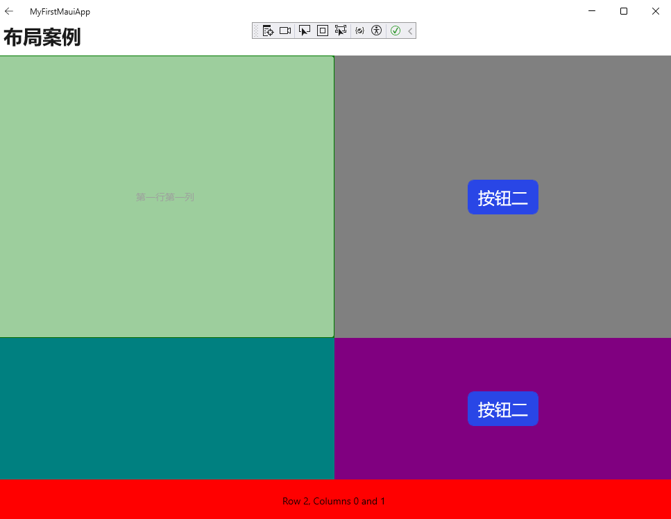
 <Grid>
     <Grid.RowDefinitions>
         <RowDefinition Height="2*" />
         <RowDefinition />
         <RowDefinition Height="60" />
     </Grid.RowDefinitions>
     <Grid.ColumnDefinitions>
         <ColumnDefinition />
         <ColumnDefinition />
     </Grid.ColumnDefinitions>
     <BoxView Color="Green" />
     <Label Text="第一行第一列"
            HorizontalOptions="Center"
            VerticalOptions="Center" />
     <Image x:Name="Image1" Source="ImageSources" ></Image>
     <ImageButton ></ImageButton>

     <BoxView Grid.Column="1"
              Color="Gray" />
     <Label Grid.Column="1"
            Text="第一行第二列"
            HorizontalOptions="Center"
            VerticalOptions="Center" />
     <BoxView Grid.Row="1"
              Color="Teal" />

     <Button Grid.Row="0" Grid.Column="1" x:Name="Btn1" Text="按钮二" HeightRequest="50"  HorizontalOptions="Center" Margin="5"  Style="{StaticResource ButtonStyle}" BorderWidth="1" TextColor="White"  BackgroundColor="#2946E6" BorderColor="#2946E6" />

     <BoxView Grid.Row="1"
              Grid.Column="1"
              Color="Purple" />

     <Button Grid.Row="1" Grid.Column="1" x:Name="Btn2" Text="按钮二" HeightRequest="50"  HorizontalOptions="Center" Margin="5"  Style="{StaticResource ButtonStyle}" BorderWidth="1" TextColor="White"  BackgroundColor="#2946E6" BorderColor="#2946E6" />

     <BoxView Grid.Row="2"
              Grid.ColumnSpan="2"
              Color="Red" />
     <Label Grid.Row="2"
            Grid.ColumnSpan="2"
            Text="Row 2, Columns 0 and 1"
            HorizontalOptions="Center"
            VerticalOptions="Center" />
 </Grid>
运行效果如下:
五、FlexLayout
.NET Multi-platform App UI (.NET MAUI) 中的 FlexLayout 是一种灵活的布局控件,它可以在堆栈中水平和垂直排列其子项。当子项太多无法容纳在单行或单列时,FlexLayout 还可以自动换行以适应内容。此外,它还提供了丰富的属性来控制方向、对齐方式,并且能够适应不同的屏幕大小。FlexLayout 基于 CSS 的灵活框布局模块,因此它具有类似 CSS 的灵活性。
属性列表
属性名 | 类型 | 描述 | 默认值 |
|---|---|---|---|
AlignContent | FlexAlignContent | 确定多行布局中子元素之间的空间分配方式。 | Stretch |
AlignItems | FlexAlignItems | 指示子元素沿交叉轴的空间分配方式。 | Stretch |
Direction | FlexDirection | 定义子元素的方向和主轴方向。 | Row |
JustifyContent | FlexJustify | 指定子元素沿主轴的空间分配方式。 | Start |
Position | FlexPosition | 确定子元素的位置方式,是相对位置还是使用固定位置。 | Relative |
Wrap | FlexWrap | 控制子元素是否应该换行到新行。 | NoWrap |
AlignSelf | FlexAlignSelf | 指示特定子元素沿交叉轴的空间分配方式。 | Auto |
Basis | FlexBasis | 定义子元素在分配空间前的初始大小。 | Auto |
Grow | float | 指定子元素在主轴上扩展的可用空间量。 | 0.0 |
Order | int | 确定子元素在容器中的布局顺序。 | 0 |
Shrink | float | 控制子元素在必要时如何收缩以适应容器。 | 1.0 |
 <StackLayout>
     <FlexLayout Direction="Column"
      AlignItems="Center"
      JustifyContent="SpaceEvenly">
         <Label Text="FlexLayout 垂直布局" />
         <Button x:Name="Btn1" Text="按钮一" HeightRequest="50"  HorizontalOptions="Center" Margin="5"  Style="{StaticResource ButtonStyle}" BorderWidth="1" TextColor="White"  BackgroundColor="#2946E6" BorderColor="#2946E6"  />
         <Button x:Name="Btn2" Text="按钮二" HeightRequest="50"  HorizontalOptions="Center" Margin="5"  Style="{StaticResource ButtonStyle}" BorderWidth="1" TextColor="White"  BackgroundColor="#2946E6" BorderColor="#2946E6" />
         <Button x:Name="Btn3" Text="按钮三" HeightRequest="50"  HorizontalOptions="Center" Margin="5"  Style="{StaticResource ButtonStyle}" BorderWidth="1" TextColor="White"  BackgroundColor="#2946E6" BorderColor="#2946E6" />

         <Label Text="Another Label" />
     </FlexLayout>
     <FlexLayout Direction="Row" Margin="50"
      AlignItems="Center"
      JustifyContent="SpaceEvenly">
         <Label Text="FlexLayout 水平布局" />
         <Button x:Name="Btn4" Text="按钮四" HeightRequest="50"  HorizontalOptions="Center" Margin="5"  Style="{StaticResource ButtonStyle}" BorderWidth="1" TextColor="White"  BackgroundColor="#2946E6" BorderColor="#2946E6"  />
         <Button x:Name="Btn5" Text="按钮五" HeightRequest="50"  HorizontalOptions="Center" Margin="5"  Style="{StaticResource ButtonStyle}" BorderWidth="1" TextColor="White"  BackgroundColor="#2946E6" BorderColor="#2946E6" />
         <Button x:Name="Btn6" Text="按钮六" HeightRequest="50"  HorizontalOptions="Center" Margin="5"  Style="{StaticResource ButtonStyle}" BorderWidth="1" TextColor="White"  BackgroundColor="#2946E6" BorderColor="#2946E6" />
         <Label Text="Another Label" />
     </FlexLayout>
 </StackLayout>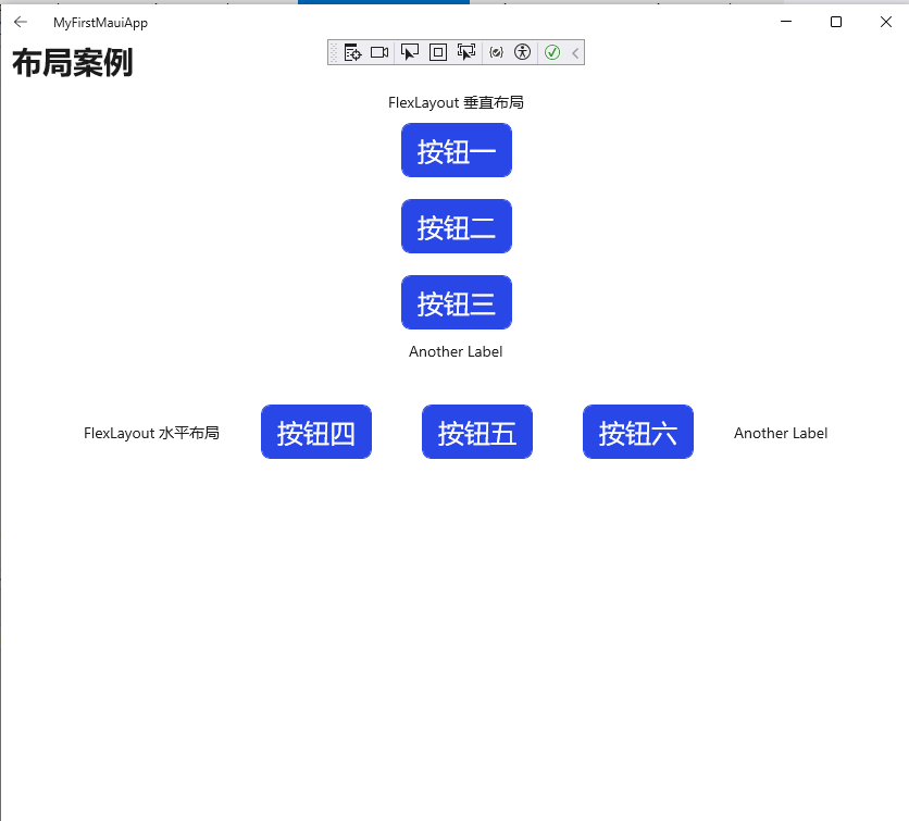
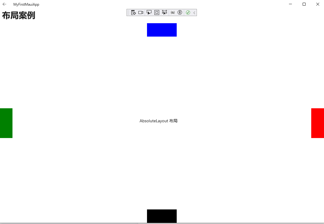
六、AbsoluteLayout布局
.NET Multi-platform App UI (.NET MAUI) 中的 AbsoluteLayout 是一种特殊的布局控件,它允许你精确地控制子项的位置和大小。你可以使用设备无关的单位来指定子项相对于 AbsoluteLayout 左上角的位置。这种布局还支持按比例定位和调整大小,这意味着你可以根据屏幕大小或容器尺寸来动态调整子项的位置和大小。
与 .NET MAUI 中的其他布局不同,AbsoluteLayout 允许子项相互重叠。因此,它适用于那些需要精确控制子项位置的场景,比如创建复杂的界面元素或动画效果。不过,由于它不自动调整子项的位置以避免重叠,所以在大多数常规布局需求中并不常用。当你知道子项的大小或不需要考虑子项之间的相互影响时,AbsoluteLayout 是一个很好的选择。
优点
灵活性高:BindableLayout可以根据需要呈现多种不同类型的数据,而不仅仅局限于单一的列表或网格布局。
可定制性强:BindableLayout可以使用自定义的数据模板来呈现数据,以满足不同的呈现需求。
数据绑定方便:BindableLayout可以直接绑定一个集合数据源,无需编写额外的代码来维护数据绑定。
性能高效:BindableLayout使用虚拟化技术来呈现大量的数据,从而保证了性能的高效和稳定。
属性列表
属性名 | 类型 | 描述 | 默认值 |
|---|---|---|---|
LayoutBounds | Rect | 表示子元素的位置和大小。该属性允许您指定子元素相对于其父 AbsoluteLayout 的位置和尺寸。 | (0, 0, AutoSize, AutoSize) |
LayoutFlags | AbsoluteLayoutFlags 枚举 | 指示用于调整子元素位置和大小的布局边界属性是否按比例解释。 | AbsoluteLayoutFlags.None |
代码示例
    <AbsoluteLayout>
        <BoxView Color="Blue"
                 AbsoluteLayout.LayoutBounds="0.5,0,100,45"
                 AbsoluteLayout.LayoutFlags="PositionProportional" />
        <BoxView Color="Green"
                 AbsoluteLayout.LayoutBounds="0,0.5,45,100"
                 AbsoluteLayout.LayoutFlags="PositionProportional" />
        <BoxView Color="Red"
                 AbsoluteLayout.LayoutBounds="1,0.5,45,100"
                 AbsoluteLayout.LayoutFlags="PositionProportional" />
        <BoxView Color="Black"
                 AbsoluteLayout.LayoutBounds="0.5,1,100,45"
                 AbsoluteLayout.LayoutFlags="PositionProportional" />
        <Label Text="AbsoluteLayout 布局"
               AbsoluteLayout.LayoutBounds="0.5,0.5,150,35"
               AbsoluteLayout.LayoutFlags="PositionProportional" />
    </AbsoluteLayout>
运行效果
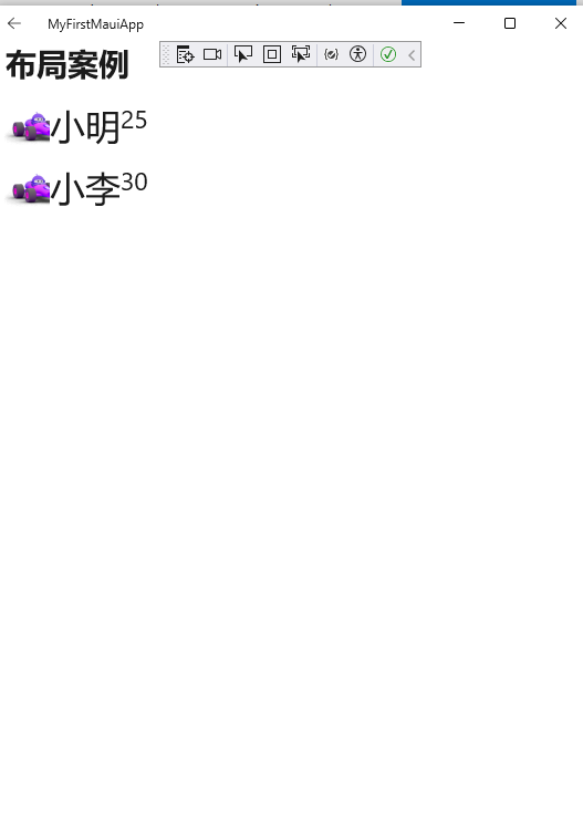
七、BindableLayout布局
BindableLayout 是一种特殊的布局类,它允许你通过绑定数据集(通常是实现 IEnumerable 接口的集合)来动态地生成布局的内容。这意味着你可以把一个数据列表绑定到这个布局上,然后布局会根据数据集中的每一项自动生成对应的视图组件。
属性列表
属性名 | 类型 | 描述 |
|---|---|---|
ItemsSource | IEnumerable | 想要显示的数据集,比如一个用户列表 |
ItemTemplate | DataTemplate | 告诉布局如何显示每一个数据项,比如每个用户的名字和头像怎么展示 |
ItemTemplateSelector | DataTemplateSelector | 在某些情况下,你可能希望根据数据的不同来改变显示方式,这时候就需要用到选择器来决定使用哪个模板。 |
新增user实体类
 public class User : INotifyPropertyChanged
 {
     private string name ;
     private int age;
     private string imagePath;

     public string Name
     {
         get => name;
         set
         {
             name = value;
             OnPropertyChanged();
         }
     }

     public int Age
     {
         get => age;
         set
         {
             age = value;
             OnPropertyChanged();
         }
     }

     public string ImagePath
     {
         get => imagePath;
         set
         {
             imagePath = value;
             OnPropertyChanged();
         }
     }

     public event PropertyChangedEventHandler PropertyChanged;

     protected virtual void OnPropertyChanged([CallerMemberName] string propertyName = null)
     {
         PropertyChanged?.Invoke(this, new PropertyChangedEventArgs(propertyName));
     }
 }
xaml代码
 <StackLayout x:Name="userList" BindableLayout.ItemsSource="{Binding}"
     Orientation="Vertical">
     <BindableLayout.ItemTemplate>
         <DataTemplate>
             <Border StrokeThickness="1">
                 <HorizontalStackLayout Margin="5">
                     <Image Source="{Binding ImagePath}"
                     Aspect="AspectFill"
                     WidthRequest="44"
                     HeightRequest="44" />
                     <Label FontSize="Large" Text="{Binding Name}"></Label>
                     <Label FontSize="Medium" Text="{Binding Age}"></Label>
                 </HorizontalStackLayout>
             </Border>
         </DataTemplate>
     </BindableLayout.ItemTemplate>
 </StackLayout>
后台绑定代码
 ObservableCollection<User> users = new ObservableCollection<User>();
 users.Add(new User()
 {
     Name = "小明",
     Age = 25,
     ImagePath = "dotnet_bot.png"
 });
 users.Add(new User()
 {
     Name = "小李",
     Age = 30,
     ImagePath = "dotnet_bot.png"
 });
 userList.BindingContext = users;
效果展示
原创声明:本文系作者授权腾讯云开发者社区发表,未经许可,不得转载。
如有侵权,请联系 cloudcommunity@tencent.com 删除。
原创声明:本文系作者授权腾讯云开发者社区发表,未经许可,不得转载。
如有侵权,请联系 cloudcommunity@tencent.com 删除。
评论
登录后参与评论
推荐阅读
目录
腾讯云开发者

Copyright © 2013 - 2026 Tencent Cloud. All Rights Reserved. 腾讯云 版权所有
深圳市腾讯计算机系统有限公司 ICP备案/许可证号:粤B2-20090059  粤公网安备44030502008569号
腾讯云计算(北京)有限责任公司 京ICP证150476号 | 京ICP备11018762号