单细胞经典文章复现(一)


从零基础掌握单细胞数据的分析技巧最有效的方法就是复现一篇单细胞研究文章,学习作者的分析思路和可视化方法。本次我们选择复现的文章是2023年发表在《Nature Communications》上的一篇研究,题为《Single-cell analysis reveals prognostic fibroblast subpopulations linked to molecular and immunological subtypes of lung cancer》,研究聚焦于肺癌肿瘤中的成纤维细胞(CAFs)单细胞分析。
文章使用的数据集上传至GEO数据平台,编号是GSE153935,可以采用手动下载的方式,数据链接:https://ftp.ncbi.nlm.nih.gov/geo/series/GSE153nnn/GSE153935/suppl/GSE153935_TLDS_AllCells.txt.gz
https://ftp.ncbi.nlm.nih.gov/geo/series/GSE153nnn/GSE153935/suppl/GSE153935_Merged_StromalCells.txt.gz

在做单细胞转录组分析的研究时,第一步永远都是先构建一个单细胞转录组图谱,即对单细胞数据先进行降维聚类, 完成细胞注释,展示marker基因的表达情况, 计算细胞比例等,以此来展示数据基本特征。在前面我们已经介绍过第一步的分析,这里不再赘述。文章作者也提供了已经注释好的数据,我们可以从(https://doi.org/10.5281/zenodo.7400873)中下载得到作者注释之后的数据来复现。为了能够得到和作者一样的图形,我们直接用作者注释好的数据,方便解释和学习。
代码下载地址:
(https://github.com/cjh-lab/NCOMMS_NSCLC_scFibs)
下载数据和代码后解压到同一文件夹。我们首先完成Figure1的复现,下图为文献中的截图,接下来我们跟着作者的代码看 。
先加载包,导入数据
# 加载所需的R包
library(Seurat)
library(WGCNA)
library(tidyverse)
library(ggpubr)
library(ggsci)
library(RColorBrewer)
# 指定数据目录
data_directory <- "./" # 指定保存 Zenodo 数据的目录
source(paste0(data_directory, "0_NewFunctions.R"))
# 加载数据
load(paste0(data_directory, "TLDS_AllCells_RPCAintegrated.Rdata"))
load(paste0(data_directory, "IntegratedFibs_Zenodo.Rdata"))
load(paste0(data_directory, "HCLA.SS_muralSig_data.Rdata"))
load(paste0(data_directory, "Qian_AllCells_RPCAintegrated.Rdata"))
图1a可能是作者用AI或者其他软件工具绘制的,R程序绘制不出,我们从图1b开始
# Gender Data redacted for GDPR concerns
# Stage Barplot
Stage_barplot <-
Sample_MetaData %>%
filter(Dataset == "TLDS") %>%
filter(!Sample.Subtype == "Control") %>%
ggplot(aes(y = Dataset, fill = Stage)) +
geom_bar(position = "fill") +
facet_wrap(~Sample.Subtype) +
theme_pubr(base_size = 12) +
theme(legend.position = "right", legend.key.size = unit(3, "pt"), legend.direction = "horizontal",
axis.title.y = element_blank(), axis.text.y = element_blank()) +
guides(fill = guide_legend(title.position = "top")) +
xlab("Sample Fraction") +
scale_fill_brewer(palette = "Set2", name = "Stage")

# Smoking Barplot
Smoking_barplot <-
Sample_MetaData %>%
filter(Dataset == "TLDS") %>%
filter(!Sample.Subtype == "Control") %>%
drop_na(Smoking.status) %>%
ggplot(aes(y = Dataset, fill = Smoking.status)) +
geom_bar(position = "fill") +
facet_wrap(~Sample.Subtype) +
theme_pubr(base_size = 12) +
theme(legend.position = "right", legend.key.size = unit(3, "pt"), legend.direction = "horizontal",
axis.title.y = element_blank(), axis.text.y = element_blank()) +
guides(fill = guide_legend(title.position = "top")) +
xlab("Sample Fraction") +
scale_fill_brewer(palette = "Set2", name = "Smoking Status")

# Grade Barplot
Grade_barplot <-
Sample_MetaData %>%
filter(Dataset == "TLDS") %>%
filter(!Sample.Subtype == "Control") %>%
drop_na(Differentiation) %>%
ggplot(aes(y = Dataset, fill = Differentiation)) +
geom_bar(position = "fill") +
facet_wrap(~Sample.Subtype) +
theme_pubr(base_size = 12) +
theme(legend.position = "right", legend.key.size = unit(3, "pt"), legend.direction = "horizontal",
axis.title.y = element_blank(), axis.text.y = element_blank()) +
guides(fill = guide_legend(title.position = "top")) +
xlab("Sample Fraction") +
scale_fill_brewer(palette = "Set2", name = "Grade")

# Combine all barplots into a single figure
Fig_1B <- ggarrange(NULL,
ggarrange(Smoking_barplot + theme(legend.justification = 0,
axis.text.x = element_blank(), axis.title.x = element_blank(),
axis.ticks.y = element_blank(), theme_pubr(base_size = 20)),
Stage_barplot + theme(legend.justification = 0,
axis.text.x = element_blank(), axis.title.x = element_blank(),
axis.ticks.y = element_blank(),
strip.background = element_blank(), strip.text.x = element_blank(), theme_pubr(base_size = 20)),
Grade_barplot + theme(legend.justification = 0,
axis.ticks.y = element_blank(),
strip.background = element_blank(), strip.text.x = element_blank(), theme_pubr(base_size = 20)) +
rotate_x_text(angle = 45),
ncol = 1, nrow = 3, align = "v", heights = c(1.3,1,1.7)),
ncol = 2, widths = c(0.05,0.95))
Fig_1B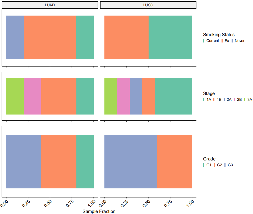
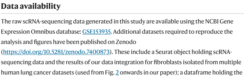
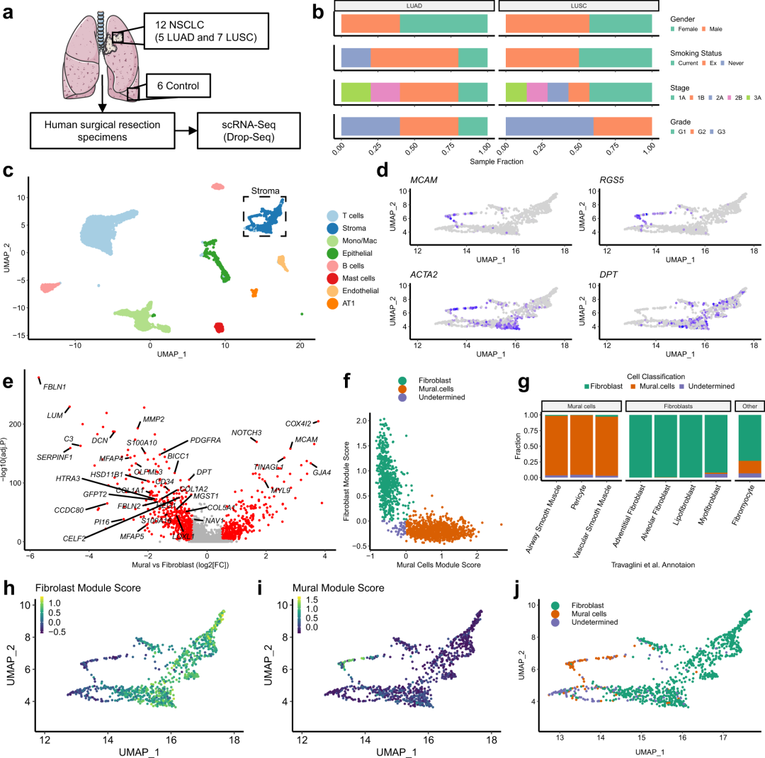
作者首先对所取非小细胞肺癌的样本进行临床信息进行展示(图1a-b)。
# Filter TLDS meta data
TLDS_metaData <- Sample_MetaData %>%
filter(Dataset == "TLDS")

# Keep columns that don't have all missing values
cols2keep <- colnames(TLDS_metaData)[(!colSums(apply(TLDS_metaData,2,is.na)) == nrow(TLDS_metaData))]
Table_S1 <- TLDS_metaData[, cols2keep]

# Mark control tissue sampled status
Control.samples <- as.character(Table_S1$PatientID)[Table_S1$Sample.type == "Control"]
Table_S1$Control.tissue.Sampled <- Table_S1$PatientID %in% Control.samples

# Finalizing Table_S1
Table_S1.final <- Table_S1[!Table_S1$Sample.type == "Control", ]
Table_S1.final <- Table_S1.final[, -c(20:21)]

# Mesenchymal cell processing
TLDS.combined <- SetIdent(TLDS.combined, value = "Cell.type")
TLDS.combined$Cell.type3 <- factor(TLDS.combined$Cell.type2,
levels = levels(TLDS.combined$Cell.type2),
labels = c(levels(TLDS.combined$Cell.type2)[1],
"Stroma",
levels(TLDS.combined$Cell.type2)[3:8])

# Figure 1C
Fig_1C <-
DimPlot(TLDS.combined, label = F, group.by = "Cell.type3")  &
theme_pubr(base_size = 10) &
theme(plot.title = element_blank(),
legend.background = element_rect(fill = "transparent",colour = NA),
panel.background = element_rect(fill = "transparent",colour = NA),
legend.position = "right", legend.key.size = unit(1.5, "pt"),
legend.justification = c(0,0.5)) &
scale_color_brewer(palette = "Paired",
labels = c("T cells", "Stroma", "Mono/Mac", "Epithelial", "B cells",
"Mast cells", "Endothelial", "AT1"), na.translate = F)
Fig_1C
作者进行了去批次、降维聚类、细胞注释,注释到常规的T细胞、B细胞、基质细胞(Stroma)等。
# Supplementary Figure 1A
# Calculate nearest neighbour z-scores on raw data
DefaultAssay(TLDS.combined) <- "RNA"
TLDS.combined <- NormalizeData(TLDS.combined)
TLDS.combined <- FindVariableFeatures(TLDS.combined)
TLDS.combined <- ScaleData(TLDS.combined, verbose = FALSE)
TLDS.combined <- RunPCA(TLDS.combined, npcs = 30, verbose = FALSE)
TLDS.combined <- FindNeighbors(TLDS.combined, reduction = "pca", dims = 1:30)
Batchtest_raw <- Batch.Quant(seurat_obj = TLDS.combined,

                           vars = c("PatientID"),

                           nPerm = 1000, assay_nn = "RNA")
# Calculate nn z-scores on integrated data
Batchtest_rpca <- Batch.Quant(seurat_obj = TLDS.combined,

                            vars = c("PatientID"),

                            nPerm = 1000, assay_nn = "integrated")

# Collate and plot results
Batch.test_res <- data.frame(
raw = Batchtest_raw$PatientID,
rpca  = Batchtest_rpca$PatientID

    )

SupplFig_1A <- reshape2::melt(Batch.test_res) %>%
ggplot(aes(x = variable, y = value)) +
theme_pubr(base_size = 10) +
geom_boxplot(outlier.size = 0.1) +
geom_hline(yintercept = 1.96, linetype = "dashed") +
rotate_x_text(angle = 45) +
theme(axis.title.x = element_blank()) +
scale_x_discrete(labels = c("Raw Data", "rPCA Integrated", "Clustering")) +
ylab("Intra-Patient nn overlap\n(Z-score)") +
ggforce::facet_zoom(ylim = c(-1, 7))
SupplFig_1A

# Supplementary Figure 1B
SupplFig_1B <-
TLDS.combined@meta.data %>%
drop_na(Cell.type3) %>%
ggplot(aes(x = orig.ident, fill = Cell.type3)) +
theme_pubr(base_size = 10) +
theme(plot.title = element_blank(),

            legend.title = element_blank(),

            legend.key.size = unit(3,"pt"),

            axis.text.x = element_blank(), legend.position = "right") +
facet_grid(~Sample.Subtype, scales = "free_x", space = "free_x") +
geom_bar(position = "fill", alpha = 0.9) +
scale_fill_brewer(palette = "Paired", labels = c("T cells", "Stroma", "Mono/Mac", "Epithelial", "B cells",

                                          "Mast cells", "Endothelial", "AT1")) +
xlab("Sample") + ylab("Fraction")
SupplFig_1B

# Supplementary Figure 1C&D
SupplFig_1CD <-
    ggarrange(
    TLDS.combined@meta.data %>%
    drop_na(Cell.type3) %>%
    ggplot(aes(x = Cell.type3, y = nFeature_RNA)) +
        theme_pubr(base_size = 10) +
        theme(legend.position = "none", axis.title.x = element_blank()) +
        geom_violin(aes(fill = Cell.type3), alpha = 0.9, scale = "width") +
        geom_jitter(alpha = 0.1, size = 0.1, width = 0.2) +
        scale_y_log10() +
        scale_fill_brewer(palette = "Paired") +
        rotate_x_text(angle = 45) +
        ylab("nGenes"),
TLDS.combined@meta.data %>%
        drop_na(Cell.type3) %>%
        ggplot(aes(x = Cell.type3, y = nCount_RNA)) +
        theme_pubr(base_size = 10) +
        theme(legend.position = "none", axis.title.x = element_blank()) +
        geom_violin(aes(fill = Cell.type3), alpha = 0.9, scale = "width") +
        geom_jitter(alpha = 0.1, size = 0.1, width = 0.2) +
        scale_y_log10() +
        scale_fill_npg() +
        rotate_x_text(angle = 45) +
        ylab("nCounts"),

      ncol = 2)
SupplFig_1CD# Supplementary Figure 1E
DefaultAssay(TLDS.combined) <- "RNA"
Markers <- c("TRBC2", "DCN", "LYZ", "KRT19", "CD79A", "KIT", "VWF", "AGER")
SupplFig_1E <-
FeaturePlot(TLDS.combined, features = Markers, ncol = 4, reduction = "umap") &
theme_pubr(base_size = 10) &
theme(plot.title = element_text(face = "italic"), legend.position = "none")
SupplFig_1E

# Figure 1D
TLDS_Mesenchymal_seurat <- subset(TLDS.combined, idents = "Fibroblasts")
Fig_1D <-
FeaturePlot(TLDS_Mesenchymal_seurat, c("MCAM", "RGS5", "ACTA2", "DPT"),
pt.size = 0.8, reduction = "umap") &
theme_pubr(base_size = 10) &
ylim(c(2.5, 10)) &
theme(legend.position = "none",
legend.justification = 0, legend.key.width = unit(2,"pt"), legend.key.height = unit(5, "pt"),
legend.background = element_blank(),
plot.title = element_text(face = "italic"))
Fig_1D
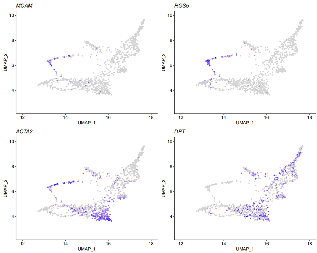
作者试图确定基质细胞簇是否同时包含成纤维细胞和壁细胞,使用壁细胞(MCAM和 RGS5)肌成纤维细胞(ACTA2)和成纤维细胞(DPT)marker基因进行观察后,可以看到表达存在差异。
# Separating Mural cells and fibroblasts
DefaultAssay(TLDS_Mesenchymal_seurat) <- "RNA"
TLDS_Mesenchymal_seurat <- AddModuleScore(TLDS_Mesenchymal_seurat, features = Consensus_FibsvMural_sigs)
names(TLDS_Mesenchymal_seurat@meta.data)
TLDS_Mesenchymal_seurat$Fib_or_Mural <- "Undetermined"
TLDS_Mesenchymal_seurat$Fib_or_Mural[TLDS_Mesenchymal_seurat$Cluster1 > 0 &
TLDS_Mesenchymal_seurat$Cluster1 - TLDS_Mesenchymal_seurat$Cluster2 > 0.1] <- "Fibroblast"
TLDS_Mesenchymal_seurat$Fib_or_Mural[TLDS_Mesenchymal_seurat$Cluster2 > 0 &
TLDS_Mesenchymal_seurat$Cluster2 - TLDS_Mesenchymal_seurat$Cluster1 > 0.1] <- "Mural.cells"
TLDS_Mesenchymal_seurat$Fibrolast.Module.Score <- TLDS_Mesenchymal_seurat$Cluster1
TLDS_Mesenchymal_seurat$Mural.Module.Score <- TLDS_Mesenchymal_seurat$Cluster2
# Figure 1E-G: HCLA Mural cell score optimisation
Fig_1E <-
Mural.v.Fibs_markers %>
ggplot(aes(x = avg_log2FC, y = -log10(p_val_adj), label = label, colour = p_val_adj < 0.01 & abs(avg_log2FC) > 0.5)) +
      geom_point(size = 0.8) +
      theme_pubr(base_size = 10) +
      theme(legend.position = "none") +
      ggrepel::geom_text_repel(size = 1.75, colour = "black", fontface = "italic", min.segment.length = 0, max.overlaps = 30) +
      scale_color_manual(values = c("grey70", "red")) +
      ylab("-log10(adj.P)") +
      xlab("Mural vs Fibroblast (log2[FC])")
Fig_1E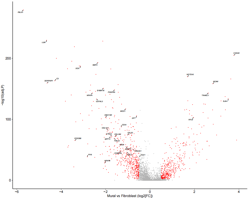
为了进一步区分这些细胞,随后使用已发表的人肺细胞图谱的scRNA-seq(HCLA)数据鉴定了人肺组织中成纤维细胞和壁细胞之间差异表达的基因,利用这些基因对壁细胞和纤维细胞有较好的区分效果,同时验证效果显示准确率为 99%。再运用到自己的数据上。
# Separating Mural cells and fibroblasts (Filling NA)
HCLA.SS_muralSig_data$Fib_or_Mural[is.na(HCLA.SS_muralSig_data$Fib_or_Mural)] <- "Undetermined"

# Figure 1F: Plotting Mural vs Fibroblast Module Scores
Fig_1F <-
HCLA.SS_muralSig_data %>
ggplot(aes(x = Mural.Cells.Module.Score,
y = Fibroblast.Module.Score, colour = Fib_or_Mural)) +
theme_pubr(base_size = 20) +
geom_point(size = 2) +
xlab("Mural Cells Module Score") +
ylab("Fibroblast Module Score") +
scale_colour_brewer(palette = "Dark2") +
theme(legend.position = "top", plot.title = element_blank(),
legend.key.height = unit(2, "pt"), legend.direction = "vertical",
legend.justification = 0.25, legend.background = element_blank(), legend.title = element_blank()) +
guides(colour = guide_legend(override.aes = list(size = 2)))
Fig_1F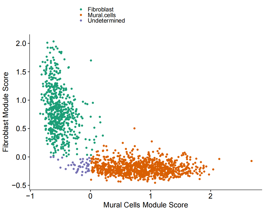
# Adding custom cell classification labels
HCLA.SS_muralSig_data$free_annotation_merged2 <- factor(HCLA.SS_muralSig_data$free_annotation_merged,labels = c("Mural cells", "Fibroblasts", "Other"))# Figure 1G: Bar plot of cell classification
Fig_1G <-
      HCLA.SS_muralSig_data %>
      ggplot(aes(x = free_annotation, fill = Fib_or_Mural)) +
      theme_pubr(base_size = 12) +
      geom_bar(position = "fill") +
      rotate_x_text(angle = 65) +
      theme(legend.key.size = unit(4, "pt")) +
      facet_grid(~free_annotation_merged2, scale = "free_x", space = "free_x") +
      scale_fill_brewer(palette = "Dark2", name = "Cell Classification") +
      guides(fill = guide_legend(title.position = "top", title.hjust = 0.5)) +
      ylab("Fraction") +
      xlab("Travaglini et al. Annotation")
Fig_1G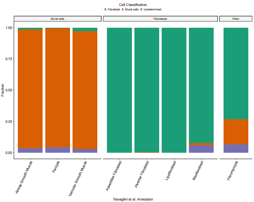
# Figure 1H-J
Fig_1HIJ <-
ggarrange(
FeaturePlot(TLDS_Mesenchymal_seurat, c("Fibrolast.Module.Score"), pt.size = 1) &
        scale_color_viridis_c() &
        ylim(c(2.5, 10)) &
        theme_pubr(base_size = 7) &
        theme(legend.position = c(0, 0.9),
          legend.justification = 0,
          legend.key.width = unit(2, "pt"),
          legend.key.height = unit(5, "pt"),
          legend.background = element_blank()),
FeaturePlot(TLDS_Mesenchymal_seurat, c("Mural.Module.Score"), pt.size = 1) &
        scale_color_viridis_c() &
        ylim(c(2.5, 10)) &
        theme_pubr(base_size = 7) &
        theme(legend.position = c(0, 0.9),
          legend.justification = 0,
          legend.key.width = unit(2, "pt"),
          legend.key.height = unit(5, "pt"),
          legend.background = element_blank()),
DimPlot(TLDS_Mesenchymal_seurat, reduction = "umap",
          group.by = "Fib_or_Mural",
          label = F, repel = TRUE, pt.size = 1) &
        ylim(c(2.5, 10)) &
        theme_pubr(base_size = 5) &
        theme(legend.position = c(0,0.9), plot.title = element_blank(),
          legend.key.height = unit(2, "pt"), legend.justification = c(0, 0.5),
          legend.background = element_blank()) &
        scale_colour_brewer(palette = "Dark2") &
        guides(colour = guide_legend(override.aes = list(size = 2)))
Fig_1HIJ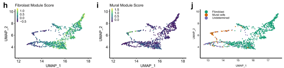
以上是文章Figure1的复现情况,Figure1的数据是作者自测所得,证明了NSCLC中成纤维细胞存在异质性。下一节接着复现Figure2的内容。
本文参与 腾讯云自媒体同步曝光计划,分享自微信公众号。
原始发表:2025-02-22,如有侵权请联系 cloudcommunity@tencent.com 删除
评论
登录后参与评论
推荐阅读
腾讯云开发者

Copyright © 2013 - 2026 Tencent Cloud. All Rights Reserved. 腾讯云 版权所有
深圳市腾讯计算机系统有限公司 ICP备案/许可证号:粤B2-20090059 ![]() 粤公网安备44030502008569号
粤公网安备44030502008569号
腾讯云计算(北京)有限责任公司 京ICP证150476号 | 京ICP备11018762号