鸿蒙特效教程05-鸿蒙很开门
原创

鸿蒙特效教程05-鸿蒙很开门
本教程适合HarmonyOS初学者,通过简单到复杂的步骤,通过 Stack 层叠布局 + animation 动画,一步步实现这个"鸿蒙很开门"特效。
开发环境准备
- DevEco Studio 5.0.3
- HarmonyOS Next API 15
下载代码仓库
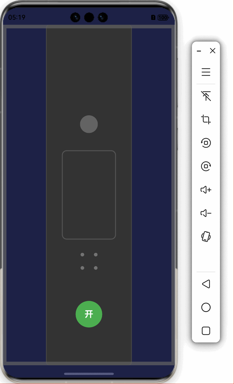
最终效果预览
屏幕上有一个双开门,点击中间的按钮后,两侧门会向打开,露出开门后面的内容。当用户再次点击按钮时,门会关闭。
实现步骤
我们将通过以下步骤逐步构建这个效果:
- 用层叠布局搭建基础UI结构
- 用层叠布局创建门的装饰
- 实现开关门动画效果
步骤1:搭建基础UI结构
首先,我们需要创建一个基本的页面结构。在这个效果中,最关键的是使用Stack组件来实现层叠效果。
@Entry
@Component
struct OpenTheDoor {
  build() {
    Stack() {
      // 背景层
      Column() {
        Text('鸿蒙很开门')
          .fontSize(28)
          .fontWeight(FontWeight.Bold)
          .fontColor(Color.White)
      }
      .width('100%')
      .height('100%')
      .backgroundColor('#1E2247')

      // 按钮
      Button({ type: ButtonType.Circle }) {
        Text('开')
          .fontSize(20)
          .fontColor(Color.White)
      }
      .width(60)
      .height(60)
      .backgroundColor('#4CAF50')
      .position({ x: '50%', y: '85%' })
      .translate({ x: '-50%', y: '-50%' })
    }
    .width('100%')
    .height('100%')
    .backgroundColor(Color.Black)
  }
}
代码说明:
Stack组件是一个层叠布局容器,子组件会按照添加顺序从底到顶叠放。- 我们首先放置了一个背景层,它包含了将来门打开后要显示的内容。
- 然后放置了一个圆形按钮,用于触发开门动作。
- 使用
position和translate组合定位按钮在屏幕底部中间。
此时,只有一个简单的背景和按钮,还没有门的效果。
步骤2:创建门的设计
接下来,我们在Stack层叠布局中添加左右两扇门:
@Entry
@Component
struct OpenTheDoor {
  build() {
    Stack() {
      // 背景层
      Column() {
        Text('鸿蒙很开门')
          .fontSize(28)
          .fontWeight(FontWeight.Bold)
          .fontColor(Color.White)
      }
      .width('100%')
      .height('100%')
      .backgroundColor('#1E2247')

      // 左门
      Stack() {
        // 门本体
        Column()
          .width('96%')
          .height('100%')
          .backgroundColor('#333333')
          .borderWidth({ right: 2 })
          .borderColor('#444444')

        // 门上装饰
        Column() {
          Circle()
            .width(40)
            .height(40)
            .fill('#666666')

          Rect()
            .width(120)
            .height(200)
            .radiusWidth(10)
            .stroke('#555555')
            .strokeWidth(2)
            .fill('none')
            .margin({ top: 40 })
        }
        .width('80%')
        .alignItems(HorizontalAlign.Center)
      }
      .width('50%')
      .height('100%')

      // 右门
      Stack() {
        // 门本体
        Column()
          .width('96%')
          .height('100%')
          .backgroundColor('#333333')
          .borderWidth({ left: 2 })
          .borderColor('#444444')

        // 门上装饰
        Column() {
          Circle()
            .width(40)
            .height(40)
            .fill('#666666')

          Rect()
            .width(120)
            .height(200)
            .radiusWidth(10)
            .stroke('#555555')
            .strokeWidth(2)
            .fill('none')
            .margin({ top: 40 })
        }
        .width('80%')
        .alignItems(HorizontalAlign.Center)
      }
      .width('50%')
      .height('100%')

      // 门框
      Column()
        .width('100%')
        .height('100%')
        .border({ width: 8, color: '#666' })

      // 按钮
      Button({ type: ButtonType.Circle }) {
        Text('开')
          .fontSize(20)
          .fontColor(Color.White)
      }
      .width(60)
      .height(60)
      .backgroundColor('#4CAF50')
      .position({ x: '50%', y: '85%' })
      .translate({ x: '-50%', y: '-50%' })
    }
    .width('100%')
    .height('100%')
    .backgroundColor(Color.Black)
  }
}
代码说明:
- 我们添加了左右两扇门,每扇门占屏幕宽度的50%。
- 每扇门自身是一个
Stack,包含门本体和装饰元素。 - 门本体使用
Column组件,设置背景色和边框。 - 装饰元素包括圆形"门把手"和矩形装饰。
- 添加门框作为装饰元素,增强立体感。
- 使用
zIndex控制层叠顺序(虽然代码中未显示,但在最终代码中会用到)。
此时我们有了一个静态的门的外观,但它还不能打开和关闭。
步骤3:实现开关门动画
现在我们需要添加状态变量和动画逻辑,使门能够打开和关闭:
@Entry
@Component
struct OpenTheDoor {
  // 门打开的最大位移(百分比)
  private doorOpenMaxOffset: number = 110
  // 当前门打开的位移
  @State doorOpenOffset: number = 0
  // 是否正在动画中
  @State isAnimating: boolean = false

  // 切换门的状态
  toggleDoor() {
    this.isAnimating = true

    if (this.doorOpenOffset <= 0) {
      // 开门动画
      animateTo({
        duration: 1500,
        curve: Curve.EaseInOut,
        iterations: 1,
        playMode: PlayMode.Normal,
        onFinish: () => {
          this.isAnimating = false
        }
      }, () => {
        this.doorOpenOffset = this.doorOpenMaxOffset
      })
    } else {
      // 关门动画
      animateTo({
        duration: 1500,
        curve: Curve.EaseInOut,
        iterations: 1,
        playMode: PlayMode.Normal,
        onFinish: () => {
          this.isAnimating = false
        }
      }, () => {
        this.doorOpenOffset = 0
      })
    }
  }

  build() {
    Stack() {
      // 背景层(保持不变)
      ...

      // 左门
      Stack() {
        // 门本体和装饰(保持不变)
        ...
      }
      .width('50%')
      .height('100%')
      .translate({ x: this.doorOpenOffset <= 0 ? '0%' : (-this.doorOpenOffset) + '%' })

      // 右门
      Stack() {
        // 门本体和装饰(保持不变)
        ...
      }
      .width('50%')
      .height('100%')
      .translate({ x: this.doorOpenOffset <= 0 ? '0%' : this.doorOpenOffset + '%' })

      // 门框(保持不变)
      ...

      // 按钮
      Button({ type: ButtonType.Circle }) {
        Text(this.doorOpenOffset > 0 ? '关' : '开')
          .fontSize(20)
          .fontColor(Color.White)
      }
      .width(60)
      .height(60)
      .backgroundColor(this.doorOpenOffset > 0 ? '#FF5252' : '#4CAF50')
      .position({ x: '50%', y: '85%' })
      .translate({ x: '-50%', y: '-50%' })
      .onClick(() => {
        if (!this.isAnimating) {
          this.toggleDoor()
        }
      })
    }
    .width('100%')
    .height('100%')
    .backgroundColor(Color.Black)
  }
}
代码说明:
- 添加了状态变量:
doorOpenMaxOffset: 门打开的最大位移doorOpenOffset: 当前门的位移状态isAnimating: 标记动画是否正在进行
- 使用
translate属性绑定到doorOpenOffset状态,实现门的移动效果:- 左门向左移动:
translate({ x: (-this.doorOpenOffset) + '%' }) - 右门向右移动:
translate({ x: this.doorOpenOffset + '%' })
- 左门向左移动:
- 实现
toggleDoor方法,使用animateTo函数创建动画:animateTo是HarmonyOS中用于创建显式动画的API- 设置动画时长1500毫秒
- 使用
EaseInOut曲线使动画更加平滑 - 通过改变
doorOpenOffset状态触发UI更新
- 按钮样式和文本随门的状态变化:
- 门关闭时显示"开",背景绿色
- 门打开时显示"关",背景红色
- 添加点击事件调用
toggleDoor方法 - 使用
isAnimating防止动画进行中重复触发
此时,门可以通过动画打开和关闭,但门后的内容没有渐变效果。
步骤4:添加门后内容和渐变效果
现在我们为门后的内容添加渐变显示效果:
@Entry
@Component
struct OpenTheDoor {
  // 已有的状态变量
  private doorOpenMaxOffset: number = 110
  @State doorOpenOffset: number = 0
  @State isAnimating: boolean = false
  // 新增状态变量
  @State showContent: boolean = false
  @State backgroundOpacity: number = 0

  toggleDoor() {
    this.isAnimating = true

    if (this.doorOpenOffset <= 0) {
      // 开门动画
      animateTo({
        duration: 1500,
        curve: Curve.EaseInOut,
        iterations: 1,
        playMode: PlayMode.Normal,
        onFinish: () => {
          this.isAnimating = false
          this.showContent = true
        }
      }, () => {
        this.doorOpenOffset = this.doorOpenMaxOffset
        this.backgroundOpacity = 1
      })
    } else {
      // 关门动画
      this.showContent = false
      animateTo({
        duration: 1500,
        curve: Curve.EaseInOut,
        iterations: 1,
        playMode: PlayMode.Normal,
        onFinish: () => {
          this.isAnimating = false
        }
      }, () => {
        this.doorOpenOffset = 0
        this.backgroundOpacity = 0
      })
    }
  }

  build() {
    Stack() {
      // 背景层 - 门后内容
      Column() {
        Text('鸿蒙很开门')
          .fontSize(28)
          .fontWeight(FontWeight.Bold)
          .fontColor(Color.White)
          .opacity(this.backgroundOpacity)
          .margin({ bottom: 20 })

        Image($r('app.media.startIcon'))
          .width(100)
          .height(100)
          .objectFit(ImageFit.Contain)
          .opacity(this.backgroundOpacity)
          .animation({
            duration: 800,
            curve: Curve.EaseOut,
            delay: 500,
            iterations: 1,
            playMode: PlayMode.Normal
          })

        Text('探索无限可能')
          .fontSize(20)
          .fontColor(Color.White)
          .opacity(this.backgroundOpacity)
          .margin({ top: 20 })
          .visibility(this.showContent ? Visibility.Visible : Visibility.Hidden)
          .animation({
            duration: 800,
            curve: Curve.EaseOut,
            delay: 100,
            iterations: 1,
            playMode: PlayMode.Normal
          })
      }
      .width('100%')
      .height('100%')
      .justifyContent(FlexAlign.Center)
      .alignItems(HorizontalAlign.Center)
      .backgroundColor('#1E2247')

      // 其他部分(左门、右门、按钮等)保持不变
      ...
    }
    .width('100%')
    .height('100%')
    .backgroundColor(Color.Black)
  }
}
代码说明:
- 添加新的状态变量:
showContent: 控制额外内容的显示与隐藏backgroundOpacity: 控制背景内容的透明度
- 在
toggleDoor方法中同时控制门的位移和内容的透明度:- 开门时,门位移增加到最大值,同时透明度从0变为1
- 关门时,门位移减少到0,同时透明度从1变为0
- 在开门动画完成后设置
showContent为true,显示额外内容
- 为内容元素添加动画效果:
- 使用
opacity属性绑定到backgroundOpacity状态 - 为图片添加
animation属性,设置渐入效果 - 为第二段文本添加条件显示
visibility属性 - 两个元素使用不同的延迟时间,创造错落有致的动画效果
- 使用
这样,当门打开时,背景内容会平滑地渐入,创造更加连贯的用户体验。
步骤5:优化交互体验
最后,我们添加一些细节来增强交互体验:
@Entry
@Component
struct OpenTheDoor {
  // 状态变量保持不变
  private doorOpenMaxOffset: number = 110
  @State doorOpenOffset: number = 0
  @State isAnimating: boolean = false
  @State showContent: boolean = false
  @State backgroundOpacity: number = 0

  // toggleDoor方法保持不变
  ...

  build() {
    Stack() {
      // 背景层保持不变
      ...

      // 左门和右门保持不变,但添加zIndex
      Stack() { ... }
      .width('50%')
      .height('100%')
      .translate({ x: this.doorOpenOffset <= 0 ? '0%' : (-this.doorOpenOffset) + '%' })
      .zIndex(3)

      Stack() { ... }
      .width('50%')
      .height('100%')
      .translate({ x: this.doorOpenOffset <= 0 ? '0%' : this.doorOpenOffset + '%' })
      .zIndex(3)

      // 门框
      Column()
        .width('100%')
        .height('100%')
        .zIndex(5)
        .opacity(0.7)
        .border({ width: 8, color: '#666' })

      // 按钮
      Button({ type: ButtonType.Circle, stateEffect: true }) {
        Stack() {
          Circle()
            .width(60)
            .height(60)
            .fill('#00000060')

          if (!this.isAnimating) {
            // 用文本替代图片
            Text(this.doorOpenOffset > 0 ? '关' : '开')
              .fontSize(20)
              .fontColor(Color.White)
              .fontWeight(FontWeight.Bold)
          } else {
            // 加载动效
            LoadingProgress()
              .width(30)
              .height(30)
              .color(Color.White)
          }
        }
      }
      .width(60)
      .height(60)
      .backgroundColor(this.doorOpenOffset > 0 ? '#FF5252' : '#4CAF50')
      .position({ x: '50%', y: '85%' })
      .translate({ x: '-50%', y: '-50%' })
      .zIndex(10)
      .onClick(() => {
        if (!this.isAnimating) {
          this.toggleDoor()
        }
      })
    }
    .width('100%')
    .height('100%')
    .backgroundColor(Color.Black)
    .expandSafeArea()
  }
}
代码说明:
- 添加了
zIndex属性来控制组件的层叠顺序:- 背景内容:默认层级最低
- 左右门:zIndex为3
- 门框:zIndex为5,确保在门的上层
- 按钮:zIndex为10,确保始终在最上层
- 改进按钮状态反馈:
- 添加
stateEffect: true使按钮有按下效果 - 在动画过程中显示
LoadingProgress加载指示器 - 非动画状态下显示"开"或"关"文本
- 添加
- 添加
expandSafeArea()以全屏显示效果,覆盖刘海屏、挖孔屏的安全区域
完整代码
以下是完整的实现代码:
@Entry
@Component
struct OpenTheDoor {
  // 门打开的位移
  private doorOpenMaxOffset: number = 110
  // 门打开的幅度
  @State doorOpenOffset: number = 0
  // 是否正在动画
  @State isAnimating: boolean = false
  // 是否显示内容
  @State showContent: boolean = false
  // 背景透明度
  @State backgroundOpacity: number = 0

  toggleDoor() {
    this.isAnimating = true

    if (this.doorOpenOffset <= 0) {
      // 开门动画
      animateTo({
        duration: 1500,
        curve: Curve.EaseInOut,
        iterations: 1,
        playMode: PlayMode.Normal,
        onFinish: () => {
          this.isAnimating = false
          this.showContent = true
        }
      }, () => {
        this.doorOpenOffset = this.doorOpenMaxOffset
        this.backgroundOpacity = 1
      })
    } else {
      // 关门动画
      this.showContent = false
      animateTo({
        duration: 1500,
        curve: Curve.EaseInOut,
        iterations: 1,
        playMode: PlayMode.Normal,
        onFinish: () => {
          this.isAnimating = false
        }
      }, () => {
        this.doorOpenOffset = 0
        this.backgroundOpacity = 0
      })
    }
  }

  build() {
    // 层叠布局
    Stack() {
      // 背景层 - 门后内容
      Column() {
        Text('鸿蒙很开门')
          .fontSize(28)
          .fontWeight(FontWeight.Bold)
          .fontColor(Color.White)
          .opacity(this.backgroundOpacity)
          .margin({ bottom: 20 })

        // 图片
        Image($r('app.media.startIcon'))
          .width(100)
          .height(100)
          .objectFit(ImageFit.Contain)
          .opacity(this.backgroundOpacity)
          .animation({
            duration: 800,
            curve: Curve.EaseOut,
            delay: 500,
            iterations: 1,
            playMode: PlayMode.Normal
          })

        Text('探索无限可能')
          .fontSize(20)
          .fontColor(Color.White)
          .opacity(this.backgroundOpacity)
          .margin({ top: 20 })
          .visibility(this.showContent ? Visibility.Visible : Visibility.Hidden)
          .animation({
            duration: 800,
            curve: Curve.EaseOut,
            delay: 100,
            iterations: 1,
            playMode: PlayMode.Normal
          })
      }
      .width('100%')
      .height('100%')
      .justifyContent(FlexAlign.Center)
      .alignItems(HorizontalAlign.Center)
      .backgroundColor('#1E2247')
      .expandSafeArea()

      // 左门
      Stack() {
        // 门
        Column()
          .width('96%')
          .height('100%')
          .backgroundColor('#333333')
          .borderWidth({ right: 2 })
          .borderColor('#444444')
        // 装饰图案
        Column() {
          // 简单的门把手和几何图案设计
          Circle()
            .width(40)
            .height(40)
            .fill('#666666')
            .opacity(0.8)

          Rect()
            .width(120)
            .height(200)
            .radiusWidth(10)
            .stroke('#555555')
            .strokeWidth(2)
            .fill('none')
            .margin({ top: 40 })

          // 添加门上的小装饰
          Grid() {
            ForEach(Array.from({ length: 4 }), () => {
              GridItem() {
                Circle()
                  .width(8)
                  .height(8)
                  .fill('#777777')
              }
            })
          }
          .columnsTemplate('1fr 1fr')
          .rowsTemplate('1fr 1fr')
          .width(60)
          .height(60)
          .margin({ top: 20 })
        }
        .width('80%')
        .alignItems(HorizontalAlign.Center)
      }
      .width('50%')
      .height('100%')
      .translate({ x: this.doorOpenOffset <= 0 ? '0%' : (-this.doorOpenOffset) + '%' })
      .zIndex(3)

      // 右门
      Stack() {
        // 门
        Column()
          .width('96%')
          .height('100%')
          .backgroundColor('#333333')
          .borderWidth({ left: 2 })
          .borderColor('#444444')
        // 装饰图案
        Column() {
          // 简单的门把手和几何图案设计
          Circle()
            .width(40)
            .height(40)
            .fill('#666666')
            .opacity(0.8)

          Rect()
            .width(120)
            .height(200)
            .radiusWidth(10)
            .stroke('#555555')
            .strokeWidth(2)
            .fill('none')
            .margin({ top: 40 })

          // 添加门上的小装饰
          Grid() {
            ForEach(Array.from({ length: 4 }), () => {
              GridItem() {
                Circle()
                  .width(8)
                  .height(8)
                  .fill('#777777')
              }
            })
          }
          .columnsTemplate('1fr 1fr')
          .rowsTemplate('1fr 1fr')
          .width(60)
          .height(60)
          .margin({ top: 20 })
        }
        .width('80%')
        .alignItems(HorizontalAlign.Center)
      }
      .width('50%')
      .height('100%')
      .translate({ x: this.doorOpenOffset <= 0 ? '0%' : this.doorOpenOffset + '%' })
      .zIndex(3)

      // 门框
      Column()
        .width('100%')
        .height('100%')
        .zIndex(5)
        .opacity(0.7)
        .border({ width: 8, color: '#666' })

      // 控制按钮
      Button({ type: ButtonType.Circle, stateEffect: true }) {
        Stack() {
          Circle()
            .width(60)
            .height(60)
            .fill('#00000060')

          if (!this.isAnimating) {
            // 用文本替代图片
            Text(this.doorOpenOffset > 0 ? '关' : '开')
              .fontSize(20)
              .fontColor(Color.White)
              .fontWeight(FontWeight.Bold)
          } else {
            // 加载动效
            LoadingProgress()
              .width(30)
              .height(30)
              .color(Color.White)
          }
        }
      }
      .width(60)
      .height(60)
      .backgroundColor(this.doorOpenOffset > 0 ? '#FF5252' : '#4CAF50')
      .position({ x: '50%', y: '85%' })
      .translate({ x: '-50%', y: '-50%' })
      .zIndex(10) // 按钮位置在最上方
      .onClick(() => {
        // 防止多点
        if (!this.isAnimating) {
          this.toggleDoor()
        }
      })
    }
    .width('100%')
    .height('100%')
    .backgroundColor(Color.Black)
    .expandSafeArea()
  }
}
总结与技术要点
涉及了以下HarmonyOS开发中的重要技术点:
1. Stack布局
Stack组件是实现这种叠加效果,允许子组件按照添加顺序从底到顶叠放。使用时有以下注意点:
- 使用
zIndex属性控制层叠顺序 - 使用
alignContent参数控制子组件对齐
2. 动画系统
本教程中使用了两种动画机制:
- animateTo:显式动画API,用于创建状态变化时的过渡效果animateTo({ duration: 1500, curve: Curve.EaseInOut, iterations: 1, playMode: PlayMode.Normal, onFinish: () => { /* 动画完成回调 */ } }, () => { // 状态变化,触发动画 this.doorOpenOffset = this.doorOpenMaxOffset })
- animation:属性动画,直接在组件上定义.animation({ duration: 800, curve: Curve.EaseOut, delay: 500, iterations: 1, playMode: PlayMode.Normal })
3. 状态管理
我们使用以下几个状态来控制整个效果:
doorOpenOffset:控制门的位移isAnimating:标记动画状态,防止重复触发backgroundOpacity:控制背景内容的透明度showContent:控制特定内容的显示与隐藏
4. translate 位移
使用translate属性实现门的移动效果:
.translate({ x: this.doorOpenOffset <= 0 ? '0%' : this.doorOpenOffset + '%' })扩展与改进
这个效果还有很多可以改进和扩展的地方:
- 门的样式:可以添加更多细节,如纹理、把手、贴图等
- 开门音效:添加音效增强
- 3D效果:添加透视效果
- 更多内容过渡:门后可以更有趣
- 手势交互:添加滑动手势来开关门
希望这个教程能够帮助你理解HarmonyOS中的层叠布局和动画系统!
原创声明:本文系作者授权腾讯云开发者社区发表,未经许可,不得转载。
如有侵权,请联系 cloudcommunity@tencent.com 删除。
原创声明:本文系作者授权腾讯云开发者社区发表,未经许可,不得转载。
如有侵权,请联系 cloudcommunity@tencent.com 删除。
评论
登录后参与评论
推荐阅读
目录
腾讯云开发者

Copyright © 2013 - 2026 Tencent Cloud. All Rights Reserved. 腾讯云 版权所有
深圳市腾讯计算机系统有限公司 ICP备案/许可证号:粤B2-20090059  粤公网安备44030502008569号
腾讯云计算(北京)有限责任公司 京ICP证150476号 | 京ICP备11018762号