scRNA Figure1作图


作图 · 参考一
参考文献:Mapping the cellular biogeography of human bone marrow niches using single-cell transcriptomics and proteomic imaging. Bandyopadhyay et al., 2024, Cell 187, 3120–3140
一、作图准备
01. 加载所需的包
library(dplyr)
library(Seurat)
library(patchwork)
library(readr)
library(RColorBrewer)
library(ggplot2)
library(VisCello)
library(viridis)
library(forcats)
library(ggrastr)
library(cowplot)
library(GSEABase)
library(SeuratDisk)
library(ComplexHeatmap)
library(DoubletFinder)
library(irlba)
library(AUCell)
02.读取数据
## 读取数据
bm <- readRDS("GSE253355_Normal_Bone_Marrow_Atlas_Seurat_SB_v2.rds")
combined <- bm
## 指定ident为"cluster_anno_l2"
combined <- SetIdent(combined, value = "cluster_anno_l2")
# length(unique(combined@meta.data[["cluster_anno_l2"]]))
# print(unique(combined@meta.data[["cluster_anno_l2"]]))
03.寻找maker基因
## 对每一个身份类别(cluster / cell type / condition…) 分别做一次差异分析。
combined_markers_anno <- FindAllMarkers(combined, max.cells.per.ident = 500) # Downsample 500 cells per cluster
write.csv(combined_markers_anno, "SB66_combined_markers_annotated.csv")
04.定义cluster_anno_l2颜色和名称
# save cluster_anno_l2 colors
cal2_cols <- c("#FFD580", "#FFBF00", "#B0DFE6", "#7DB954",
               "#64864A", "#8FCACA", "#4682B4", "#CAA7DD",
               "#B6D0E2", "#a15891", "#FED7C3", "#A8A2D2",
               "#CF9FFF", "#9C58A1", "#2874A6", "#96C5D7",
               "#63BA97", "#BF40BF", "#953553", "#6495ED",
               "#E7C7DC", "#5599C8", "#FA8072", "#F3B0C3",
               "#F89880", "#40B5AD", "#019477", "#97C1A9",
               "#C6DBDA", "#CCE2CB", "#79127F", "#FFC5BF",
               "#ff9d5c", "#FFC8A2", "#DD3F4E")
length(cal2_cols)

cal2_col_names <- c("Adipo-MSC", "AEC", "Ba/Eo/Ma", "CD4+ T-Cell",
                    "CD8+ T-Cell", "CLP", "Cycling DCs", "Cycling HSPC",
                    "Early Myeloid Progenitor", "Erythroblast", "Fibro-MSC", "GMP",
                    "HSC", "Late Erythroid", "Late Myeloid", "Macrophages",
                    "Mature B", "Megakaryocyte", "MEP", "Monocyte",
                    "MPP", "Neutrophil", "Osteo-MSC", "Osteoblast",
                    "OsteoFibro-MSC", "pDC", "Plasma Cell", "Pre-B",
                    "Pre-Pro B", "Pro-B", "RBC", "RNAlo MSC",
                    "SEC", "THY1+ MSC", "VSMC")
# length(cal2_col_names)
names(cal2_cols) <- cal2_col_names
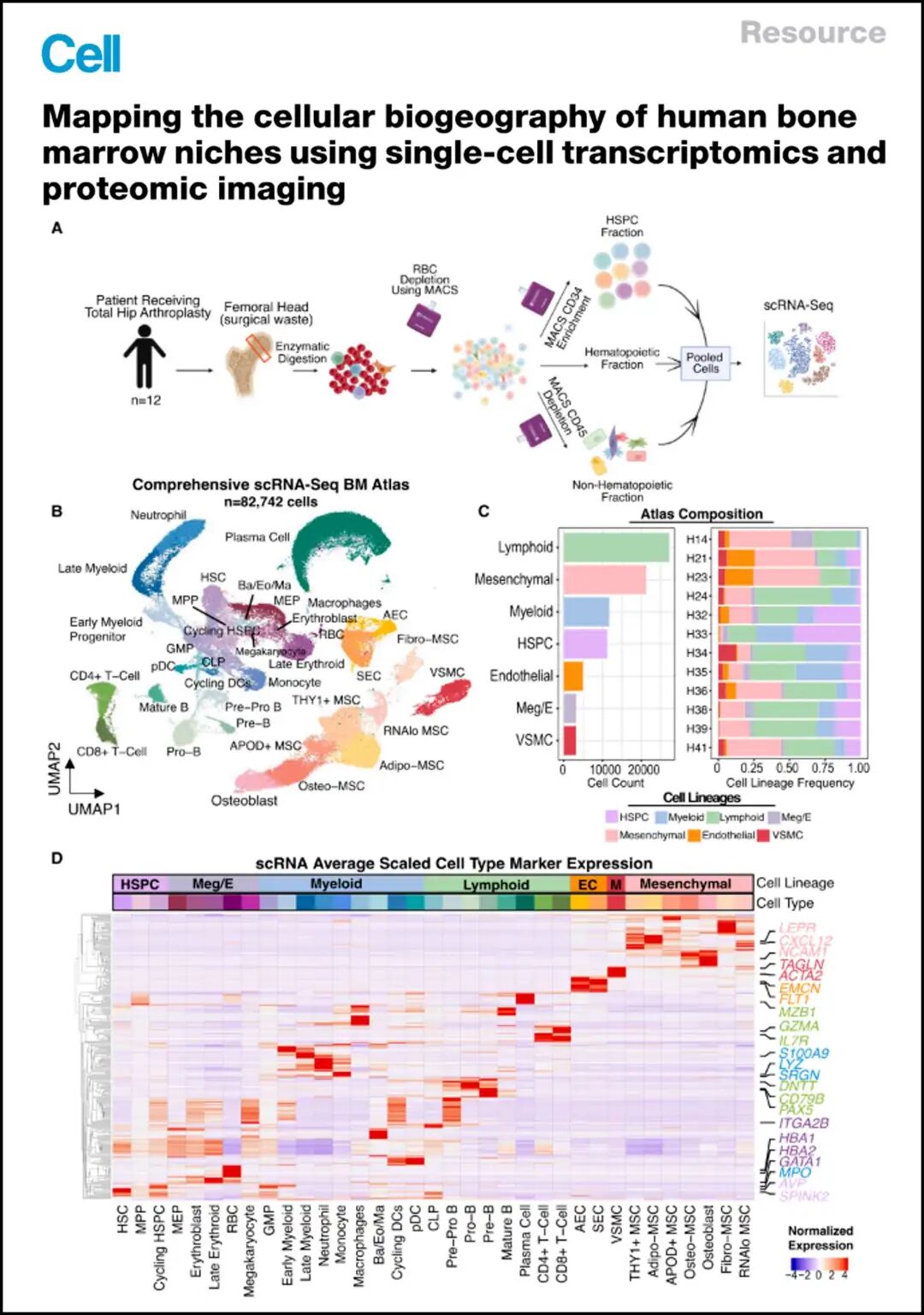
二、绘制Figure_1BUMAP图
# Figure 1B - UMAP Showing all of the Cell Types Captured in Our Analysis ----
p1 <- DimPlot(combined,
              group.by = 'cluster_anno_l2',
              raster = TRUE,
              raster.dpi = c(1028,1028),
              label = TRUE,
              repel = TRUE,
              reduction = "UMAP_dim30",
              cols=cal2_cols) +
  coord_fixed() +
  NoAxes() +
  NoLegend()
p1_raster <- rasterize(p1)
ggsave(p1_raster,file = "Figure1/PanelB_scRNA_UMAP.pdf")
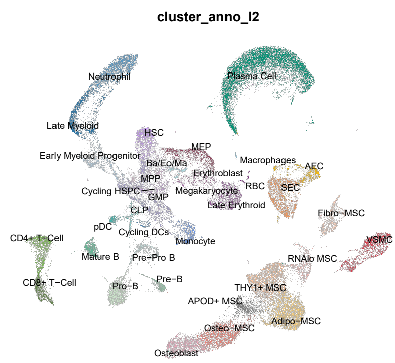
Figure 1B
Figure 1B
三、绘制细胞比例图
# Figure 1C - Bar chart showing the counts of each lineage assayed -----
## Figure 1C (left)
p2 <- combined@meta.data %>%
  ggplot(aes(y=forcats::fct_rev(forcats::fct_infreq(cluster_anno_l1)),
             fill = cluster_anno_l1)) +
  geom_bar(stat = 'count') +
  theme_bw() +
  scale_fill_manual(values = cal1_cols,
                    labels = c("HSPC", "Myeloid", "Lymphoid", "Meg/E",
                               "Mesenchymal", "Endothelial", "Muscle")) +
  theme(axis.text = element_text(size=12))

cell_counts <- as.data.frame(table(combined$cluster_anno_l1,combined$orig.ident))

## Figure 1D (right)
p3 <- ggplot(data=cell_counts, aes(x=forcats::fct_rev(Var2),y=Freq, fill=Var1)) +
  geom_bar(position="fill",stat="identity") +
  coord_flip() +
  theme_bw() +
  labs(y='Cell Type Frequency') +
  labs(x='') +
  scale_fill_manual(values=cal1_cols) +
  theme(axis.text = element_text(size=16)) +
  ggtitle("CODEX Cell Type Frequencies Per Sample") +
  scale_x_discrete(labels = c("H41", "H39", "H38", "H36", "H35", "H34", "H33", "H32", "H24", "H23", "H21", "H14"))
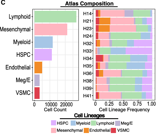
Figure 1C
Figure 1C
四、绘制不同簇代表性特征基因热图
# Figure 1D Heatmap ----
## 对每一个身份类别(cluster / cell type / condition…) 分别做一次差异分析。
combined_markers_anno <- FindAllMarkers(combined, max.cells.per.ident = 500) # Downsample 500 cells per cluster
write.csv(combined_markers_anno, "SB66_combined_markers_annotated.csv")

library(ComplexHeatmap)
library(circlize)
combined_markers_anno %>%
  group_by(cluster) %>%
  top_n(n = 10, wt = 1/p_val_adj) -> top10 # Get top 10 most significant genes for each cell type

combined <- SetIdent(combined, value = "cluster_anno_l2")
avg <- AverageExpression(object = combined,
                         group.by = 'cluster_anno_l2',
                         slot = 'data',
                         features = top10$gene) # Return average expression values across cells in each cluster for the selected genes from top3 object

col_fun = colorRamp2(c(-4, 0, 4), c("blue", "white", "red"))

cell_lineages <- c("HSPC", "HSPC", "HSPC",
                   "Meg/E", "Meg/E", "Meg/E", "Meg/E","Meg/E",
                   "Myeloid", "Myeloid", "Myeloid", "Myeloid", "Myeloid", "Myeloid", "Myeloid", "Myeloid", "Myeloid",
                   "Lymphoid", "Lymphoid", "Lymphoid", "Lymphoid", "Lymphoid", "Lymphoid", "Lymphoid", "Lymphoid",
                   "Endothelial", "Endothelial",
                   "Muscle",
                   "Mesenchymal", "Mesenchymal", "Mesenchymal", "Mesenchymal", "Mesenchymal", "Mesenchymal","Mesenchymal")

cell_lineage_colors <- c("HSPC" = "steelblue", "HSPC"= "steelblue", "HSPC"= "steelblue",
                         "Meg/E" = 'darkorchid1', "Meg/E" = 'darkorchid1', "Meg/E" = 'darkorchid1', "Meg/E" = 'darkorchid1',
                         "Myeloid" = 'salmon', "Myeloid" = 'salmon', "Myeloid" = 'salmon', "Myeloid" = 'salmon', "Myeloid" = 'salmon', "Myeloid" = 'salmon', "Myeloid" = 'salmon', "Myeloid" = 'salmon', "Myeloid" = 'salmon',
                         "Lymphoid" = 'darkgoldenrod1', "Lymphoid"= 'darkgoldenrod1', "Lymphoid"= 'darkgoldenrod1', "Lymphoid" = 'darkgoldenrod1', "Lymphoid" = 'darkgoldenrod1', "Lymphoid" = 'darkgoldenrod1', "Lymphoid"= 'darkgoldenrod1', "Lymphoid"= 'darkgoldenrod1',
                         "Endothelial" = 'lavender', "Endothelial" = 'lavender',
                         "Muscle" = 'cornflowerblue',
                         "Mesenchymal" = 'darkolivegreen2', "Mesenchymal" = 'darkolivegreen2', "Mesenchymal" = 'darkolivegreen2', "Mesenchymal" = 'darkolivegreen2', "Mesenchymal" = 'darkolivegreen2', "Mesenchymal" = 'darkolivegreen2',"Mesenchymal" = 'darkolivegreen2')

cell_lineage_colors <- c("HSPC" = "#E0B0FF", "HSPC"= "#E0B0FF", "HSPC"= "#E0B0FF",
                         "Meg/E" = "#BDB5D5", "Meg/E" = "#BDB5D5", "Meg/E" = "#BDB5D5", "Meg/E" = "#BDB5D5", "Meg/E" = "#BDB5D5",
                         "Myeloid" = "#A7C7E7", "Myeloid" = "#A7C7E7", "Myeloid" = "#A7C7E7", "Myeloid" = "#A7C7E7", "Myeloid" = "#A7C7E7", "Myeloid" = "#A7C7E7", "Myeloid" = "#A7C7E7", "Myeloid" = "#A7C7E7", "Myeloid" = "#A7C7E7",
                         "Lymphoid" = "#AFE1AF", "Lymphoid"= "#AFE1AF", "Lymphoid"= "#AFE1AF", "Lymphoid" = "#AFE1AF", "Lymphoid" = "#AFE1AF", "Lymphoid" = "#AFE1AF", "Lymphoid"= "#AFE1AF", "Lymphoid"= "#AFE1AF",
                         "Endothelial" = "#F28C28", "Endothelial" = "#F28C28",
                         "Muscle" = "#DD3F4E",
                         "Mesenchymal" = "#FFB6C1", "Mesenchymal" = "#FFB6C1", "Mesenchymal" = "#FFB6C1", "Mesenchymal" = "#FFB6C1", "Mesenchymal" = "#FFB6C1", "Mesenchymal" = "#FFB6C1", "Mesenchymal" ="#FFB6C1")

cell_counts <- as.numeric(table(factor(combined$cluster_anno_l2, levels = cell_order)))
names(cell_order) <- cal2_cols

anno_df <- data.frame(cell_order, cell_lineages)
names(cal2_cols) <- levels(droplevels(as.factor(combined$cluster_anno_l2)))

ha = HeatmapAnnotation(annotation_label = c("Cell Type", "Cell Lineage"),
                       df = anno_df,
                       border = TRUE,
                       which = 'col',
                       col = list(cell_order = cal2_cols,
                                  cell_lineages = c(cell_lineage_colors))
)

avg <- as.data.frame(avg$RNA)
genes_show = c("AVP","SPINK2","IL7R", "GZMA","DNTT","CD79B","PAX5","MZB1", "MPO", "SRGN","S100A9" ,"LYZ", "CD14", "C1Q","GATA1", "ITGA2B", "HBA1","HBA2", "CXCL12","LEPR", "PDGFRA", "NCAM1","FLT1","EMCN", "TAGLN", "ACTA2")

pdf("Figure1/Heatmap_scRNA_Average_Scaled_CellType_Marker_Expression.pdf",
    width = 15,   # 英寸
    height = 8)

Heatmap(t(scale(t(avg[,cell_order]))),
        name = "mat",
        rect_gp = gpar(col = "black", lwd = 0),
        col = col_fun,
        column_order = cell_order,
        column_title = "scRNA Average Scaled Cell Type Marker Expression",
        clustering_method_rows = "single",
        show_row_names = FALSE,
        row_names_gp = grid::gpar(fontsize = 8),
        top_annotation =  ha) +
  rowAnnotation(link=anno_mark(
    at=which(rownames(avg) %in% genes_show),
    labels = rownames(avg)[rownames(avg) %in% genes_show],
    which = "rows")                )

dev.off()
Figure 1D
Figure 1D
本文参与 腾讯云自媒体同步曝光计划,分享自微信公众号。
原始发表:2025-11-26,如有侵权请联系 cloudcommunity@tencent.com 删除
评论
登录后参与评论
推荐阅读
目录
腾讯云开发者

Copyright © 2013 - 2026 Tencent Cloud. All Rights Reserved. 腾讯云 版权所有
深圳市腾讯计算机系统有限公司 ICP备案/许可证号:粤B2-20090059 ![]() 粤公网安备44030502008569号
粤公网安备44030502008569号
腾讯云计算(北京)有限责任公司 京ICP证150476号 | 京ICP备11018762号