5HTML盒子模型

5HTML盒子模型
步步为营DotNet
发布于 2026-06-17 09:21:07
发布于 2026-06-17 09:21:07
01-选择器
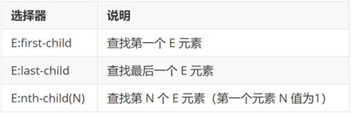
结构伪类选择器
基本使用
作用:根据元素的结构关系查找元素。
1680321408957
<!DOCTYPE html>
<html lang="en">

<head>
  <meta charset="UTF-8">
  <meta http-equiv="X-UA-Compatible" content="IE=edge">
  <meta name="viewport" content="width=device-width, initial-scale=1.0">
  <title>Document</title>
  <style>
    /* 结构伪类选择器 */
    /* 1.选择第一个li */
    ul li:first-child {
      color: pink;
    }

    /* 2. 最后一个小li */
    ul li:last-child {
      color: green;
    }

    /* 3. 选择其中任意一个 */
    ul li:nth-child(6) {
      color: red;
    }
  </style>
</head>

<body>
  <!-- ul>li{第$个}*8 -->
  <ul>
    <li>我是第1个小li</li>
    <li>我是第2个小li</li>
    <li>我是第3个小li</li>
    <li>我是第4个小li</li>
    <li>我是第5个小li</li>
    <li>我是第6个小li</li>
    <li>我是第7个小li</li>
    <li>我是第8个小li</li>
  </ul>
</body>

</html>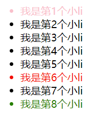
68307745453
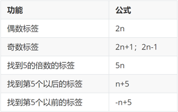
:nth-child(公式)
1680321448162
提示:公式中的n取值从 0 开始。
<!DOCTYPE html>
<html lang="en">
<head>
<meta charset="UTF-8">
<meta http-equiv="X-UA-Compatible" content="IE=edge">
<meta name="viewport" content="width=device-width, initial-scale=1.0">
<title>Document</title>
<style>
/* 公式 */
/* 2n 是偶数个 */
ul li:nth-child(2n) {
background-color: #eee;
}
ul li:hover {
background-color: #bbb;
}
/* 2n+1 奇数 */
/* ul li:nth-child(2n + 1) {
background-color: #eee;
} */
/* 5n 5的倍数 */
/* ul li:nth-child(5n) {
background-color: #eee;
} */
/* -n+5 选择第5个以前的 包含第5个 */
/* ul li:nth-child(-n + 5) {
background-color: #eee;
} */
/* n+5 选择第5个以后的 包含第5个 */
/* ul li:nth-child(n + 5) {
background-color: #eee;
} */
</style>
</head>
<body>
<ul>
<li>我是第1个小li</li>
<li>我是第2个小li</li>
<li>我是第3个小li</li>
<li>我是第4个小li</li>
<li>我是第5个小li</li>
<li>我是第6个小li</li>
<li>我是第7个小li</li>
<li>我是第8个小li</li>
<li>我是第9个小li</li>
<li>我是第10个小li</li>
<li>我是第11个小li</li>
<li>我是第12个小li</li>
<li>我是第13个小li</li>
<li>我是第14个小li</li>
<li>我是第15个小li</li>
</ul>
</body>
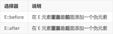
</html>伪元素选择器
作用:创建虚拟元素(伪元素),用来摆放装饰性的内容。
1680321533901
1680321544646
div::before {
  content: "before 伪元素";
}
div::after {
  content: "after 伪元素";
}

<div>
  <span>内容</span>
</div>
image-20240424142256153
注意点:
- 必须设置 content: ""属性,用来 设置伪元素的内容,如果没有内容,则引号留空即可
- 伪元素默认是行内显示模式
- 权重和标签选择器相同
02-PxCook
PxCook(像素大厨) 是一款切图设计工具软件。支持PSD文件的文字、颜色、距离自动智能识别。
- 开发面板(自动智能识别)
- 设计面板(手动测量尺寸和颜色)
使用方法:创建项目 → 输入 项目名称、项目类型 Web → 单击按钮【创建项目】 → 单击按钮【添加】,导入设计稿
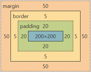
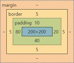
03-盒子模型
作用:布局网页,摆放盒子和内容。
盒子模型-组成
- 内容区域 – width & height
- 内边距 – padding(出现在内容与盒子边缘之间)
- 边框线 – border
- 外边距 – margin(出现在盒子外面)
div {
  margin: 50px;
  border: 5px solid brown;
  padding: 20px;
  width: 200px;
  height: 200px;
  background-color: pink;
}
1680330935635
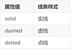
边框线
四个方向
属性名:border(bd)
属性值:边框线粗细 线条样式 颜色(不区分顺序)
1680330976390
div {
  border: 5px solid brown;
  width: 200px;
  height: 200px;
  background-color: pink;
}
单方向边框线
属性名:border-方位名词(bd+方位名词首字母,例如,bdl)
属性值:边框线粗细 线条样式 颜色(不区分顺序)
div {
  border-top: 2px solid red;
  border-right: 3px dashed green;
  border-bottom: 4px dotted blue;
  border-left: 5px solid orange;
  width: 200px;
  height: 200px;
  background-color: pink;
}
内边距
作用:设置 内容 与 盒子边缘 之间的距离。
- 属性名:padding / padding-方位名词
div {
  /* 四个方向 内边距相同 */
  padding: 30px;
  /* 单独设置一个方向内边距 */
  padding-top: 10px;
  padding-right: 20px;
  padding-bottom: 40px;
  padding-left: 80px;
  width: 200px;
  height: 200px;
  background-color: pink;
}
提示:添加 padding 会撑大盒子。
- padding 多值写法
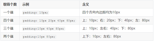
1680331118330
技巧:从上开始顺时针赋值,当前方向没有数值则与对面取值相同。
<!DOCTYPE html>
<html lang="en">

<head>
  <meta charset="UTF-8">
  <meta http-equiv="X-UA-Compatible" content="IE=edge">
  <meta name="viewport" content="width=device-width, initial-scale=1.0">
  <title>Document</title>
  <style>
    .box {
      /* 1. 手动去减 */
      /* width: 160px;
      height: 160px; */
      /* 2. css3 盒子模型 box-sizing: border-box */
      box-sizing: border-box;
      width: 200px;
      height: 200px;
      background-color: pink;
      border: 10px solid red;
      padding: 10px;
    }
  </style>
</head>

<body>
  <div class="box">qwe</div>
</body>

</html>
尺寸计算
1680331322935
默认情况:盒子尺寸 = 内容尺寸 + border 尺寸 + 内边距尺寸
结论:给盒子加 border / padding 会撑大盒子
解决:
- 手动做减法,减掉 border / padding 的尺寸
- 內减模式:box-sizing: border-box
外边距
作用:拉开两个盒子之间的距离
属性名:margin
提示:与 padding 属性值写法、含义相同
版心居中
1680331503466
左右 margin 值 为 auto(盒子要有宽度)
div {
  margin: 0 auto;
  width: 1000px;
  height: 200px;
  background-color: pink;
}- 行内和行内块元素水平居中对齐,给块级的父元素添加 tac
- 块级元素水平居中对齐: 让盒子的
左右外边距设置为 auto 就可以了。 margin: auto;
- 小米 margin-left: auto; margin-right: auto;
- 京东/淘宝: margin: 0 auto;
清除默认样式
1680331558304
清除标签默认的样式,比如:默认的内外边距。
1680331580746
/* 清除默认内外边距 */
* {
  margin: 0;
  padding: 0;
  box-sizing: border-box;
}
/* 清除列表项目符号 */
li {
  list-style: none;
}
元素溢出
作用:控制溢出元素的内容的显示方式。
属性名:overflow
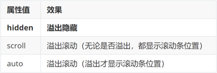
1680331623305
外边距问题
合并现象
场景:垂直排列的兄弟元素,上下 margin 会合并
现象:取两个 margin 中的较大值生效
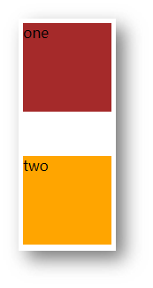
1680331672628
.one {
  margin-bottom: 50px;
}
.two {
  margin-top: 20px;
}
外边距塌陷
场景:父子级的标签,子级的添加 上外边距 会产生塌陷问题
现象:导致父级一起向下移动
.son {
  margin-top: 50px;
  width: 100px;
  height: 100px;
  background-color: orange;
}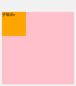
1680333860271
解决方法:
- 取消子级margin,父级设置padding
- 父级设置 overflow: hidden
- 父级设置 border-top
行内元素 – 内外边距问题
场景:行内元素添加 margin 和 padding,无法改变元素垂直位置
解决方法:给行内元素添加 line-height 可以改变垂直位置
span {
  /* margin 和 padding 属性,无法改变垂直位置 */
  margin: 50px;
  padding: 20px;
  /* 行高可以改变垂直位置 */
  line-height: 100px;
}
圆角
作用:设置元素的外边框为圆角。
属性名:border-radius
属性值:数字+px / 百分比
提示:属性值是圆角半径
1680334014390
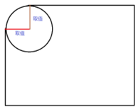
- 多值写法
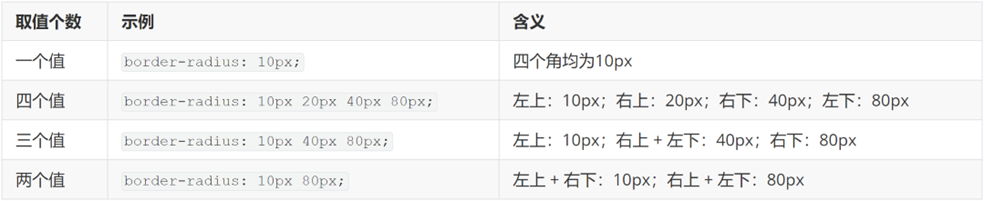
1680334027657
技巧:从左上角开始顺时针赋值,当前角没有数值则与对角取值相同。
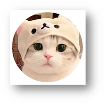
- 正圆形状:给正方形盒子设置圆角属性值为 宽高的一半 / 50%
img {
  width: 200px;
  height: 200px;

  border-radius: 100px;
  border-radius: 50%;
}
1680334083567
- 胶囊形状:给长方形盒子设置圆角属性值为 盒子高度的一半
div {
  width: 200px;
  height: 80px;
  background-color: orange;
  border-radius: 40px;
}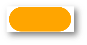
1680334136242
盒子阴影(拓展)
作用:给元素设置阴影效果
属性名:box-shadow
属性值:X 轴偏移量 Y 轴偏移量 模糊半径 扩散半径 颜色 内外阴影
注意:
- X 轴偏移量 和 Y 轴偏移量 必须书写
- 默认是外阴影,内阴影需要添加 inset
div {
width: 200px;
height: 80px;
background-color: orange;
box-shadow: 2px 5px 10px 0 rgba(0, 0, 0, 0.5) inset;
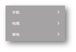
}04-综合案例-产品卡片
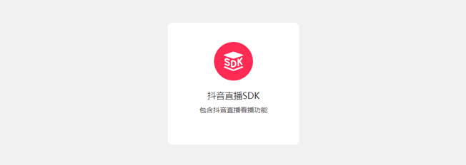
1680334221212
CSS 书写顺序:
- 盒子模型属性
- 文字样式
- 圆角、阴影等修饰属性
HTML标签
<div class="product">
  <img src="./images/liveSDK.svg" alt="">
  <h4>抖音直播SDK</h4>
  <p>包含抖音直播看播功能</p>
</div>
CSS样式
<style>
  * {
    margin: 0;
    padding: 0;
    box-sizing: border-box;
  }

  body {
    background-color: #f1f1f1;
  }

  .product {
    margin: 50px auto;
    padding-top: 40px;

    width: 270px;
    height: 253px;
    background-color: #fff;
    text-align: center;

    border-radius: 10px;
  }

  .product h4 {
    margin-top: 20px;
    margin-bottom: 12px;
    font-size: 18px;
    color: #333;
    font-weight: 400;
  }

  .product p {
    font-size: 12px;
    color: #555;
  }
</style>
05-综合案例二 – 新闻列表
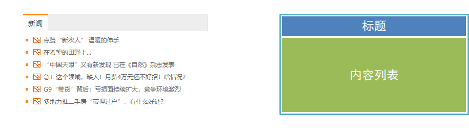
1680334329887
整体布局
<style>
* {
  margin: 0;
  padding: 0;
  box-sizing: border-box;
}

li {
  list-style: none;
}

a {
  text-decoration: none;
}

.news {
  margin: 100px auto;
  width: 360px;
  height: 200px;
  /* background-color: pink; */
}
</style>

<div class="news"></div>
标题区域
<style>
.news .hd {
  height: 34px;
  background-color: #eee;
  border: 1px solid #dbdee1;
  border-left: 0;
}

.news .hd a {
  /* -1 盒子向上移动 */
  margin-top: -1px;
  display: block;
  border-top: 3px solid #ff8400;
  border-right: 1px solid #dbdee1;
  width: 48px;
  height: 34px;
  background-color: #fff;

  text-align: center;
  line-height: 32px;
  font-size: 14px;
  color: #333;
}
</style>

<div class="hd"><a href="#">新闻</a></div>
内容区域
<style>
.news .bd {
  padding: 5px;
}

.news .bd li {
  padding-left: 15px;
  background-image: url(./images/square.png);
  background-repeat: no-repeat;
  background-position: 0 center;
}

.news .bd li a {
  padding-left: 20px;
  background: url(./images/img.gif) no-repeat 0 center;

  font-size: 12px;
  color: #666;
  line-height: 24px;
}

.news .bd li a:hover {
  color: #ff8400;
}
</style>

<div class="bd">
  <ul>
    <li><a href="#">点赞“新农人” 温暖的伸手</a></li>
    <li><a href="#">在希望的田野上...</a></li>
    <li><a href="#">“中国天眼”又有新发现 已在《自然》杂志发表</a></li>
    <li><a href="#">急!这个领域,缺人!月薪4万元还不好招!啥情况?</a></li>
    <li><a href="#">G9“带货”背后:亏损面持续扩大,竞争环境激烈</a></li>
    <li><a href="#">多地力推二手房“带押过户”,有什么好处?</a></li>
  </ul>
</div>
ges/square.png); background-repeat: no-repeat; background-position: 0 center; }
.news .bd li a { padding-left: 20px; background: url(./images/img.gif) no-repeat 0 center;
font-size: 12px; color: #666; line-height: 24px; }
.news .bd li a:hover { color: #ff8400; }
- 点赞“新农人” 温暖的伸手
- 在希望的田野上...
- “中国天眼”又有新发现 已在《自然》杂志发表
- 急!这个领域,缺人!月薪4万元还不好招!啥情况?
- G9“带货”背后:亏损面持续扩大,竞争环境激烈
- 多地力推二手房“带押过户”,有什么好处?
```
本文参与 腾讯云自媒体同步曝光计划,分享自作者个人站点/博客。
原始发表:2026-06-16,如有侵权请联系 cloudcommunity@tencent.com 删除
评论
登录后参与评论
推荐阅读
目录
腾讯云开发者

Copyright © 2013 - 2026 Tencent Cloud. All Rights Reserved. 腾讯云 版权所有
深圳市腾讯计算机系统有限公司 ICP备案/许可证号:粤B2-20090059  粤公网安备44030502008569号
腾讯云计算(北京)有限责任公司 京ICP证150476号 | 京ICP备11018762号