玩转GSAP与barba.js,实现炫酷页面切换效果


案例展示
今天我们将通过一个实战案例,来展示如何使用GSAP和barba.js制作一个炫酷的页面切换效果。该案例展示了一个在线购物网站的首页和产品页之间的切换动画。通过这个案例,大家可以学会如何结合GSAP和barba.js实现流畅的页面过渡效果,动画效果如视频所示:
功能描述
在本案例中,我们将实现以下动画效果,让页面切换变得更加炫酷和流畅:
- 页面初次加载时的动画效果:当页面第一次加载时,背景会渐变显示,同时页面的主要内容(如产品图片和文字)会从下方滑动到屏幕中央,伴随着淡入效果。这种动画不仅提升了视觉体验,还让用户感觉页面是动态的、富有生命力的。
- 页面离开时的动画效果:当用户从当前页面导航到另一个页面时,当前页面的内容会开始淡出并向下滑动,最终完全消失。这种效果让用户感觉当前页面逐渐退场,为新的页面腾出空间,形成一种自然的过渡。
- 页面进入时的动画效果:新页面在加载时,背景颜色会根据页面的类型进行渐变,同时新页面的主要内容会从上方滑动到屏幕中央,并伴随着淡入效果。这种设计使页面切换更具连贯性和视觉冲击力。
- 不同页面之间切换时的背景渐变效果:为了让每个页面更具特色,我们设置了不同页面在切换时的背景渐变效果。例如,当从“handbag”(手袋)页面切换到“boot”(靴子)页面时,背景颜色会从温暖的红色渐变为冷静的蓝色。这不仅区分了不同的页面,也丰富了整体的视觉体验,让用户在浏览时感到新鲜有趣。
学习目标
在这个案例中,我们的学习目标包括以下几个方面,每一个目标都将帮助你更深入地理解和掌握GSAP和barba.js的应用:
- 了解GSAP的基础用法:
- 基础动画:学习如何创建基本的GSAP动画,例如从一个位置移动到另一个位置,改变透明度等。
- 时间线概念:理解时间线(Timeline)的概念,如何使用时间线组织和控制多个动画。
- 学习barba.js的基本配置:
- 初始化barba.js:学习如何在项目中引入和初始化barba.js。
- 配置过渡效果:掌握如何配置barba.js的过渡效果,包括页面加载、离开和进入时的动画。
- 深入理解动画效果的设计与实现:
- 细节设计:掌握如何设计细腻、流畅的动画效果,使页面切换更加生动和吸引人。
- 用户体验提升:学习如何通过动画提升用户体验,使网站更具互动性和吸引力。
源码分析
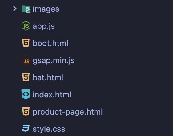
项目结构
项目文件结构如图所示:
HTML结构(index.html)
<!DOCTYPE html>
<html lang="en">
  <head>
    <meta charset="UTF-8" />
    <meta http-equiv="X-UA-Compatible" content="IE=edge" />
    <meta name="viewport" content="width=device-width, initial-scale=1.0" />
    <title>Page Transitions</title>
    <link rel="preconnect" href="https://fonts.googleapis.com" />
    <link rel="preconnect" href="https://fonts.gstatic.com" crossorigin />
    <link
      href="https://fonts.googleapis.com/css2?family=Poppins:wght@400;500&display=swap"
      rel="stylesheet"
    />
    <link rel="stylesheet" href="./style.css" />
  </head>
  <body class="handbag-body" data-barba="wrapper">
    <nav>
      <img src="./images/burger.svg" alt="" />
      <a class="logo" href="./index.html">maxed.</a>
      <img src="./images/shopping-cart.svg" class="shopping-bag" alt="" />
    </nav>

    <section
      class="showcase"
      data-barba="container"
      data-barba-namespace="handbag"
    >
      <div class="image-container">
        <img src="./images/frontpage-handbag.png" alt="" />
      </div>
      <div class="showcase-text">
        <h2 class="showcase-title">Going places. With bags of beauty</h2>
        <h3 class="showcase-subtitle">
          On everyone's wish list this season? Timeless presents they'll
          treasure forever, including our must-have Leisara handbag.
        </h3>
        <a href="./product-page.html">
          <button class="showcase-button">explore</button>
        </a>
      </div>
      <a href="./boot.html">
       <!-- 省略部分代码,请下载源码查看 -->
    </section>
    <script src="gsap.min.js"></script>
    <!-- unpkg -->
    <script src="https://unpkg.com/@barba/core"></script>
    <script src="./app.js"></script>
  </body>
</html>
在HTML代码中,我们使用了一些自定义的 data- 属性来与 barba.js 配合实现页面切换效果。下面详细解释这些属性及其作用。
data-barba="wrapper":这个属性告诉 barba.js 这是整个页面的包裹容器。barba.js 会在这个容器内部进行页面内容的切换。换句话说,所有需要切换的页面内容都应该包含在这个容器中。data-barba="container":这个属性指定了页面中需要切换的部分容器。每当页面切换时,barba.js 会替换这个容器中的内容。这意味着,只有标记了data-barba="container"属性的部分才会参与页面切换,其他部分如导航栏、页脚等会保持不变。data-barba-namespace="handbag":这个属性为容器定义了一个命名空间(namespace)。命名空间用于区分不同的页面或不同类型的内容。在我们的例子中,handbag是这个页面的命名空间。通过这种方式,我们可以为不同的页面设置不同的动画效果。例如,我们可以有data-barba-namespace="boot"或data-barba-namespace="hat"的页面,每个页面可以有不同的背景颜色和动画效果。
hat.html、boot.html、product-page.html 结构类似,由于篇幅原因,就不在这里展示了,具体的请下载源码查看。
CSS样式(style.css)
* {
  margin: 0;
  padding: 0;
  box-sizing: border-box;
  font-family: "Poppins", sans-serif;
}

body {
  background: linear-gradient(260deg, #b75d62, #754d4f);
}

.showcase {
  display: flex;
  position: absolute;
  align-items: center;
  justify-content: space-between;
  min-height: 90vh;
  padding: 0rem 15% 0rem 15%;
  overflow: hidden;
}
nav {
  min-height: 10vh;
  color: white;
  display: flex;
  align-items: center;
  justify-content: space-between;
  padding: 0.5rem 15%;
}
.logo {
  text-decoration: none;
  color: white;
  font-size: 1rem;
  font-weight: bold;
}
nav img {
  transform: scale(0.7);
}

.image-container {
  display: flex;
  align-items: center;
  justify-content: flex-start;
  height: 80vh;
  z-index: 2;
  flex: 1;
}
.image-container img {
  width: 80%;
}
.showcase-text {
  flex: 1;
  color: white;
  padding-bottom: 10rem;
}

.showcase-title {
  font-size: 2rem;
}
.showcase-subtitle {
  font-size: 1rem;
  padding: 3rem 0rem;
  font-weight: 400;
}
.showcase-button {
  padding: 0.5rem 2rem;
  border: none;
  color: black;
  font-weight: 500;
  font-family: "Poppins", sans-serif;
  font-size: 0.8rem;
}
.showcase-arrow {
  position: absolute;
  right: 15%;
  bottom: 10%;
  transform: scale(0.6);
}

/*BUBBLESSS */
.circle {
  position: absolute;
}
.circle-1 {
  left: -3%;
  bottom: -3%;
  transform: scale(2);
}

.circle-2 {
  left: 35%;
  bottom: 10%;
}
.circle-3 {
  left: 20%;
  top: 15%;
  transform: scale(1.5);
}

/* product page*/
.product-nav {
  min-height: 10vh;
}
.product-section {
  background: white;
  min-height: 90vh;
  position: absolute;
  width: 100vw;
  z-index: 5;
}

.product-description {
  padding: 5% 15%;
  color: #4b4b4b;
}
.product-description h2 {
  font-size: 2rem;
}
.product-description p {
  font-size: 1.2rem;
  padding: 1rem 0rem;
}

.product-gallery {
  display: grid;
  padding: 0% 15%;
  grid-template-columns: repeat(auto-fit, minmax(300px, 1fr));
  grid-gap: 2rem;
}

.product-gallery .product-img {
  border-radius: 1rem;
  width: 100%;
}
.price {
  display: flex;
  justify-content: space-between;
  align-items: center;
}
.card {
  padding: 2rem;
}

@media screen and (max-width: 768px) {
  .showcase {
    flex-direction: column;
    padding: 20%;
    justify-content: space-evenly;
    min-height: 85vh;
  }
  .image-container {
    min-height: 30vh;
    justify-content: center;
    order: 1;
  }

  .circle-3 {
    top: 90%;
    left: 50%;
    transform: translate(-50%, -50%) scale(3);
  }
  .circle-1,
  .circle-2 {
    display: none;
  }
  .showcase-title {
    font-size: 1.5rem;
  }
  .showcase-subtitle {
    font-size: 1rem;
    padding: 2rem 0rem;
  }
  .showcase-text {
    padding-bottom: 0;
  }
  .showcase-arrow {
    right: 0;
    bottom: 50%;
  }
}
JavaScript代码详解(app.js)
这个JavaScript代码段主要使用了GSAP(GreenSock Animation Platform)和barba.js两个库来实现页面切换动画效果。接下来我分段详细解释每个部分的功能。
1、定义时间线(Timeline)
本文参与 腾讯云自媒体同步曝光计划,分享自微信公众号。
原始发表:2024-06-28,如有侵权请联系 cloudcommunity@tencent.com 删除
评论
登录后参与评论
推荐阅读
目录
腾讯云开发者

Copyright © 2013 - 2026 Tencent Cloud. All Rights Reserved. 腾讯云 版权所有
深圳市腾讯计算机系统有限公司 ICP备案/许可证号:粤B2-20090059  粤公网安备44030502008569号
腾讯云计算(北京)有限责任公司 京ICP证150476号 | 京ICP备11018762号