211.HarmonyOS NEXT系列教程之 TabsRaisedCircle组件核心实现解析
原创
211.HarmonyOS NEXT系列教程之 TabsRaisedCircle组件核心实现解析
原创
全栈若城
发布于 2025-03-27 20:51:41
发布于 2025-03-27 20:51:41
温馨提示:本篇博客的详细代码已发布到 git : https://gitcode.com/nutpi/HarmonyosNext 可以下载运行哦!

HarmonyOS NEXT系列教程之 TabsRaisedCircle组件核心实现解析
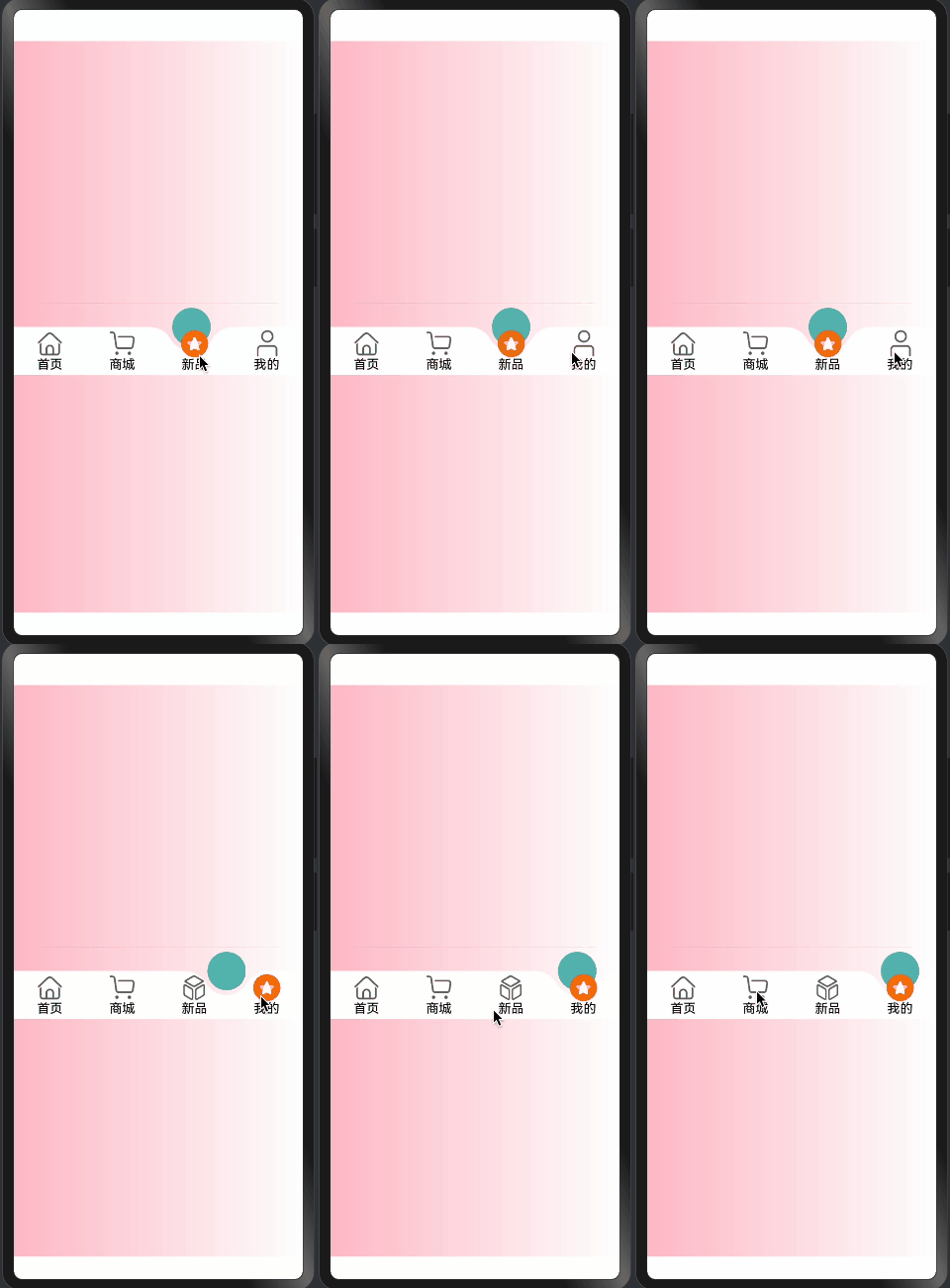
本文将详细解析TabsRaisedCircle组件的核心实现,包括状态管理、布局结构和交互处理。
效果演示
1. 组件状态定义
@Component
export struct TabsRaisedCircle {
  @Link @Watch("getAnimateSelectIndex") selectIndex: number;
  @State animateSelectIndex: number = 0;
  @Prop tabHeight: number = 60;
  @Link tabsMenu: TabMenusInterfaceIRequired[];
  @Prop tabsBgColor: Color = Color.White;
  @Prop tabsSelectBgColor: string = "rgba(92, 187, 183,1)";
  @Prop tabsFontColor: Color = Color.Black;
  @Prop tabsSelectFontColor: Color = Color.Black;
  @State chamfer: ChamferInfo | undefined = undefined;
  @State selectImageInfo: RaisedSelectImageInfo | undefined = undefined;
}
状态管理说明:
- 核心状态:
selectIndex: 当前选中项animateSelectIndex: 动画控制索引chamfer: 凸起圆信息selectImageInfo: 选中图片信息
- 样式配置:
tabHeight: 导航栏高度tabsBgColor: 背景颜色tabsSelectBgColor: 选中状态颜色tabsFontColor: 文字颜色
2. 布局结构实现
build() {
  RelativeContainer() {
    ForEach(this.tabsMenu, (item: TabMenusInterfaceIRequired, index: number) => {
      this.TabItem(item, index)
    })
    if (this.chamfer) {
      TabsRaisedCircleSelect({
        tabHeight: this.tabHeight,
        selectIndex: this.selectIndex,
        chamfer: this.chamfer,
        selectBodyId: this.selectBodyId,
        tabItemId: this.tabItemId,
        tabsBgColor: this.tabsBgColor,
        tabsSelectBgColor: this.tabsSelectBgColor,
      })
    }
  }
  .width("100%")
  .height(this.tabHeight)
  .backgroundColor(this.tabsBgColor)
  .id(this.tabsId)
}
布局实现说明:
- 容器设置:
- 使用
RelativeContainer - 设置宽高和背景色
- 添加唯一标识
- 使用
- 菜单项渲染:ForEach(this.tabsMenu, (item: TabMenusInterfaceIRequired, index: number) => {
this.TabItem(item, index)
})
- 遍历菜单数据
- 渲染每个选项
- 选中状态渲染:TabsRaisedCircleSelect({
tabHeight: this.tabHeight,
selectIndex: this.selectIndex,
chamfer: this.chamfer,
// ...其他属性
})
- 渲染选中状态
- 传递必要参数
3. 菜单项构建
@Builder
TabItem(item: TabMenusInterfaceIRequired, index: number) {
  Column() {
    if (item.image && this.chamfer) {
      Image(getImageUrl(item as TabMenusInterfaceIRequired, index, this.selectIndex))
        .size({
          width: this.chamfer.circleDiameter / 2,
          height: this.chamfer.circleDiameter / 2
        })
        .interpolation(ImageInterpolation.High)
        .offset({
          y: this.selectIndex === index && this.animateSelectIndex === index ?
             -(this.getCountOffsetY()) : 0,
        })
        .id(`${this.selectImageId}${index}`)
    }
    Text(item.text)
      .fontColor(this.selectIndex === index ?
        (item.tabsSelectFontColor || this.tabsSelectFontColor) :
        (item.tabsFontColor || this.tabsFontColor))
  }
  .onClick(() => {
    animateTo({
      duration: this.animateTime,
    }, () => {
      this.selectIndex = index
    })
  })
  .width(100 / this.tabsMenu.length + "%")
  .height("100%")
  .justifyContent(FlexAlign.Center)
  .id(`${this.tabItemId}${index}`)
}
菜单项实现说明:
- 图片处理:
- 条件渲染图片
- 设置尺寸和质量
- 计算偏移量
- 文本样式:
- 根据选中状态设置颜色
- 支持自定义颜色
- 交互处理:
- 点击事件绑定
- 动画过渡效果
- 状态更新
4. 位置计算
getCountOffsetY() {
  if (this.selectImageInfo && this.chamfer) {
    return this.selectImageInfo.getCenterOffsetY() -
      (this.chamfer.circleRadius - this.chamfer.circleOffsetY)
  }
  return 0
}
计算逻辑说明:
- 偏移计算:
- 获取中心偏移量
- 考虑圆半径
- 考虑圆偏移量
- 安全处理:
- 检查必要信息
- 提供默认值
总结
TabsRaisedCircle组件通过:
- 完善的状态管理
- 灵活的布局结构
- 精确的位置计算
- 流畅的交互处理
实现了一个:
- 功能完整
- 交互流畅
- 可定制性强
- 易于维护
的导航栏组件。
原创声明:本文系作者授权腾讯云开发者社区发表,未经许可,不得转载。
如有侵权,请联系 cloudcommunity@tencent.com 删除。
目录
腾讯云开发者

Copyright © 2013 - 2026 Tencent Cloud. All Rights Reserved. 腾讯云 版权所有
深圳市腾讯计算机系统有限公司 ICP备案/许可证号:粤B2-20090059  粤公网安备44030502008569号
腾讯云计算(北京)有限责任公司 京ICP证150476号 | 京ICP备11018762号