构建AI智能体:模型评估指南:准确率、精确率、F1分数与ROC/AUC的深度解析
原创
构建AI智能体:模型评估指南:准确率、精确率、F1分数与ROC/AUC的深度解析
原创
未闻花名
发布于 2026-01-01 07:33:03
发布于 2026-01-01 07:33:03
一. 前言
在我们面对项目需求时,构建模型只是第一步,评估其性能并判断它是否真正解决了问题,才是决定项目成败的关键。一个在训练集上表现完美的模型,可能在现实数据面前一败涂地。因此,掌握一套科学的模型评估工具箱至关重要。今天我们将深入剖析准确率、精确率、召回率、F1分数、ROC曲线和AUC等核心指标,并结合实际分类场景拆解它们的适用逻辑与计算本质,让每个指标的价值边界更清晰。

当我们听说一个AI模型有99%的准确率时,我们的第一反应可能是太厉害了!但事实上,这很可能是一个陷阱。我们要厘清事实本质,窥一斑而知全豹,处一隅而观全局,下面我们就拨开迷雾,看懂模型评估的真实面貌。
二、基础指标
1. 混淆矩阵
混淆矩阵是机器学习中用于评估分类模型性能的重要工具。它通过表格形式直观展示模型的预测结果与真实标签的对比情况,让我们能够清楚看到模型在哪些地方做对了,在哪些地方做错了。
核心概念:
对于一个二分类问题,混淆矩阵包含四个关键指标:
- TP:真正例 - 模型正确预测为正例
- FP:假正例 - 模型错误预测为正例(误报)
- FN:假负例 - 模型错误预测为负例(漏报)
- TN:真负例 - 模型正确预测为负例
import matplotlib.pyplot as plt
import seaborn as sns
import numpy as np
from sklearn.metrics import confusion_matrix
plt.rcParams['font.sans-serif'] = ['Microsoft YaHei', 'SimHei', 'Segoe UI Symbol', 'DejaVu Sans']
plt.rcParams['axes.unicode_minus'] = False
# 数据
y_true = [0, 0, 1, 1, 0, 1, 0, 1, 1, 0]
y_pred = [0, 1, 1, 0, 0, 1, 0, 1, 0, 0]

# 计算混淆矩阵
cm = confusion_matrix(y_true, y_pred)

# 简单绘图
fig, ax = plt.subplots(figsize=(6, 5))

# 为每个格子自定义颜色(示例:二分类的TN/FP/FN/TP)
cell_colors = {
    (0, 0): 'lightblue',   # TN
    (0, 1): 'lightcoral',  # FP
    (1, 0): 'gold',        # FN
    (1, 1): 'lightgreen'   # TP
}

# 构建颜色索引矩阵
unique_colors = list(dict.fromkeys(cell_colors.values()))
color_to_idx = {c: i for i, c in enumerate(unique_colors)}
color_idx = np.zeros_like(cm, dtype=int)
for (r, c), col in cell_colors.items():
    color_idx[r, c] = color_to_idx[col]

from matplotlib.colors import ListedColormap
cmap = ListedColormap(unique_colors)

# 使用颜色矩阵绘制背景,并在其上叠加真实的混淆矩阵数值
im = ax.imshow(color_idx, cmap=cmap, vmin=0, vmax=max(color_to_idx.values()))

# 在每个格子写入数值
for i in range(cm.shape[0]):
    for j in range(cm.shape[1]):
        ax.text(j, i, f"{cm[i, j]}", ha='center', va='center', color='black', fontsize=12)

ax.set_title('混淆矩阵')
ax.set_xlabel('预测值')
ax.set_ylabel('真实值')
ax.set_xticks(np.arange(cm.shape[1]))
ax.set_yticks(np.arange(cm.shape[0]))
plt.show()

# 打印结果
print("真实值:", y_true)
print("预测值:", y_pred)
print("混淆矩阵:")
print(cm)

# 手动计算过程
tp = 0  # 真正例
fp = 0  # 假正例
fn = 0  # 假负例
tn = 0  # 真负例

print("样本逐个分析:")
for i, (true, pred) in enumerate(zip(y_true, y_pred)):
    if true == 1 and pred == 1:
        tp += 1
        result = "TP (真正例)"
    elif true == 0 and pred == 1:
        fp += 1
        result = "FP (假正例)"
    elif true == 1 and pred == 0:
        fn += 1
        result = "FN (假负例)"
    else:  # true == 0 and pred == 0
        tn += 1
        result = "TN (真负例)"

    print(f"样本{i+1}: {true} -> {pred} | {result}")

print(f"\n📊 最终统计:")
print(f"TP (真正例): {tp}")
print(f"FP (假正例): {fp}")
print(f"FN (假负例): {fn}")
print(f"TN (真负例): {tn}")

# 创建对比表格
fig, ax = plt.subplots(figsize=(12, 4))
ax.axis('tight')
ax.axis('off')

# 表格数据
table_data = []
headers = ['样本', '真实值', '预测值', '比较结果', '类别']
table_data.append(headers)

for i, (true, pred) in enumerate(zip(y_true, y_pred)):
    if true == pred:
        if true == 1:
            category = "TP (真正例)"
            color = "green"
        else:
            category = "TN (真负例)"
            color = "blue"
    else:
        if pred == 1:
            category = "FP (假正例)"
            color = "orange"
        else:
            category = "FN (假负例)"
            color = "red"

    comparison = "正确" if true == pred else "错误"
    table_data.append([f"样本{i+1}", true, pred, comparison, category])

# 创建表格
table = ax.table(cellText=table_data,
                cellLoc='center',
                loc='center',
                colWidths=[0.15, 0.15, 0.15, 0.2, 0.35])

# 设置表格样式
table.auto_set_font_size(False)
table.set_fontsize(11)
table.scale(1, 1.6)

# 为不同类别设置颜色
for i in range(1, len(table_data)):
    # 类别列着色
    cell = table[i, 4]  # 类别列
    if "TP" in table_data[i][4]:
        cell.set_facecolor('lightgreen')
    elif "TN" in table_data[i][4]:
        cell.set_facecolor('lightblue')
    elif "FP" in table_data[i][4]:
        cell.set_facecolor('lightcoral')
    elif "FN" in table_data[i][4]:
        cell.set_facecolor('gold')

    # 比较结果列着色(正确为绿色,错误为红色)
    comp_cell = table[i, 3]  # 比较结果列
    if table_data[i][3] == "正确":
        comp_cell.set_facecolor('palegreen')
        comp_cell.get_text().set_color('green')
    else:  # 错误
        comp_cell.set_facecolor('mistyrose')
        comp_cell.get_text().set_color('red')

plt.title('混淆矩阵计算过程 - 逐样本分析', fontsize=14, pad=2)
plt.tight_layout(pad=1.5)
plt.show()
输出显示:
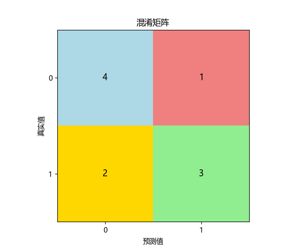
真实值: [0, 0, 1, 1, 0, 1, 0, 1, 1, 0] 预测值: [0, 1, 1, 0, 0, 1, 0, 1, 0, 0] 混淆矩阵: [[4 1] [2 3]]
样本逐个分析: 样本1: 0 -> 0 | TN (真负例) 样本2: 0 -> 1 | FP (假正例) 样本3: 1 -> 1 | TP (真正例) 样本4: 1 -> 0 | FN (假负例) 样本5: 0 -> 0 | TN (真负例) 样本6: 1 -> 1 | TP (真正例) 样本7: 0 -> 0 | TN (真负例) 样本8: 1 -> 1 | TP (真正例) 样本9: 1 -> 0 | FN (假负例) 样本10: 0 -> 0 | TN (真负例)
📊 最终统计: TP (真正例): 3 FP (假正例): 1 FN (假负例): 2 TN (真负例): 4
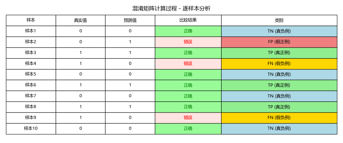
结果说明:
一个标准的混淆矩阵图:
- 4个格子分别显示 TP, FP, FN, TN
- 和计算过程统一的颜色区分显示
- 清晰的坐标轴标签
数字解释:
- 左上角(TN):预测正确为负例的数量,正确排除
- 右上角(FP):预测错误为正例的数量,误报(假警报)
- 左下角(FN):预测错误为负例的数量,漏报(漏掉的真实情况)
- 右下角(TP):预测正确为正例的数量,正确识别
2. 准确率
- 定义:所有预测正确的样本占总样本的比例。
- 公式:Accuracy = (TP + TN) / (TP + TN + FP + FN)
- 解读:它给出了一个最直观的整体性能概览。在上例中,准确率 = (5+3)/10 = 80%。
- 局限性:当数据分布极度不平衡时,准确率会严重失真。例如,在99%是负例的欺诈检测数据中,一个永远预测“非欺诈”的模型,其准确率也能高达99%,但这个模型毫无用处。
accuracy_manual = (tp + tn) / (tp + tn + fp + fn)
print(f"\n1. 准确率 (Accuracy):")
print(f"   公式: (TP + TN) / (TP + TN + FP + FN)")
print(f"   计算: ({tp} + {tn}) / {len(y_true)} = {accuracy_manual:.3f}")
print(f"   含义: 模型整体预测正确率")
准确率 (Accuracy): 公式: (TP + TN) / (TP + TN + FP + FN) 计算: (3 + 4) / 10 = 0.700 含义: 模型整体预测正确率
3. 精确率
- 定义:在所有被预测为正例的样本中,实际是正例的比例。
- 公式:Precision = TP / (TP + FP)
- 解读:它衡量的是模型“不冤枉好人”的能力。高精确率意味着,每当模型发出一个正例信号,这个信号很可能是可靠的。
- 应用场景:垃圾邮件检测。我们希望被标记为“垃圾”的邮件,尽可能都是真正的垃圾邮件(减少FP),以免误删重要邮件。
precision_manual = tp / (tp + fp) if (tp + fp) > 0 else 0
print(f"\n精确率 (Precision):")
print(f"  公式: TP / (TP + FP)")
print(f"  计算: {tp} / ({tp} + {fp}) = {precision_manual:.4f}")
精确率 (Precision): 公式: TP / (TP + FP) 计算: 3 / (3 + 1) = 0.7500
4. 召回率
- 定义:在所有实际为正例的样本中,被正确预测为正例的比例。
- 公式:Recall = TP / (TP + FN)
- 解读:它衡量的是模型“不放过坏人”的能力。高召回率意味着,模型能够找出绝大部分真正的正例。
- 应用场景:疾病诊断,我们希望尽可能找出所有真正的患者(减少FN),即使这意味着会让一些健康的人进行二次检查。
recall_manual = tp / (tp + fn) if (tp + fn) > 0 else 0
print(f"\n召回率 (Recall):")
print(f"  公式: TP / (TP + FN)")
print(f"  计算: {tp} / ({tp} + {fn}) = {recall_manual:.4f}")
召回率 (Recall): 公式: TP / (TP + FN) 计算: 3 / (3 + 2) = 0.6000
5. F1分数
- 定义:精确率和召回率的调和平均数。
- 公式:F1 Score = 2 * (Precision * Recall) / (Precision + Recall)
- 解读:精确率和召回率通常相互矛盾,提高一个往往会降低另一个。F1分数提供了一个单一指标来平衡这两者。当需要同时兼顾精确率和召回率,且正负样本分布不平衡时,F1是比准确率更好的指标。
f1_manual = 2 * (precision_manual * recall_manual) / (precision_manual + recall_manual) if (precision_manual + recall_manual) > 0 else 0
print(f"\nF1分数 (F1-Score):")
print(f"  公式: 2 * (Precision * Recall) / (Precision + Recall)")
print(f"  计算: 2 * ({precision_manual:.4f} * {recall_manual:.4f}) / ({precision_manual:.4f} + {recall_manual:.4f}) = {f1_manual:.4f}")
F1分数 (F1-Score): 公式: 2 * (Precision * Recall) / (Precision + Recall) 计算: 2 * (0.7500 * 0.6000) / (0.7500 + 0.6000) = 0.6667
6. 指标图
指标对比条形图与指标关系图
# 2. 指标对比条形图与指标关系图
fig_metrics, axes_metrics = plt.subplots(1, 2, figsize=(12, 5))

# 指标对比条形图
ax_bar = axes_metrics[0]
metrics = ['准确率', '精确率', '召回率', 'F1分数']
values = [accuracy_manual, precision_manual, recall_manual, f1_manual]
colors = ['#3498db', '#e74c3c', '#2ecc71', '#f39c12']

bars = ax_bar.bar(metrics, values, color=colors, alpha=0.7, width=0.6)
ax_bar.set_ylim(0, 1)
ax_bar.set_title('核心评估指标对比', fontsize=14, pad=20)
ax_bar.set_ylabel('分数', fontsize=12)
ax_bar.grid(True, alpha=0.3, axis='y')

# 在条形上添加数值
for bar, value in zip(bars, values):
    height = bar.get_height()
    ax_bar.text(bar.get_x() + bar.get_width()/2., height + 0.02,
                f'{value:.3f}', ha='center', va='bottom', fontsize=11, fontweight='bold')

# 指标关系图(混淆矩阵分布)
ax_pie = axes_metrics[1]
categories = ['TN', 'FP', 'FN', 'TP']
counts = [tn, fp, fn, tp]
colors_detail = ['lightblue', 'lightcoral', 'gold', 'lightgreen']
wedges, texts, autotexts = ax_pie.pie(counts, labels=categories, colors=colors_detail,
                                      autopct='%1.0f%%', startangle=90)
ax_pie.axis('equal')
ax_pie.set_title('混淆矩阵分布', fontsize=14, pad=20)
plt.tight_layout()
plt.show()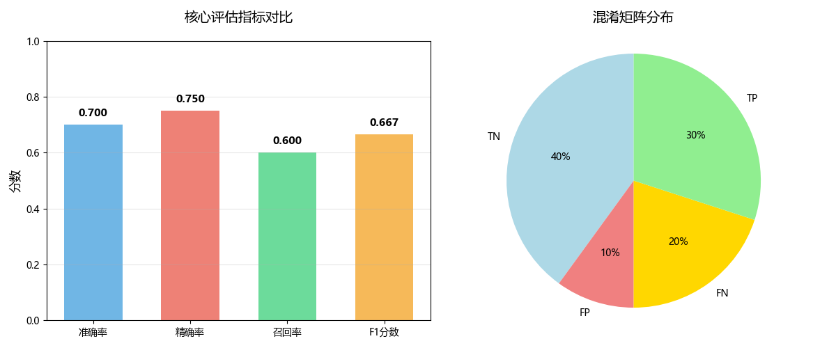
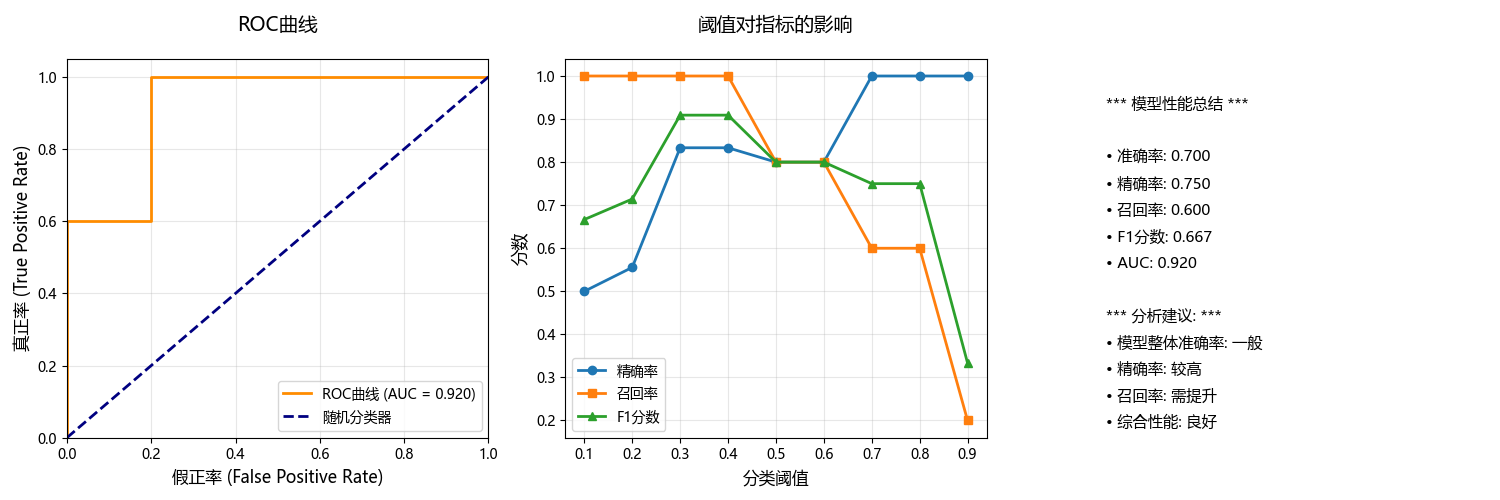
三、 综合评估:ROC曲线与AUC
上述指标通常依赖于一个固定的分类阈值(例如,模型输出概率>0.5则判为正例)。但阈值是可以调整的,ROC曲线则通过动态调整阈值,为我们提供了更全面的视角。
1. ROC曲线
- 定义:以假正率(FPR) 为横轴,真正率(TPR,即召回率) 为纵轴绘制的曲线。
- FPR = FP / (FP + TN):所有负例中被误判为正例的比例。我们希望它越低越好。
- TPR = Recall = TP / (TP + FN)
- 如何绘制:通过不断调整分类阈值,计算出每一组(FPR, TPR)坐标,并将其连接成线。
- 解读:
- 理想点:左上角(0,1),即FPR=0(没有误报),TPR=1(全部捕捉)。
- 对角线:从(0,0)到(1,1),代表一个“随机猜测”模型的性能。任何有意义的模型的ROC曲线都应高于这条线。
- 曲线含义:曲线越靠近左上方,模型的整体性能越好。
2. AUC
- 定义:ROC曲线下的面积。
- 取值范围:[0, 1]。
- 解读:
- AUC = 1.0:完美模型。
- AUC = 0.5:随机模型,无预测能力。
- AUC < 0.5:比随机还差,可能数据或模型有严重问题。
- 优点:
- 尺度不变:它衡量的是模型排序质量的概率,不受具体分类阈值影响。
- 分类能力稳定:对样本类别分布不敏感,非常适合处理不平衡数据集。
from sklearn.metrics import confusion_matrix, accuracy_score, precision_score, recall_score, f1_score, roc_curve, auc
# 计算ROC曲线和AUC
# 模拟预测概率(用于ROC曲线)
y_pred_proba = [0.1, 0.7, 0.8, 0.4, 0.2, 0.9, 0.3, 0.85, 0.6, 0.25]
fpr, tpr, thresholds = roc_curve(y_true, y_pred_proba)
roc_auc = auc(fpr, tpr)

print("\n" + "="*50)
print(" ROC曲线与AUC计算:")
print("="*50)

print(f"\nROC曲线坐标点 (FPR, TPR):")
for i, (f, t, thresh) in enumerate(zip(fpr, tpr, thresholds)):
    print(f"  阈值={thresh:.2f}: FPR={f:.2f}, TPR={t:.2f}")

print(f"\nAUC (曲线下面积) = {roc_auc:.3f}")
print("AUC含义:")
print("  • 0.9-1.0: 极好的分类能力")
print("  • 0.8-0.9: 良好的分类能力")
print("  • 0.7-0.8: 一般的分类能力")
print("  • 0.5-0.7: 较差的分类能力")
print("  • 0.5: 随机猜测")

# 创建可视化图形
fig, axes = plt.subplots(1, 3, figsize=(15, 5))

# 4. ROC曲线
plt.sca(axes[0])
plt.plot(fpr, tpr, color='darkorange', lw=2, label=f'ROC曲线 (AUC = {roc_auc:.3f})')
plt.plot([0, 1], [0, 1], color='navy', lw=2, linestyle='--', label='随机分类器')
plt.xlim([0.0, 1.0])
plt.ylim([0.0, 1.05])
plt.xlabel('假正率 (False Positive Rate)', fontsize=12)
plt.ylabel('真正率 (True Positive Rate)', fontsize=12)
plt.title('ROC曲线', fontsize=14, pad=20)
plt.legend(loc="lower right")
plt.grid(True, alpha=0.3)

# 5. 阈值对指标的影响
plt.sca(axes[1])
test_thresholds = np.arange(0.1, 1.0, 0.1)
precisions = []
recalls = []
f1_scores = []

# 演示不同阈值的影响
print(f"\n 不同阈值下的预测结果对比:")
print("阈值 | 精确率 | 召回率 | F1分数")
print("-" * 55)

for thresh in test_thresholds:
    y_pred_thresh = [1 if prob >= thresh else 0 for prob in y_pred_proba]
    precisions.append(precision_score(y_true, y_pred_thresh, zero_division=0))
    recalls.append(recall_score(y_true, y_pred_thresh))
    f1_scores.append(f1_score(y_true, y_pred_thresh, zero_division=0))

    print(f"{thresh:.1f}  | {precisions[-1]:.3f}  | {recalls[-1]:.3f}  | {f1_scores[-1]:.3f}")

plt.plot(test_thresholds, precisions, 'o-', label='精确率', linewidth=2)
plt.plot(test_thresholds, recalls, 's-', label='召回率', linewidth=2)
plt.plot(test_thresholds, f1_scores, '^-', label='F1分数', linewidth=2)
plt.xlabel('分类阈值', fontsize=12)
plt.ylabel('分数', fontsize=12)
plt.title('阈值对指标的影响', fontsize=14, pad=20)
plt.legend()
plt.grid(True, alpha=0.3)

print(f"\n 关键洞察:")
print("• 阈值降低 → 召回率↑,精确率↓(更敏感,更多FP)")
print("• 阈值提高 → 精确率↑,召回率↓(更严格,更多FN)")
print("• 需要根据业务需求选择最佳阈值")

# 6. 性能总结
plt.sca(axes[2])
plt.axis('off')

summary_text = [
    "*** 模型性能总结 ***",
    "",
    f"• 准确率: {accuracy_manual:.3f}",
    f"• 精确率: {precision_manual:.3f}",
    f"• 召回率: {recall_manual:.3f}",
    f"• F1分数: {f1_manual:.3f}",
    f"• AUC: {roc_auc:.3f}",
    "",
    "*** 分析建议: ***",
    f"• 模型整体准确率: {'良好' if accuracy_manual > 0.7 else '一般'}",
    f"• 精确率: {'较高' if precision_manual > 0.7 else '需提升'}",
    f"• 召回率: {'较高' if recall_manual > 0.7 else '需提升'}",
    f"• 综合性能: {'优秀' if f1_manual > 0.7 else '良好' if f1_manual > 0.5 else '需优化'}"
]

for i, text in enumerate(summary_text):
    plt.text(0.1, 0.9 - i*0.07, text, fontsize=11,
             verticalalignment='top', transform=plt.gca().transAxes)

plt.tight_layout()
plt.show()
输出结果:
================================================== ROC曲线与AUC计算: ================================================== ROC曲线坐标点 (FPR, TPR): 阈值=inf: FPR=0.00, TPR=0.00 阈值=0.90: FPR=0.00, TPR=0.20 阈值=0.80: FPR=0.00, TPR=0.60 阈值=0.70: FPR=0.20, TPR=0.60 阈值=0.40: FPR=0.20, TPR=1.00 阈值=0.10: FPR=1.00, TPR=1.00 AUC (曲线下面积) = 0.920 AUC含义: • 0.9-1.0: 极好的分类能力 • 0.8-0.9: 良好的分类能力 • 0.7-0.8: 一般的分类能力 • 0.5-0.7: 较差的分类能力 • 0.5: 随机猜测 不同阈值下的预测结果对比: 阈值 | 精确率 | 召回率 | F1分数 ------------------------------------------------------- 0.1 | 0.500 | 1.000 | 0.667 0.2 | 0.556 | 1.000 | 0.714 0.3 | 0.833 | 1.000 | 0.909 0.4 | 0.833 | 1.000 | 0.909 0.5 | 0.800 | 0.800 | 0.800 0.6 | 0.800 | 0.800 | 0.800 0.7 | 1.000 | 0.600 | 0.750 0.8 | 1.000 | 0.600 | 0.750 0.9 | 1.000 | 0.200 | 0.333 关键洞察: • 阈值降低 → 召回率↑,精确率↓(更敏感,更多FP) • 阈值提高 → 精确率↑,召回率↓(更严格,更多FN) • 需要根据业务需求选择最佳阈值
阈值的选择:
test_thresholds = np.arange(0.1, 1.0, 0.1)- 1. 生成测试范围: 创建从0.1到0.9的阈值序列,步长为0.1
- 2. 全面评估: 测试模型在不同严格程度下的表现
- 3. 寻找最优: 帮助找到最适合业务需求的最佳阈值
- 4. 理解权衡: 展示精确率-召回率之间的trade-off关系
- 5. 决策支持: 为阈值选择提供数据依据
3. 最佳阈值分析
基于不同阈值下的预测结果对比,阈值0.3或0.4是最好的选择,我们详细分析一下过程:
import matplotlib.pyplot as plt
import numpy as np

# 数据
thresholds = [0.1, 0.2, 0.3, 0.4, 0.5, 0.6, 0.7, 0.8, 0.9]
precisions = [0.500, 0.556, 0.833, 0.833, 0.800, 0.800, 1.000, 1.000, 1.000]
recalls = [1.000, 1.000, 1.000, 1.000, 0.800, 0.800, 0.600, 0.600, 0.200]
f1_scores = [0.667, 0.714, 0.909, 0.909, 0.800, 0.800, 0.750, 0.750, 0.333]

# 可视化分析
plt.figure(figsize=(12, 8))

plt.plot(thresholds, precisions, 'o-', label='精确率', linewidth=3, markersize=8)
plt.plot(thresholds, recalls, 's-', label='召回率', linewidth=3, markersize=8)
plt.plot(thresholds, f1_scores, '^-', label='F1分数', linewidth=3, markersize=10)

# 标记最佳点
best_idx = np.argmax(f1_scores)
plt.axvline(x=thresholds[best_idx], color='red', linestyle='--', alpha=0.7, label=f'最佳阈值 ({thresholds[best_idx]})')
plt.scatter(thresholds[best_idx], f1_scores[best_idx], color='red', s=200, zorder=5)

plt.xlabel('分类阈值', fontsize=12)
plt.ylabel('分数', fontsize=12)
plt.title('阈值性能分析 - 最佳阈值选择', fontsize=14, pad=20)
plt.legend()
plt.grid(True, alpha=0.3)
plt.ylim(0, 1.1)

# 添加数值标注
for i, (t, p, r, f) in enumerate(zip(thresholds, precisions, recalls, f1_scores)):
    plt.annotate(f'F1={f:.3f}', (t, f), textcoords="offset points", xytext=(0,10), ha='center', fontsize=9)

plt.tight_layout()
plt.show()

print(" F1分数排名:")
f1_ranking = sorted(zip(thresholds, f1_scores), key=lambda x: x[1], reverse=True)
for i, (thresh, f1) in enumerate(f1_ranking[:3], 1):
    print(f"第{i}名: 阈值{thresh} → F1分数 = {f1:.3f}")

print("\n 不同业务场景下的最佳选择:")
print("=" * 50)

scenarios = {
    "疾病筛查": {"priority": "召回率", "recommended": [0.3, 0.4], "reason": "不能漏掉任何患者"},
    "垃圾邮件过滤": {"priority": "精确率", "recommended": [0.7, 0.8], "reason": "不能误判重要邮件"},
    "平衡场景": {"priority": "F1分数", "recommended": [0.3, 0.4], "reason": "精确率和召回率都很好"},
    "欺诈检测": {"priority": "召回率", "recommended": [0.3, 0.4], "reason": "不能漏掉欺诈交易"}
}

for scenario, info in scenarios.items():
    print(f" {scenario}:")
    print(f"   关注指标: {info['priority']}")
    print(f"   推荐阈值: {info['recommended']}")
    print(f"   原因: {info['reason']}")
    print()

# 创建详细比较表
print(" 前三名阈值详细比较:")
print("阈值 | 精确率 | 召回率 | F1分数 | 优势")
print("-" * 55)

top_thresholds = [(0.3, 0.833, 1.000, 0.909),
                  (0.4, 0.833, 1.000, 0.909),
                  (0.5, 0.800, 0.800, 0.800)]

for thresh, prec, rec, f1 in top_thresholds:
    if thresh in [0.3, 0.4]:
        advantage = " 完美召回率 + 高精确率"
    else:
        advantage = " 平衡但两者都不突出"
    print(f"{thresh}   | {prec:.3f}   | {rec:.3f}  | {f1:.3f}  | {advantage}")
输出结果:
F1分数排名: 第1名: 阈值0.3 → F1分数 = 0.909 第2名: 阈值0.4 → F1分数 = 0.909 第3名: 阈值0.5 → F1分数 = 0.800 不同业务场景下的最佳选择: ================================================== 疾病筛查: 关注指标: 召回率 推荐阈值: [0.3, 0.4] 原因: 不能漏掉任何患者 垃圾邮件过滤: 关注指标: 精确率 推荐阈值: [0.7, 0.8] 原因: 不能误判重要邮件 平衡场景: 关注指标: F1分数 推荐阈值: [0.3, 0.4] 原因: 精确率和召回率都很好 欺诈检测: 关注指标: 召回率 推荐阈值: [0.3, 0.4] 原因: 不能漏掉欺诈交易 前三名阈值详细比较: 阈值 | 精确率 | 召回率 | F1分数 | 优势 ------------------------------------------------------- 0.3 | 0.833 | 1.000 | 0.909 | 完美召回率 + 高精确率 0.4 | 0.833 | 1.000 | 0.909 | 完美召回率 + 高精确率 0.5 | 0.800 | 0.800 | 0.800 | 平衡但两者都不突出
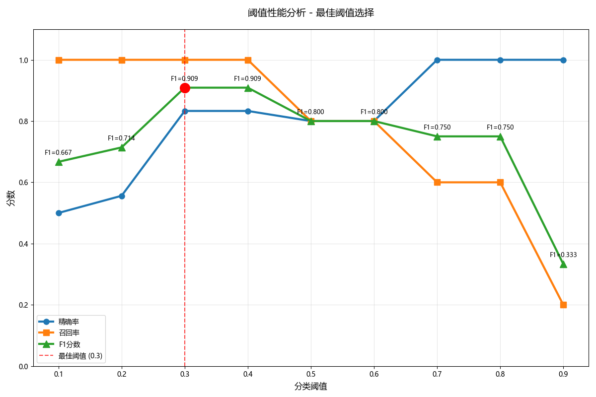
阈值0.3/0.4的优势:
- 1. 完美的召回率 (1.000)
- 能够找出所有的真实正例
- 没有漏报(FN)
- 对于不能接受漏报的场景至关重要
- 2. 很高的精确率 (0.833)
- 当模型预测为正例时,83.3%的概率是正确的
- 只有16.7%的误报率
- 3. 最优的F1分数 (0.909)
- 在精确率和召回率之间达到最佳平衡
- 是所有阈值中最高的综合分数
其他阈值的问题:
- 阈值0.1-0.2:精确率太低 (50%-55%),误报太多
- 阈值0.5-0.6:召回率下降至80%,开始出现漏报
- 阈值0.7-0.8:召回率大幅下降至60%,漏报严重
- 阈值0.9:召回率只有20%,基本无法找出正例
阈值0.3和0.4在保持完美召回率的同时,提供了很高的精确率,达到了精确率-召回率权衡的最佳平衡点,因此是最佳选择。
四、指标的适用性与选择
选择评估指标的本质,是将技术指标与业务目标对齐。以下是一些常见场景的策略:
1. 均衡数据,无特殊业务偏好
- 推荐指标:准确率、F1分数、AUC。
- 场景:MNIST手写数字识别。我们希望整体识别正确率越高越好。
2. 高度关注误报,追求宁缺毋滥
- 核心指标:精确率。
- 场景:
- 推荐系统:向用户推送的内容必须高度相关,不相关的推荐(FP)会损害用户体验。
- 垃圾邮件过滤:将正常邮件误判为垃圾邮件(FP)的代价很高。
3. 高度关注漏报,追求“宁可错杀,不可放过”
- 核心指标:召回率。
- 场景:
- 疾病筛查:漏掉一个病人(FN)的后果远比让一个健康人做进一步检查(FP)更严重。
- 金融风控:漏掉一个欺诈交易(FN)可能导致直接的经济损失。
4. 需要在精确率和召回率之间取得平衡
- 核心指标:F1分数。
- 场景:
- 学术论文的查重系统:既不能过于宽松(召回率低,漏掉抄袭),也不能过于严苛(精确率低,误伤原创)。
- 电商评论的情感分析:需要平衡正面和负面评论的识别。
5. 需要全面评估模型整体排序性能,或数据高度不平衡
- 核心指标:ROC曲线与AUC。
- 场景:
- 任何不平衡分类问题,如欺诈检测、客户流失预测、罕见病诊断等。AUC能给出一个稳健的性能评估。
- 当你不确定如何设定分类阈值时,ROC曲线可以帮你分析不同阈值下的模型表现,为最终决策提供依据。
6. 当误分类的代价不对称时
- 核心指标:代价敏感分析 或 指定业务目标下的Fβ分数。
- 说明:F1分数是Fβ分数在β=1时的特例。Fβ = (1+β²) * (Precision * Recall) / (β² * Precision + Recall)。
- 如果认为召回率更重要,就设置β>1(例如,F2分数)。
- 如果认为精确率更重要,就设置β<1(例如,F0.5分数)。
五、总结
模型评估需超越单一的准确率指标,综合运用混淆矩阵、精确率、召回率、F1分数和ROC/AUC等多维度工具。混淆矩阵直观展示TP、FP、FN、TN四类结果,是各项指标的计算基础。精确率衡量预测正例的准确性,召回率评估找出真实正例的能力,F1分数则是两者的调和平均。
ROC曲线和AUC值评估模型整体区分能力,对类别不平衡不敏感。关键在于根据业务需求选择指标:高精度场景重视精确率,高召回场景关注召回率,平衡场景优选F1分数。分类阈值是可调参数,不同阈值会产生不同的性能表现,需通过系统测试找到最佳平衡点。
了解了这些,下次当你听到我们的模型准确率99%时,我们会淡定地思考,提问它的精确率和召回率分别是多少?AUC怎么样?通过了这些精确的指标值方能认可99%的纯度是否真的属实。
原创声明:本文系作者授权腾讯云开发者社区发表,未经许可,不得转载。
如有侵权,请联系 cloudcommunity@tencent.com 删除。
原创声明:本文系作者授权腾讯云开发者社区发表,未经许可,不得转载。
如有侵权,请联系 cloudcommunity@tencent.com 删除。
评论
登录后参与评论
推荐阅读
目录
腾讯云开发者

Copyright © 2013 - 2026 Tencent Cloud. All Rights Reserved. 腾讯云 版权所有
深圳市腾讯计算机系统有限公司 ICP备案/许可证号:粤B2-20090059 ![]() 粤公网安备44030502008569号
粤公网安备44030502008569号
腾讯云计算(北京)有限责任公司 京ICP证150476号 | 京ICP备11018762号