
我可以使用seaborn.countplot显示数据吗?
我可以使用seaborn.countplot显示数据吗?
提问于 2020-07-12 17:23:06
我很难用海运显示一些人力资源分数数据。我想使用一个计数图来可视化与雇员在y轴上的数据,得分类别作为色调,以及他们在x轴上分数的值范围。
import pandas as pd
import numpy as np
import seaborn as sns
import matplotlib.pyplot as plt

btraits = {'Behavioural Traits': ['Communicaiton', 'Teamwork', 'Leadership', 'Negotiation', 'Agreeableness'],
'James':[0,-2,0,-2,-2],
'John':[2,0,0,2,-1],
'Gary':[0,-1,0,1,-3],
'Raymond':[3,-5,0,1,0]}
df = pd.DataFrame(btraits)
df.set_index('Behavioural Traits', inplace=True)

sns.countplot(data=btraits, y='columns', hue='index')回答 2
Stack Overflow用户
回答已采纳
发布于 2020-07-12 19:42:25
import pandas as pd
import seaborn as sns
import matplotlib.pyplot as plt
btraits = {'Behavioural Traits': ['Communicaiton', 'Teamwork', 'Leadership', 'Negotiation', 'Agreeableness'],
'James': [0,-2,0,-2,-2],
'John': [2,0,0,2,-1],
'Gary': [0,-1,0,1,-3],
'Raymond': [3,-5,0,1,0]}
df = pd.DataFrame(btraits)
df.set_index('Behavioural Traits', inplace=True)
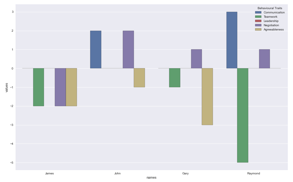
James John Gary Raymond
Behavioural Traits
Communicaiton 0 2 0 3
Teamwork -2 0 -1 -5
Leadership 0 0 0 0
Negotiation -2 2 1 1
Agreeableness -2 -1 -3 0
# stack the columns
dfs = df.stack().reset_index().rename(columns={'level_1': 'names', 0: 'values'})
Behavioural Traits names values
0 Communicaiton James 0
1 Communicaiton John 2
2 Communicaiton Gary 0
3 Communicaiton Raymond 3
4 Teamwork James -2
5 Teamwork John 0
6 Teamwork Gary -1
7 Teamwork Raymond -5
8 Leadership James 0
9 Leadership John 0
10 Leadership Gary 0
11 Leadership Raymond 0
12 Negotiation James -2
13 Negotiation John 2
14 Negotiation Gary 1
15 Negotiation Raymond 1
16 Agreeableness James -2
17 Agreeableness John -1
18 Agreeableness Gary -3
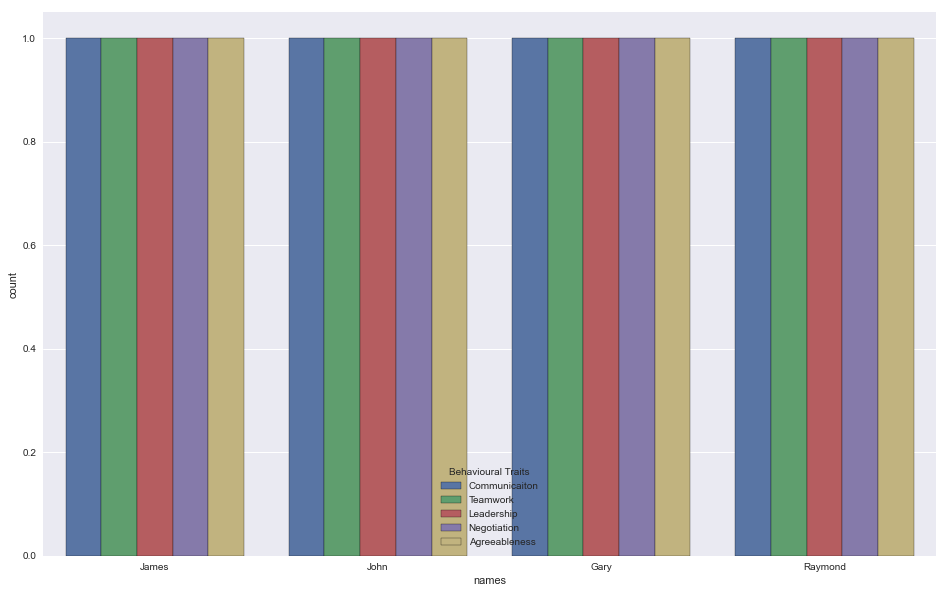
19 Agreeableness Raymond 0计数图
sns.countplot(data=dfs, x='names', hue='Behavioural Traits')
桶形
sns.barplot(x='names', y='values', hue='Behavioural Traits', data=dfs)
Stack Overflow用户
发布于 2020-07-12 20:24:37
Countplot基本上返回事件的计数。
您可以为每个分类变量尝试barplot。例:sns.barplot(x=df.index,y='James',data=df)
页面原文内容由Stack Overflow提供。腾讯云小微IT领域专用引擎提供翻译支持
原文链接:
https://stackoverflow.com/questions/62864233
复制相关文章
相似问题
腾讯云开发者

Copyright © 2013 - 2026 Tencent Cloud. All Rights Reserved. 腾讯云 版权所有
深圳市腾讯计算机系统有限公司 ICP备案/许可证号:粤B2-20090059 ![]() 粤公网安备44030502008569号
粤公网安备44030502008569号
腾讯云计算(北京)有限责任公司 京ICP证150476号 | 京ICP备11018762号