
我可以创建带有纯css的交叉衬背景框吗?
我可以创建带有纯css的交叉衬背景框吗?
提问于 2014-02-10 15:18:20

我想为我的小部件标题创建像上面这样的图片和HTML结构;
<div class="wt">
    <div class="blue-area">text</div>
    <div class="green-area">text</div>
</div>
文字长度可变,这样可以改变蓝色区域的宽度;
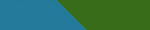
我可以用纯css创建这个吗?
回答 2
Stack Overflow用户
回答已采纳
发布于 2014-02-10 15:27:54
这里有一些CSS,但我认为这就是你想要的。我通过使用::after伪元素实现了箭头的外观
我还必须使<div>s有一个固定的高度,因为不能相对地调整三角形的大小。继续,更改文本,并查看<div>的适当更改。
.blue-area,
.green-area {
  display: inline-block;
  line-height: 30px;
  height: 30px;
}

.blue-area {
  padding: 0 0 0 8px;
  background-color: #26799b;
  position: relative;
}

.blue-area:after {
  content: '';
  position: absolute;
  left: 100%;
  top: 0;
  border-color: transparent transparent #26799b transparent;
  border-style: solid;
  border-width: 0 30px 30px 0;
  display: block;
}

.green-area {
  background-color: #386c19;
  padding: 0 8px 0 30px;
}<div class="wt">
<div class="blue-area">text dfg gh fgh </div><div class="green-area">text fgh fgh fgh fgdfg dfg dfg</div>
</div>
Stack Overflow用户
发布于 2014-02-10 15:28:25
是的,以背景梯度为例:
div {background:linear-gradient(to top right, #247A9B, #247A9B 50%,#386C19 50% ,#386C19);}对于旧浏览器,您将需要前缀。
html上的演示:http://codepen.io/anon/pen/xFjEl
html {
  background: linear-gradient( to top right, #247A9B, #247A9B 49%, #386C19 50%, #386C19);
  min-height: 100%;
}


/* or use degrees */

p {
  margin: 2em;
  background: #247A9B;
  border: solid;
}

p span {
  display: inline-block;
  padding: 0 1.5em 0 0;
  background: linear-gradient( 60deg, #386C19, #386C19 93%, #247A9B 94%, #247A9B);
}

p span b {
  display: none;
}

p span:hover b {
  display: inline;
}<p>
<span> text to increase on hover <b>here more text in green area</b></span> text in blue area
</p>
页面原文内容由Stack Overflow提供。腾讯云小微IT领域专用引擎提供翻译支持
原文链接:
https://stackoverflow.com/questions/21680941
复制相关文章
相似问题
腾讯云开发者

Copyright © 2013 - 2026 Tencent Cloud. All Rights Reserved. 腾讯云 版权所有
深圳市腾讯计算机系统有限公司 ICP备案/许可证号:粤B2-20090059  粤公网安备44030502008569号
腾讯云计算(北京)有限责任公司 京ICP证150476号 | 京ICP备11018762号