
最大长度Matplotlib图条图
最大长度Matplotlib图条图
提问于 2016-07-01 12:42:43
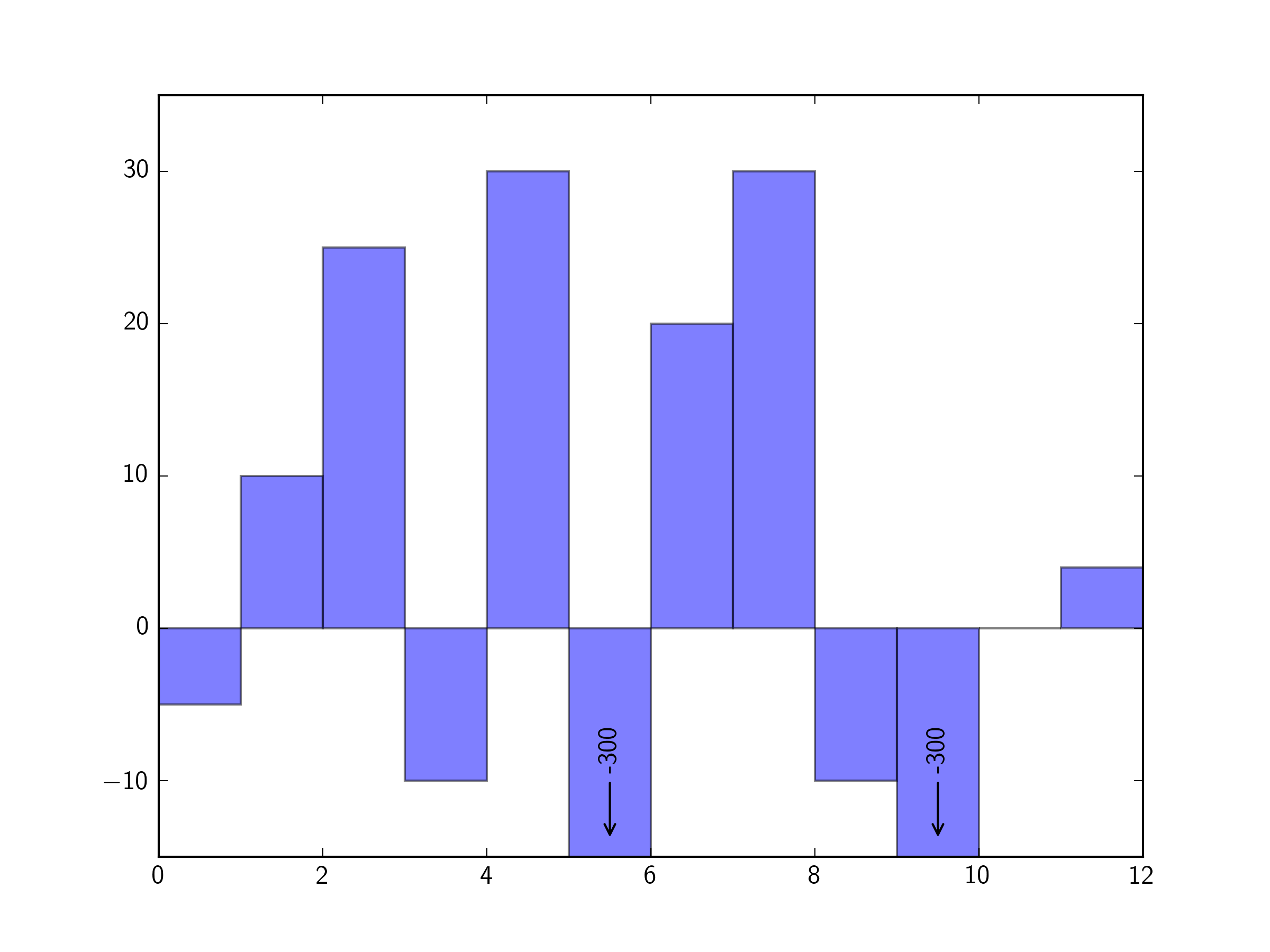
我正在使用Matplotlib绘制一个条形图。我的大部分数据值在-10到+30之间。然而,我有两个数据值大约是-300。
当我绘制我的数据时,-300数据值栏看起来太大了,它隐藏了其他条形图的洞察力。我是否可以在-10到+30的范围内绘制所有的条形图,将-300横条剪辑到-30,然后写上"-300“的标签?
回答 1
Stack Overflow用户
回答已采纳
发布于 2016-07-01 13:11:56
使用ax.set_ylim()设置y限制,使用ax.annotate编写标签(如果您愿意,还可以使用箭头)。
例如:
import matplotlib.pyplot as plt

fig, ax = plt.subplots(1)

y = [-5, 10, 25, -10, 30, -300, 20, 30, -10, -300, 0, 4]
x = range(len(y))

ax.bar(x, y, width=1, alpha=0.5)

ymin, ymax = -15, 35
ax.set_ylim(ymin, ymax)

for xbar,ybar in zip(x,y):

    if ybar < ymin:

        ax.annotate(
                ybar,
                xy=(xbar+0.5, -14),
                xytext=(xbar+0.5, -8),
                rotation=90, ha='center', va='center',
                arrowprops=dict(arrowstyle="->"))

plt.show()
页面原文内容由Stack Overflow提供。腾讯云小微IT领域专用引擎提供翻译支持
原文链接:
https://stackoverflow.com/questions/38145763
复制相关文章
相似问题
腾讯云开发者

Copyright © 2013 - 2026 Tencent Cloud. All Rights Reserved. 腾讯云 版权所有
深圳市腾讯计算机系统有限公司 ICP备案/许可证号:粤B2-20090059 ![]() 粤公网安备44030502008569号
粤公网安备44030502008569号
腾讯云计算(北京)有限责任公司 京ICP证150476号 | 京ICP备11018762号