鸿蒙特效教程10-卡片展开/收起效果
原创

鸿蒙特效教程10-卡片展开/收起效果
在移动应用开发中,卡片是一种常见且实用的UI元素,能够将信息以紧凑且易于理解的方式呈现给用户。
本教程将详细讲解如何在HarmonyOS中实现卡片的展开/收起效果,通过这个实例,你将掌握ArkUI中状态管理和动画实现的核心技巧。
开发环境准备
- DevEco Studio 5.0.3
- HarmonyOS Next API 15
下载代码仓库
一、实现效果预览
我们将实现一个包含多个卡片的页面,整个交互过程都有平滑的动画效果。
- 每个卡片默认只显示标题,点击右侧箭头按钮后可以展开显示详细内容,再次点击则收起。
- 实现"全部展开"和"全部收起"的功能按钮。
二、实现步骤
步骤1:创建基础页面结构
首先,我们需要创建一个基本的页面结构,包含一个标题和一个简单的卡片:
@Entry
@Component
struct ToggleCard {
  build() {
    Column() {
      Text('卡片展开/收起示例')
        .fontSize(22)
        .fontWeight(FontWeight.Bold)
        .margin({ top: 20 })

      // 一个简单的卡片
      Column() {
        Text('个人信息')
          .fontSize(16)
          .fontWeight(FontWeight.Medium)
      }
      .width('90%')
      .padding(16)
      .backgroundColor('#ECF2FF')
      .borderRadius(12)
      .margin({ top: 20 })
    }
    .width('100%')
    .height('100%')
    .backgroundColor('#F5F5F5')
    .alignItems(HorizontalAlign.Center)
    .expandSafeArea()
  }
}
这段代码创建了一个基本的页面,顶部有一个标题,下方有一个简单的卡片,卡片只包含一个标题文本。
步骤2:添加卡片标题行和展开按钮
接下来,我们为卡片添加一个标题行,并在右侧添加一个展开/收起按钮:
@Entry
@Component
struct ToggleCard {
  build() {
    Column() {
      Text('卡片展开/收起示例')
        .fontSize(22)
        .fontWeight(FontWeight.Bold)
        .margin({ top: 20 })

      // 一个带展开按钮的卡片
      Column() {
        Row() {
          Text('个人信息')
            .fontSize(16)
            .fontWeight(FontWeight.Medium)

          Blank()  // 占位,使按钮靠右显示

          Button() {
            Image($r('sys.media.ohos_ic_public_arrow_down'))
              .width(24)
              .height(24)
              .fillColor('#3F72AF')
          }
          .width(36)
          .height(36)
          .backgroundColor(Color.Transparent)
        }
        .width('100%')
        .justifyContent(FlexAlign.SpaceBetween)
        .alignItems(VerticalAlign.Center)
      }
      .width('90%')
      .padding(16)
      .backgroundColor('#ECF2FF')
      .borderRadius(12)
      .margin({ top: 20 })
    }
    .width('100%')
    .height('100%')
    .backgroundColor('#F5F5F5')
    .alignItems(HorizontalAlign.Center)
    .expandSafeArea()
  }
}
现在我们的卡片有了标题和一个展开按钮,但点击按钮还没有任何效果。接下来我们将添加状态管理和交互逻辑。
步骤3:添加状态变量控制卡片展开/收起
要实现卡片的展开/收起效果,我们需要添加一个状态变量来跟踪卡片是否处于展开状态:
@Entry
@Component
struct ToggleCard {
  @State isExpanded: boolean = false  // 控制卡片展开/收起状态

  build() {
    Column() {
      Text('卡片展开/收起示例')
        .fontSize(22)
        .fontWeight(FontWeight.Bold)
        .margin({ top: 20 })

      // 一个带展开按钮的卡片
      Column() {
        Row() {
          Text('个人信息')
            .fontSize(16)
            .fontWeight(FontWeight.Medium)

          Blank()

          Button() {
            Image($r('sys.media.ohos_ic_public_arrow_down'))
              .width(24)
              .height(24)
              .fillColor('#3F72AF')
          }
          .width(36)
          .height(36)
          .backgroundColor(Color.Transparent)
          .onClick(() => {
            this.isExpanded = !this.isExpanded  // 点击按钮切换状态
          })
        }
        .width('100%')
        .justifyContent(FlexAlign.SpaceBetween)
        .alignItems(VerticalAlign.Center)

        // 根据展开状态条件渲染内容
        if (this.isExpanded) {
          Text('这是展开后显示的内容,包含详细信息。')
            .fontSize(14)
            .margin({ top: 8 })
        }
      }
      .width('90%')
      .padding(16)
      .backgroundColor('#ECF2FF')
      .borderRadius(12)
      .margin({ top: 20 })
    }
    .width('100%')
    .height('100%')
    .backgroundColor('#F5F5F5')
    .alignItems(HorizontalAlign.Center)
    .expandSafeArea()
  }
}现在我们添加了一个@State状态变量isExpanded,并在按钮的onClick事件中切换它的值。同时,我们使用if条件语句根据isExpanded的值决定是否显示卡片的详细内容。
步骤4:添加基本动画效果
接下来,我们将为卡片的展开/收起添加动画效果,让交互更加流畅自然。HarmonyOS提供了两种主要的动画实现方式:
- animation属性:直接应用于组件的声明式动画
- animateTo函数:通过改变状态触发的命令式动画
首先,我们使用这两种方式来实现箭头旋转和内容展开的动画效果:
@Entry
@Component
struct ToggleCard {
  @State isExpanded: boolean = false

  // 切换卡片展开/收起状态
  toggleCard() {
    // 使用animateTo实现状态变化的动画
    animateTo({
      duration: 300,  // 动画持续时间(毫秒)
      curve: Curve.EaseOut,  // 缓动曲线
      onFinish: () => {
        console.info('卡片动画完成')  // 动画完成回调
      }
    }, () => {
      this.isExpanded = !this.isExpanded  // 在动画函数中切换状态
    })
  }

  build() {
    Column() {
      Text('卡片展开/收起示例')
        .fontSize(22)
        .fontWeight(FontWeight.Bold)
        .margin({ top: 20 })

      // 带动画效果的卡片
      Column() {
        Row() {
          Text('个人信息')
            .fontSize(16)
            .fontWeight(FontWeight.Medium)

          Blank()

          Button() {
            Image($r('sys.media.ohos_ic_public_arrow_down'))
              .width(24)
              .height(24)
              .fillColor('#3F72AF')
              .rotate({ angle: this.isExpanded ? 180 : 0 })  // 根据状态控制旋转角度
              .animation({  // 为旋转添加动画效果
                duration: 300,
                curve: Curve.FastOutSlowIn
              })
          }
          .width(36)
          .height(36)
          .backgroundColor(Color.Transparent)
          .onClick(() => this.toggleCard())  // 调用切换函数
        }
        .width('100%')
        .justifyContent(FlexAlign.SpaceBetween)
        .alignItems(VerticalAlign.Center)

        if (this.isExpanded) {
          Column() {
            Text('这是展开后显示的内容,包含详细信息。')
              .fontSize(14)
              .layoutWeight(1)
          }
          .animation({  // 为内容添加动画效果
            duration: 300,
            curve: Curve.EaseOut
          })
          .height(80)  // 固定高度便于观察动画效果
          .width('100%')
        }
      }
      .width('90%')
      .padding(16)
      .backgroundColor('#ECF2FF')
      .borderRadius(12)
      .margin({ top: 20 })
    }
    .width('100%')
    .height('100%')
    .backgroundColor('#F5F5F5')
    .alignItems(HorizontalAlign.Center)
    .expandSafeArea()
  }
}
在这个版本中,我们添加了两种动画实现:
- 使用
animateTo函数来实现状态变化时的动画效果 - 使用
.animation()属性为箭头旋转和内容展示添加过渡动画
这两种动画方式的区别:
- animation属性:简单直接,适用于属性变化的过渡动画
- animateTo函数:更灵活,可以一次性动画多个状态变化,有完成回调
步骤5:扩展为多卡片结构
现在让我们扩展代码,实现多个可独立展开/收起的卡片:
// 定义卡片数据接口
interface CardInfo {
  title: string
  content: string
  color: string
}

@Entry
@Component
struct ToggleCard {
  // 使用数组管理多个卡片的展开状态
  @State cardsExpanded: boolean[] = [false, false, false]

  // 卡片数据
  private cardsData: CardInfo[] = [
    {
      title: '个人信息',
      content: '这是个人信息卡片的内容区域,可以放置用户的基本信息,如姓名、年龄、电话等。',
      color: '#ECF2FF'
    },
    {
      title: '支付设置',
      content: '这是支付设置卡片的内容区域,可以放置用户的支付相关信息,包括支付方式、银行卡等信息。',
      color: '#E7F5EF'
    },
    {
      title: '隐私设置',
      content: '这是隐私设置卡片的内容区域,可以放置隐私相关的设置选项,如账号安全、数据权限等内容。',
      color: '#FFF1E6'
    }
  ]

  // 切换指定卡片的展开/收起状态
  toggleCard(index: number) {
    animateTo({
      duration: 300,
      curve: Curve.EaseOut,
      onFinish: () => {
        console.info(`卡片${index}动画完成`)
      }
    }, () => {
      // 创建新数组并更新特定索引的值
      let newExpandedState = [...this.cardsExpanded]
      newExpandedState[index] = !newExpandedState[index]
      this.cardsExpanded = newExpandedState
    })
  }

  build() {
    Column() {
      Text('多卡片展开/收起示例')
        .fontSize(22)
        .fontWeight(FontWeight.Bold)
        .margin({ top: 20 })

      // 使用ForEach遍历卡片数据,创建多个卡片
      ForEach(this.cardsData, (card: CardInfo, index: number) => {
        // 卡片组件
        Column() {
          Row() {
            Text(card.title)
              .fontSize(16)
              .fontWeight(FontWeight.Medium)

            Blank()

            Button() {
              Image($r('sys.media.ohos_ic_public_arrow_down'))
                .width(24)
                .height(24)
                .fillColor('#3F72AF')
                .rotate({ angle: this.cardsExpanded[index] ? 180 : 0 })
                .animation({
                  duration: 300,
                  curve: Curve.FastOutSlowIn
                })
            }
            .width(36)
            .height(36)
            .backgroundColor(Color.Transparent)
            .onClick(() => this.toggleCard(index))
          }
          .width('100%')
          .justifyContent(FlexAlign.SpaceBetween)
          .alignItems(VerticalAlign.Center)

          if (this.cardsExpanded[index]) {
            Column() {
              Text(card.content)
                .fontSize(14)
                .layoutWeight(1)
            }
            .animation({
              duration: 300,
              curve: Curve.EaseOut
            })
            .height(80)
            .width('100%')
          }
        }
        .padding(16)
        .borderRadius(12)
        .backgroundColor(card.color)
        .width('90%')
        .margin({ top: 16 })
      })
    }
    .width('100%')
    .height('100%')
    .backgroundColor('#F5F5F5')
    .alignItems(HorizontalAlign.Center)
    .expandSafeArea()
  }
}
在这个版本中,我们添加了以下改进:
- 使用
interface定义卡片数据结构 - 创建卡片数据数组和对应的展开状态数组
- 使用
ForEach循环创建多个卡片 - 修改
toggleCard函数接受索引参数,只切换特定卡片的状态
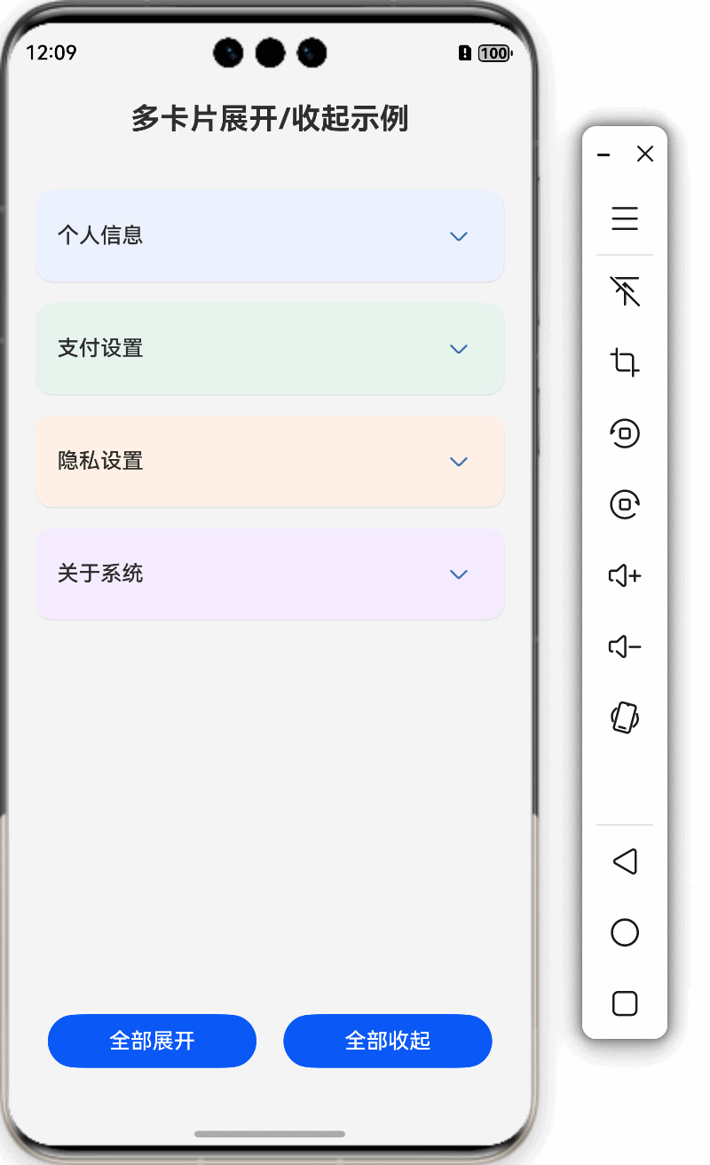
步骤6:添加滚动容器和全局控制按钮
最后,我们添加滚动容器和全局控制按钮,完善整个页面功能:
// 定义卡片数据接口
interface CardInfo {
  title: string
  content: string
  color: string
}

@Entry
@Component
struct ToggleCard {
  // 使用数组管理多个卡片的展开状态
  @State cardsExpanded: boolean[] = [false, false, false, false]

  // 卡片数据
  @State cardsData: CardInfo[] = [
    {
      title: '个人信息',
      content: '这是个人信息卡片的内容区域,可以放置用户的基本信息,如姓名、年龄、电话等。点击上方按钮可以收起卡片。',
      color: '#ECF2FF'
    },
    {
      title: '支付设置',
      content: '这是支付设置卡片的内容区域,可以放置用户的支付相关信息,包括支付方式、银行卡等信息。点击上方按钮可以收起卡片。',
      color: '#E7F5EF'
    },
    {
      title: '隐私设置',
      content: '这是隐私设置卡片的内容区域,可以放置隐私相关的设置选项,如账号安全、数据权限等内容。点击上方按钮可以收起卡片。',
      color: '#FFF1E6'
    },
    {
      title: '关于系统',
      content: '这是关于系统卡片的内容区域,包含系统版本、更新状态、法律信息等内容。点击上方按钮可以收起卡片。',
      color: '#F5EDFF'
    }
  ]

  // 切换指定卡片的展开/收起状态
  toggleCard(index: number) {
    animateTo({
      duration: 300,
      curve: Curve.EaseOut,
      onFinish: () => {
        console.info(`卡片${index}动画完成`)
      }
    }, () => {
      // 创建新数组并更新特定索引的值
      let newExpandedState = [...this.cardsExpanded]
      newExpandedState[index] = !newExpandedState[index]
      this.cardsExpanded = newExpandedState
    })
  }

  build() {
    Column({ space: 20 }) {
      Text('多卡片展开/收起示例')
        .fontSize(22)
        .fontWeight(FontWeight.Bold)
        .margin({ top: 20 })

      // 使用滚动容器,以便在内容较多时可以滚动查看
      Scroll() {
        Column({ space: 16 }) {
          // 使用ForEach遍历卡片数据,创建多个卡片
          ForEach(this.cardsData, (card: CardInfo, index: number) => {
            // 卡片组件
            Column() {
              Row() {
                Text(card.title)
                  .fontSize(16)
                  .fontWeight(FontWeight.Medium)

                Blank()

                Button() {
                  Image($r('sys.media.ohos_ic_public_arrow_down'))
                    .width(24)
                    .height(24)
                    .fillColor('#3F72AF')
                    .rotate({ angle: this.cardsExpanded[index] ? 180 : 0 })
                    .animation({
                      duration: 300,
                      curve: Curve.FastOutSlowIn
                    })
                }
                .width(36)
                .height(36)
                .backgroundColor(Color.Transparent)
                .onClick(() => this.toggleCard(index))
              }
              .width('100%')
              .justifyContent(FlexAlign.SpaceBetween)
              .alignItems(VerticalAlign.Center)

              if (this.cardsExpanded[index]) {
                Column({ space: 8 }) {
                  Text(card.content)
                    .fontSize(14)
                    .layoutWeight(1)
                }
                .animation({
                  duration: 300,
                  curve: Curve.EaseOut
                })
                .height(100)
                .width('100%')
              }
            }
            .padding(16)
            .borderRadius(12)
            .backgroundColor(card.color)
            .width('100%')
            // 添加阴影效果增强立体感
            .shadow({
              radius: 4,
              color: 'rgba(0, 0, 0, 0.1)',
              offsetX: 0,
              offsetY: 2
            })
          })

          // 底部间距
          Blank()
            .height(20)
        }
        .alignItems(HorizontalAlign.Center)
      }
      .align(Alignment.Top)
      .padding(20)
      .layoutWeight(1)

      // 添加底部按钮控制所有卡片
      Row({ space: 20 }) {
        Button('全部展开')
          .width('40%')
          .onClick(() => {
            animateTo({
              duration: 300
            }, () => {
              this.cardsExpanded = this.cardsData.map((_: CardInfo) => true)
            })
          })

        Button('全部收起')
          .width('40%')
          .onClick(() => {
            animateTo({
              duration: 300
            }, () => {
              this.cardsExpanded = this.cardsData.map((_: CardInfo) => false)
            })
          })
      }
      .margin({ bottom: 30 })
    }
    .width('100%')
    .height('100%')
    .backgroundColor('#F5F5F5')
    .alignItems(HorizontalAlign.Center)
    .expandSafeArea()
  }
}
这个最终版本添加了以下功能:
- 使用
Scroll容器,允许内容超出屏幕时滚动查看 - 添加"全部展开"和"全部收起"按钮,使用
map函数批量更新状态 - 使用
space参数优化布局间距 - 添加阴影效果增强卡片的立体感
三、关键技术点讲解
1. 状态管理
在HarmonyOS的ArkUI框架中,@State装饰器用于声明组件的状态变量。当状态变量改变时,UI会自动更新。在这个示例中:
- 对于单个卡片,我们使用
isExpanded布尔值跟踪其展开状态 - 对于多个卡片,我们使用
cardsExpanded数组,数组中的每个元素对应一个卡片的状态
更新数组类型的状态时,需要创建一个新数组而不是直接修改原数组,这样框架才能检测到变化并更新UI:
let newExpandedState = [...this.cardsExpanded]  // 创建副本
newExpandedState[index] = !newExpandedState[index]  // 修改副本
this.cardsExpanded = newExpandedState  // 赋值给状态变量
2. 动画实现
HarmonyOS提供了两种主要的动画实现方式:
A. animation属性(声明式动画)
直接应用于组件,当属性值变化时自动触发动画:
.rotate({ angle: this.isExpanded ? 180 : 0 })  // 属性根据状态变化
.animation({  // 动画配置
  duration: 300,  // 持续时间(毫秒)
  curve: Curve.FastOutSlowIn,  // 缓动曲线
  delay: 0,  // 延迟时间(毫秒)
  iterations: 1,  // 重复次数
  playMode: PlayMode.Normal  // 播放模式
})
B. animateTo函数(命令式动画)
通过回调函数中改变状态值来触发动画:
animateTo({
  duration: 300,  // 持续时间
  curve: Curve.EaseOut,  // 缓动曲线
  onFinish: () => {  // 动画完成回调
    console.info('动画完成')
  }
}, () => {
  // 在这个函数中更改状态值,这些变化将以动画方式呈现
  this.isExpanded = !this.isExpanded
})
3. 条件渲染
使用if条件语句实现内容的动态显示:
if (this.cardsExpanded[index]) {
  Column() {
    // 这里的内容只在卡片展开时渲染
  }
}
4. 数据驱动的UI
通过ForEach循环根据数据动态创建UI元素:
ForEach(this.cardsData, (card: CardInfo, index: number) => {
  // 根据每个数据项创建卡片
})
四、动画曲线详解
HarmonyOS提供了多种缓动曲线,可以实现不同的动画效果:
- Curve.Linear:线性曲线,匀速动画
- Curve.EaseIn:缓入曲线,动画开始慢,结束快
- Curve.EaseOut:缓出曲线,动画开始快,结束慢
- Curve.EaseInOut:缓入缓出曲线,动画开始和结束都慢,中间快
- Curve.FastOutSlowIn:标准曲线,类似Android标准曲线
- Curve.LinearOutSlowIn:减速曲线
- Curve.FastOutLinearIn:加速曲线
- Curve.ExtremeDeceleration:急缓曲线
- Curve.Sharp:锐利曲线
- Curve.Rhythm:节奏曲线
- Curve.Smooth:平滑曲线
- Curve.Friction:摩擦曲线/阻尼曲线
在我们的示例中:
- 使用
Curve.FastOutSlowIn为箭头旋转提供更自然的视觉效果 - 使用
Curve.EaseOut为内容展开提供平滑的过渡
五、常见问题与解决方案
- 动画不流畅:可能是因为在动画过程中执行了复杂操作。解决方法是将复杂计算从动画函数中移出,或者使用
onFinish回调在动画完成后执行。 - 条件渲染内容闪烁:为条件渲染的内容添加
.animation()属性可以实现平滑过渡。 - 卡片高度跳变:为卡片内容设置固定高度,或者使用更复杂的布局计算动态高度。
- 多卡片状态管理复杂:使用数组管理多个状态,并记得创建数组副本而不是直接修改原数组。
六、扩展与优化
你可以进一步扩展这个效果:
- 自定义卡片内容:为每个卡片添加更丰富的内容,如表单、图表或列表
- 记住展开状态:使用持久化存储记住用户的卡片展开偏好
- 添加手势交互:支持滑动展开/收起卡片
- 添加动态效果:比如展开时显示阴影或改变背景
- 优化性能:对于非常多的卡片,可以实现虚拟列表或懒加载
七、总结
通过本教程,我们学习了如何在HarmonyOS中实现卡片展开/收起效果,掌握了ArkUI中状态管理和动画实现的核心技巧。关键技术点包括:
- 使用
@State管理组件状态 - 使用
.animation()属性和animateTo()函数实现动画 - 使用条件渲染动态显示内容
- 实现数据驱动的UI创建
- 为多个卡片独立管理状态
这些技术不仅适用于卡片展开/收起效果,也是构建其他复杂交互界面的基础。
希望这篇 HarmonyOS Next 教程对你有所帮助,期待您的 👍点赞、💬评论、🌟收藏 支持。
原创声明:本文系作者授权腾讯云开发者社区发表,未经许可,不得转载。
如有侵权,请联系 cloudcommunity@tencent.com 删除。
原创声明:本文系作者授权腾讯云开发者社区发表,未经许可,不得转载。
如有侵权,请联系 cloudcommunity@tencent.com 删除。
评论
登录后参与评论
推荐阅读
目录
腾讯云开发者

Copyright © 2013 - 2026 Tencent Cloud. All Rights Reserved. 腾讯云 版权所有
深圳市腾讯计算机系统有限公司 ICP备案/许可证号:粤B2-20090059  粤公网安备44030502008569号
腾讯云计算(北京)有限责任公司 京ICP证150476号 | 京ICP备11018762号