【Html.js——页面布局】个人博客(蓝桥杯真题-1766)【合集】

【Html.js——页面布局】个人博客(蓝桥杯真题-1766)【合集】

Rossy Yan
发布于 2025-01-24 11:18:08
发布于 2025-01-24 11:18:08
背景介绍
很多人都有自己的博客,在博客上面用自己的方式去书写文章,用来记录生活,分享技术等。下面是蓝桥云课的博客,但是上面还缺少一些样式,需要大家去完善。
准备步骤
在开始答题前,你需要在线上环境终端中键入以下命令,下载并解压所提供的文件。
wget https://labfile.oss.aliyuncs.com/courses/7835/blog.zip&& unzip blog.zip && rm blog.zip下载完成之后的目录结构如下:
├── index.css
└── index.html
└── logo.svg
其中:
index.css是本次挑战需要补充样式的文件。index.html是博客页面。logo.svg是 logo 图片.
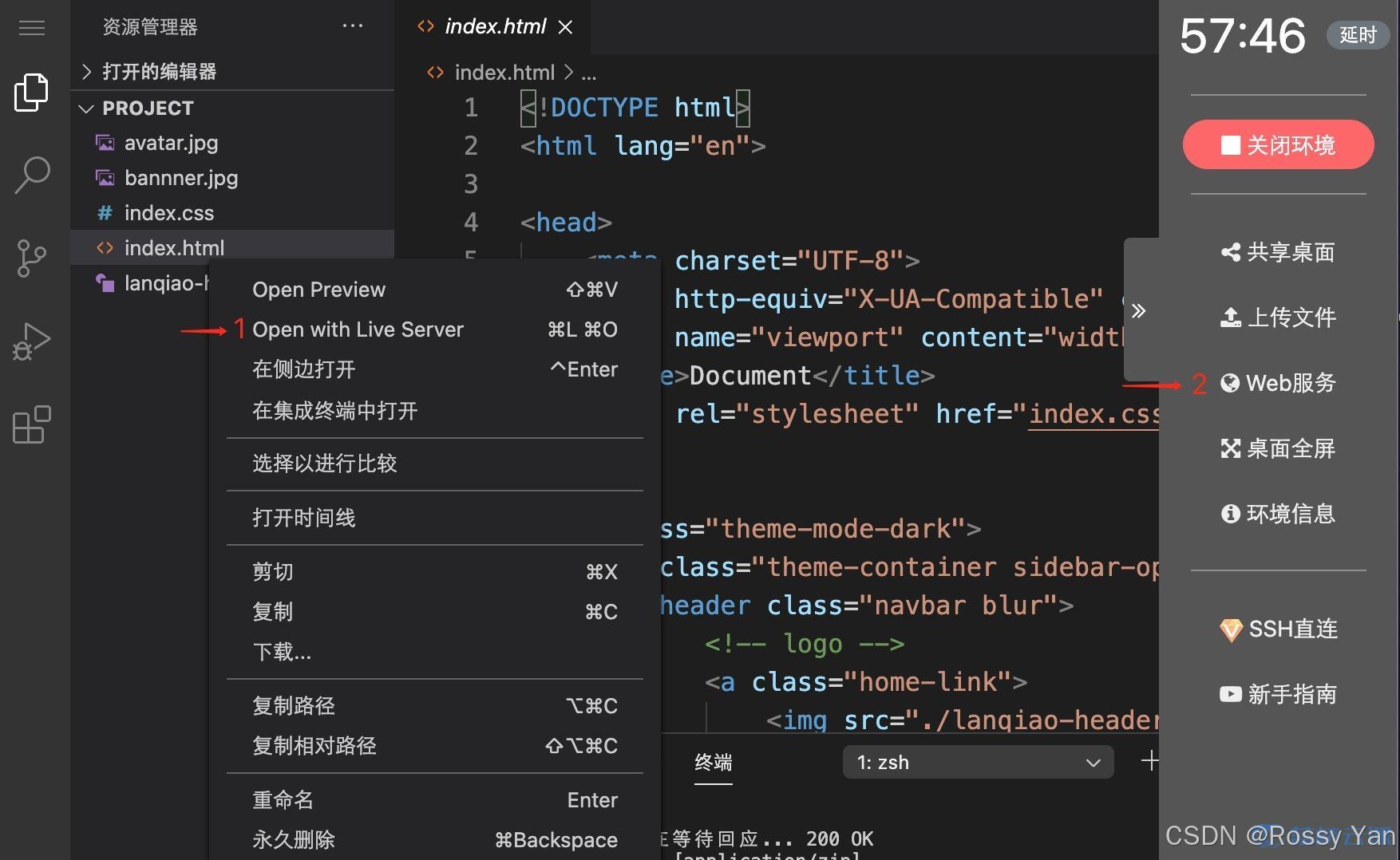
你可以参考下图中的步骤访问项目:
- 选中 index.html 右键启动 Web Server 服务(Open with Live Server),让项目运行起来。
- 打开环境右侧的【Web 服务】,就可以在浏览器中看到未完成的博客页面。
考试要求
- 在
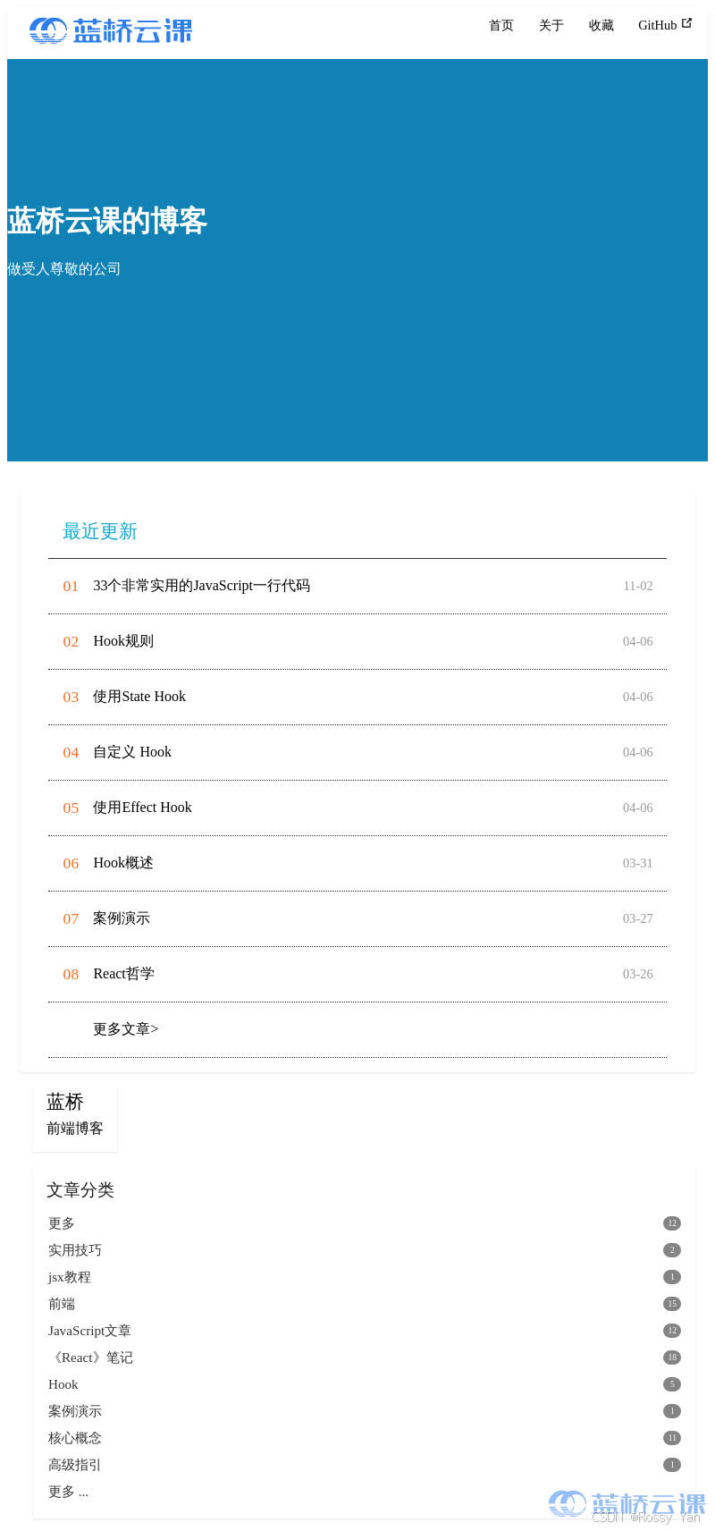
index.css中已经给出了修改部分的提示,请仔细阅读。 - 请完善
index.css上方需要修改的代码,修改完成后,页面效果如下所示:

要求规定
- 请严格按照考试步骤操作,切勿修改考试默认提供项目中的文件名称、文件夹路径等。
- 满足题目需求后,保持 Web 服务处于可以正常访问状态,点击「提交检测」系统会自动判分。
通关代码✔️
/* TODO:banner 上的文字 需要居中显示 */
.home-wrapper .banner .banner-conent .hero {
  margin-top: 3rem;
  text-align: center;
}

/* TODO: main-wrapper 通过设置main-wrapper 布局方式 让.main-left  .main-right 正确显示 */
.main-wrapper {
  margin: 1.5rem auto 0 auto;
  max-width: 1100px;
  padding: 0 0.9rem;
  box-sizing: border-box;
  position: relative;
  display: flex;
}

/*/* TODO 宽度自适应 居左显示 */
.main-wrapper .main-left {
  flex-grow:1;
}

/* 宽 245px 居右显示 */
.main-wrapper .main-right>* {
  box-sizing: border-box;
  width: 245px;
}

/* 以下代码不需要修改 */

.navbar .links {
  padding-left: 1.5rem;
  box-sizing: border-box;
  white-space: nowrap;
  font-size: 0.9rem;
  position: absolute;
  right: 1.5rem;
  top: 0.7rem;
  display: flex;
}

.nav-links .nav-item {
  position: relative;
  margin-left: 1.5rem;
  line-height: 2rem;
  color: var(--textColor);
  display: inline-block;
}

.blogger-wrapper .avatar {
  width: 100%;
  overflow: hidden;
}

.card-box {
  box-shadow: 0 1px 2px 0 rgb(0 0 0 / 10%);
  transition: box-shadow 0.5s;
}

.blogger-wrapper .avatar img {
  width: 100%;
  height: 100%;
}

.banner {
  background: rgb(17, 130, 182);
}

.theme-mode-dark {
  --bodyBg: #27272b;
  --mainBg: #1e1e22;
  --sidebarBg: rgba(30, 30, 34, 0.8);
  --blurBg: rgba(30, 30, 34, 0.8);
  --textColor: #000000;
  --textLightenColor: #0085ad;
  --borderColor: #2c2c3a;
  --codeBg: #252526;
  --codeColor: #fff;
}

.theme-container {
  color: var(--textColor);
  min-height: 100vh;
}

.article-list .article-title {
  border-bottom: 1px solid var(--borderColor);
  font-size: 1.3rem;
  padding: 1rem;
}

.nav-links .repo-link {
  margin-left: 1.5rem;
  color: var(--textColor);
}

.navbar a,
.navbar span,
.navbar img {
  display: inline-block;
}

.nav-links a {
  line-height: 1.4rem;
  color: inherit;
}

.navbar .links .search-box {
  flex: 0 0 auto;
  vertical-align: top;
}

.search-box {
  display: inline-block;
  position: relative;
  margin-right: 1rem;
}

.avbar {
  padding: 0.7rem 1.5rem;
  line-height: 2.2rem;
  transition: transform 0.3s;
}

.navbar {
  z-index: 20;
  top: 0;
  left: 0;
  right: 0;
  height: 3.6rem;
  box-sizing: border-box;
  box-shadow: 0 2px 5px rgb(0 0 0 / 6%);
}

body .search-box input {
  background-color: transparent;
  color: var(--textColor);
  border: 1px solid var(--borderColor, #ccc);
}

.article-list .article-wrapper {
  overflow: hidden;
}

.article-list .article-wrapper dl {
  border-bottom: 1px dotted var(--borderColor);
  float: left;
  display: flex;
  padding: 8px 0;
  margin: 0;
  height: 45px;
  width: 100%;
}

header {
  display: block;
}

.home-wrapper .banner {
  width: 100%;
  min-height: 450px;
  color: #fff;
  position: relative;
  overflow: hidden;
}

.article-list .article-wrapper dl dt a {
  color: var(--textColor);
  flex: 1;
  display: flex;
  height: 45px;
  align-items: center;
  font-weight: normal;
}

.article-list .article-wrapper dl dt {
  flex: 1;
  display: flex;
}

.article-list .article-wrapper dl dd {
  font-size: 1.1rem;
  color: #f17229;
  width: 50px;
  text-align: center;
  margin: 0;
  line-height: 45px;
}

dd {
  display: block;
  margin-inline-start: 40px;
}

.article-list .article-wrapper dl dt .date {
  width: 50px;
  margin-right: 15px;
  color: #999;
  text-align: right;
  font-size: 0.9rem;
  line-height: 45px;
}

.search-box input {
  cursor: text;
  width: 10rem;
  height: 2rem;
  color: #4e6e8e;
  display: inline-block;
  border: 1px solid #cfd4db;
  border-radius: 2rem;
  font-size: 0.9rem;
  line-height: 2rem;
  padding: 0 0.5rem 0 2rem;
  outline: none;
  transition: all 0.2s ease;
}

a,
input,
button {
  outline: none;
  -webkit-tap-highlight-color: rgba(255, 255, 255, 0);
  -webkit-focus-ring-color: rgba(0, 0, 0, 0);
}

.home-wrapper .main-wrapper {
  margin-top: 2rem;
}

.home-wrapper .main-wrapper .main-left .card-box {
  margin-bottom: 0.9rem;
}

.article-list {
  padding: 1rem 2rem;
}

.main-wrapper .main-right .card-box {
  margin: 0 0 0.9rem 0.9rem;
  padding-top: 0.95rem;
  padding-bottom: 0.95rem;
}

.blogger-wrapper {
  height: auto;
  display: inline-table;
  padding-top: 0 !important;
  overflow: hidden;
}

.categories-wrapper .categories {
  margin-top: 0.6rem;
}

.categories-wrapper .categories a {
  display: block;
  padding: 8px 0.95rem 7px 0.95rem;
  color: var(--textColor);
  opacity: 0.8;
  font-size: 0.95rem;
  line-height: 0.95rem;
  position: relative;
  transition: all 0.2s;
  border-left: 2px solid transparent;
  margin-top: -1px;
  overflow: hidden;
  white-space: nowrap;
  text-overflow: ellipsis;
}

a {
  font-weight: 500;
  color: #11a8cd;
  text-decoration: none;
}

a,
input,
button {
  outline: none;
  -webkit-tap-highlight-color: rgba(255, 255, 255, 0);
  -webkit-focus-ring-color: rgba(0, 0, 0, 0);
}

.categories-wrapper .categories a span {
  float: right;
  background-color: var(--textColor);
  color: #fff;
  border-radius: 8px;
  padding: 0 0.13rem;
  min-width: 1rem;
  height: 1rem;
  line-height: 1rem;
  font-size: 0.6rem;
  text-align: center;
  opacity: 0.6;
  transition: opacity 0.3s;
}

.blogger-wrapper .blogger {
  padding: 0.3rem 0.95rem 0 0.95rem;
}

.blogger-wrapper .blogger .name {
  font-size: 1.3rem;
  display: block;
  margin-bottom: 6px;
}

.blogger-wrapper .blogger .slogan {
  color: var(--textColor);
}

.blogger-wrapper .blogger .name {
  color: var(--textColor);
}

.categories-wrapper .title {
  color: var(--textColor);
  opacity: 0.9;
  font-size: 1.2rem;
  padding: 0 0.95rem;
}

.navbar {
  padding: 0.7rem 1.5rem;
  line-height: 2.2rem;
  transition: transform 0.3s;
}

.navbar a,
.navbar img,
.navbar span {
  display: inline-block;
}
代码解析📑
1. HTML 部分
(1)文档声明与头部
<!DOCTYPE html>
<html lang="en">
<head>
    <meta charset="UTF-8">
    <meta http-equiv="X-UA-Compatible" content="IE=edge">
    <meta name="viewport" content="width=device-width, initial-scale=1.0">
    <title>Document</title>
    <link rel="stylesheet" href="index.css">
</head>解释:
<!DOCTYPE html>:声明文档类型为 HTML5。<html lang="en">:定义 HTML 文档的语言为英语。<meta>标签:设置字符编码、IE 兼容性以及视口,确保页面在不同设备上正确显示。<title>标签:设置页面标题为 “Document”。<link>标签:引入外部 CSS 样式表index.css。
(2)主体内容
<body class="theme-mode-dark">
    <div class="theme-container sidebar-open no-sidebar">
        <header class="navbar blur">
            <!-- logo -->
            <a class="home-link">
                <img src="./logo.svg" class="logo">
            </a>
            <!-- 导航头部右侧内容 -->
            <div class="links" style="max-width: 863px;">
                <!-- 导航文字 -->
                <nav class="nav-links can-hide">
                    <div class="nav-item">
                        <a class="nav-link">首页</a>
                    </div>
                    <div class="nav-item">
                        <a class="nav-link">关于</a>
                    </div>
                    <div class="nav-item">
                        <a class="nav-link">收藏</a>
                    </div>
                    <!-- github图标 -->
                    <a class="repo-link">
                        GitHub
                        <span><svg xmlns="http://www.w3.org/2000/svg" aria-hidden="true" focusable="false" x="0px" y="0px" viewBox="0 0 100 100" width="15" height="15" class="icon outbound">
                                <path fill="currentColor" d="M18.8,85.1h56l0,0c2.2,0,4-1.8,4-4v-32h-8v28h-48v-48h28v-8h-32l0,0c-2.2,0-4,1.8-4,4v56C14.8,83.3,16.6,85.1,18.8,85.1z"></path>
                                <polygon fill="currentColor" points="45.7,48.7 51.3,54.3 77.2,28.5 77.2,37.2 85.2,37.2 85.2,14.9 62.8,14.9 62.8,22.9 71.5,22.9"></polygon>
                            </svg>
                        </span>
                    </a>
                </nav>
            </div>
        </header>
        <!-- banner 部分 -->
        <div class="home-wrapper">
            <div class="banner">
                <div class="banner-conent" style="padding-top: 7rem;">
                    <header class="hero">
                        <h1 id="main-title">
                            蓝桥云课的博客
                        </h1>
                        <p class="description">
                            做受人尊敬的公司
                        </p>
                    </header>
                </div>
            </div>
            <!-- 内容部分 -->
            <div class="main-wrapper">
                <div class="main-left">
                    <div class="card-box article-list">
                        <div class="article-title">
                            <a class="iconfont icon-bi">最近更新</a>
                        </div>
                        <div class="article-wrapper">
                            <dl>
                                <dd>01</dd>
                                <dt>
                                    <a>
                                        <div>
                                            33个非常实用的JavaScript一行代码
                                        </div>
                                    </a>
                                    <span class="date">11-02</span>
                                </dt>
                            </dl>
                            <!-- 更多文章列表项 -->
                        </div>
                    </div>
                </div>
                <div class="main-right">
                    <!-- 右侧头像和简介 -->
                    <aside class="blogger-wrapper card-box">
                        <div class="blogger"><span class="name">蓝桥</span> <span class="slogan">前端博客</span></div>
                    </aside>
                    <!-- 右侧文章分类 -->
                    <div class="categories-wrapper card-box">
                        <a class="title iconfont icon-wenjianjia" title="全部分类">文章分类</a>
                        <div class="categories">
                            <a class="">更多<span>12</span></a>
                            <a class="">实用技巧<span>2</span></a>
                            <!-- 更多文章分类项 -->
                        </div>
                    </div>
                </div>
            </div>
        </div>
    </div>
</body>
</html><body>标签:应用theme-mode-dark类,可能用于设置深色主题。<header>标签:作为导航栏,包含 logo 和导航链接。<div class="home-wrapper">:包含首页的 banner 和主要内容区域。<div class="banner">:首页的 banner 区域,包含标题和描述。<div class="main-wrapper">:主要内容区域,分为左侧的文章列表main-left和右侧的博主信息及文章分类main-right。
2. CSS部分
(1)banner文字居中
.home-wrapper.banner.banner-conent.hero {
    margin-top: 3rem;
    text-align: center;
}- 设置
home-wrapper下banner内banner-conent的hero元素的文本居中,并添加顶部外边距。
(2)主要内容布局
.main-wrapper {
    margin: 1.5rem auto 0 auto;
    max-width: 1100px;
    padding: 0 0.9rem;
    box-sizing: border-box;
    position: relative;
    display: flex;
}

.main-wrapper.main-left {
    flex-grow: 1;
}

.main-wrapper.main-right>* {
    box-sizing: border-box;
    width: 245px;
}.main-wrapper:设置外边距、最大宽度、内边距,使用flex布局。.main-wrapper.main-left:通过flex-grow: 1使其宽度自适应并居左显示。.main-wrapper.main-right>*:设置右侧元素的宽度为 245px 并应用盒模型。
(3)其他样式
- 导航栏样式:设置导航栏的位置、背景、字体等样式。
- 文章列表样式:设置文章列表的边框、字体、日期样式等。
- 右侧博主信息和文章分类样式:设置相关元素的宽度、字体、颜色等样式。
3. 工作流程 ▶️
- HTML 结构搭建:首先定义 HTML 文档结构,包括头部信息、导航栏、首页 banner、文章列表和右侧栏。通过不同的
div和标签来划分不同的区域,为每个区域添加相应的类名以便于 CSS 样式控制。 - CSS 样式应用:
- 首先设置整体的布局,如
.main-wrapper的flex布局,确定左侧文章列表和右侧栏的排列方式。 - 然后针对每个区域进行样式细化,如导航栏的样式设置,包括背景、字体、链接样式等;banner 区域设置背景色和文字居中;文章列表设置边框、字体大小、日期样式等;右侧栏设置博主信息和文章分类的样式。
- 首先设置整体的布局,如
- 响应式设计:通过
meta标签中的视口设置以及一些相对单位(如rem)的使用,确保页面在不同设备上能够正确显示。
通过以上步骤,HTML 和 CSS 代码协同工作,实现了一个具有导航栏、首页 banner、文章列表和右侧栏的个人博客页面布局。
测试结果👍
本文参与 腾讯云自媒体同步曝光计划,分享自作者个人站点/博客。
原始发表:2025-01-24,如有侵权请联系 cloudcommunity@tencent.com 删除
评论
登录后参与评论
推荐阅读
目录
腾讯云开发者

Copyright © 2013 - 2026 Tencent Cloud. All Rights Reserved. 腾讯云 版权所有
深圳市腾讯计算机系统有限公司 ICP备案/许可证号:粤B2-20090059  粤公网安备44030502008569号
腾讯云计算(北京)有限责任公司 京ICP证150476号 | 京ICP备11018762号